We’re not blue, but Pantone’s Color of the Year sure is!
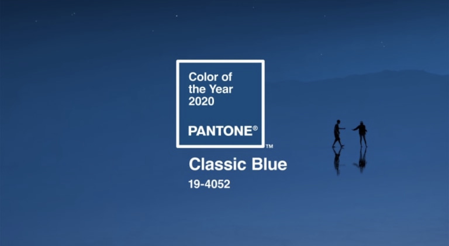
Two decades ago it all began with Cerulean Blue and ever since Pantone’s color forecasts are the reigning authority on what’s hot. As we enter a new decade, Pantone announced this week that the Pantone Color of the Year 2020 is Classic Blue. A delightfully familiar, calming shade of azure.
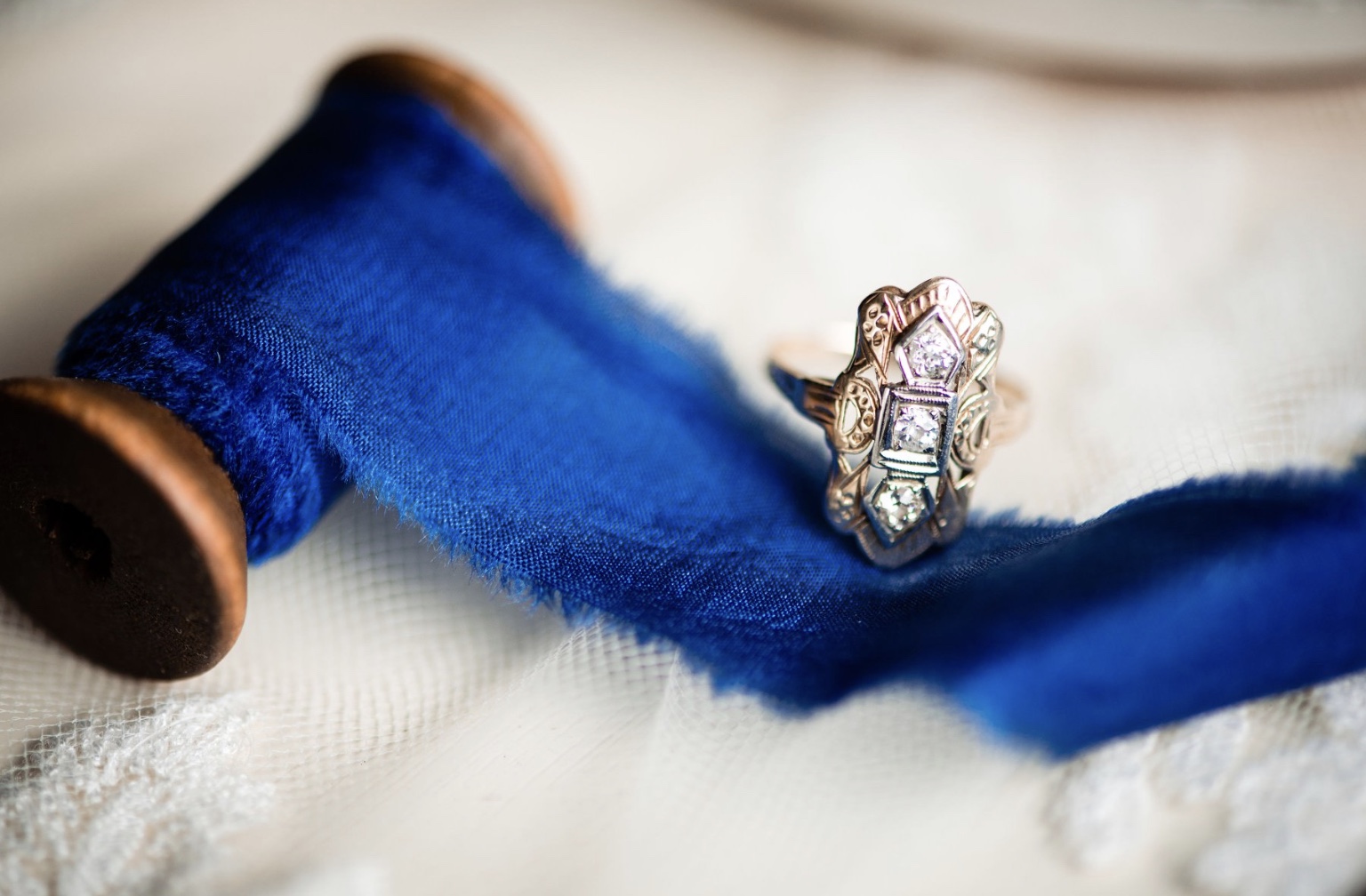
Pantone’s decade-launching color choice might seem a bit on the conservative and neutral side, especially when you compare it to 2019’s incredibly vivid Living Coral, however, such a reliable and certainly recognizable color adds an air of security during uncertainty times. Blue, from an emotional, psychological standpoint, has always represented a certain amount of dependability and calm. Clearly Pantone selected Classic Blue because it is a solid, sturdy color that you can rely on.
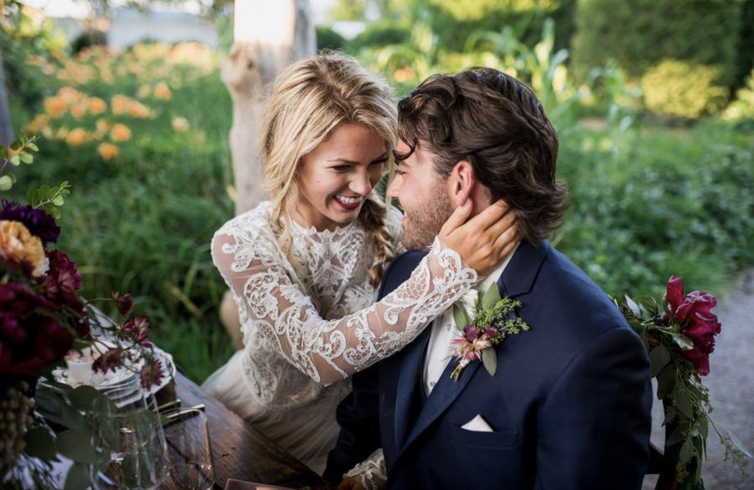
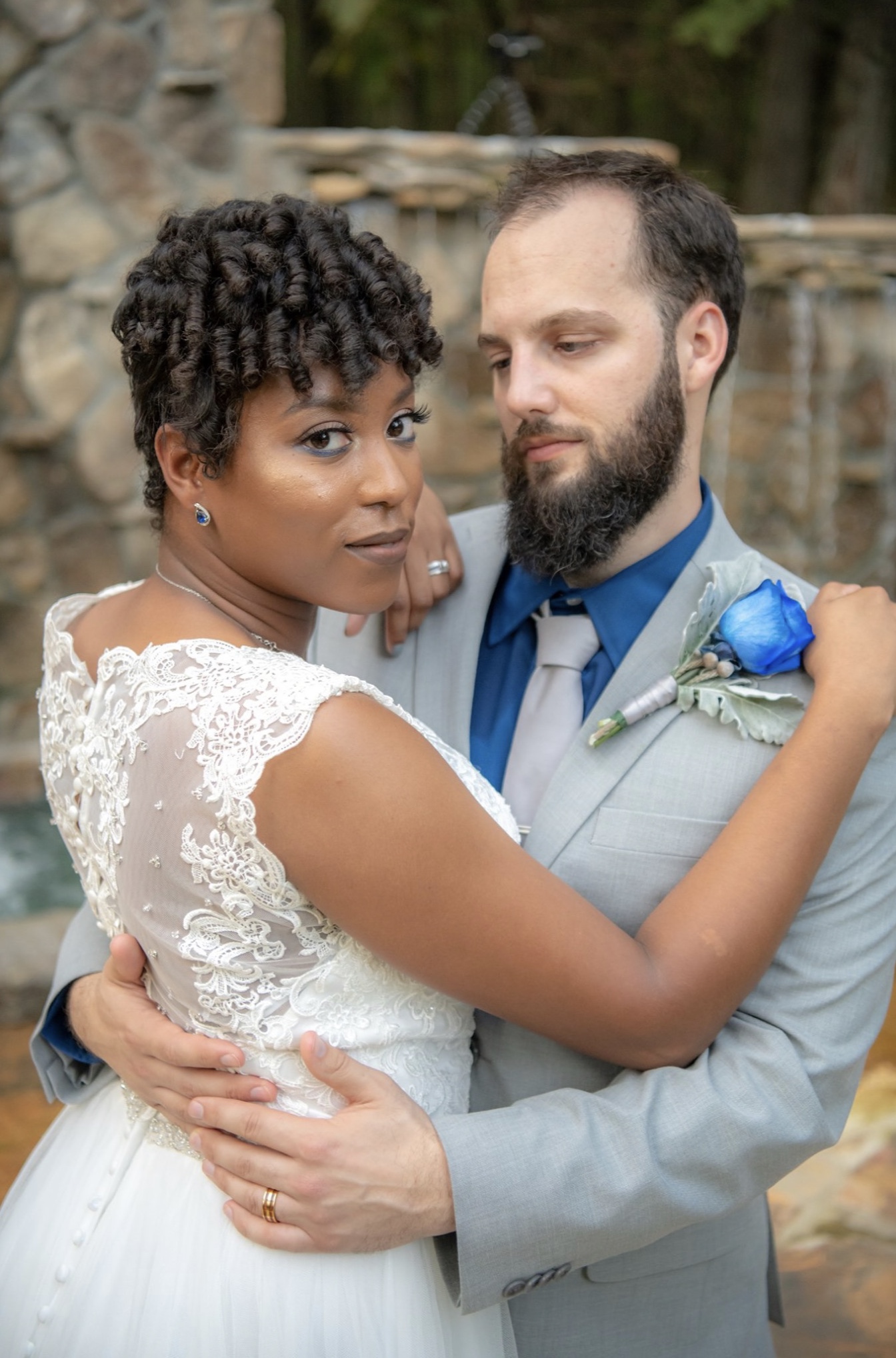
Classic Blue is also a color that is beloved the world over. During Pantone’s global research efforts, which begin over a year in advance of each year’s announcement, Classic Blue kept reappearing in countless fields one more diverse than the next. It has been prominently featured on everything seemingly everywhere from the beauty industry to auto manufacturing to the art market to tech…and even outer space! (Just look at NASA’s logo.)
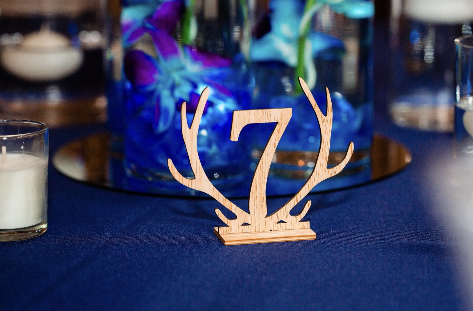
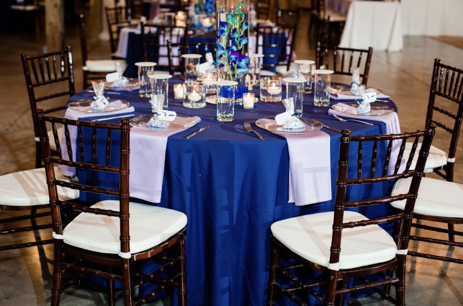
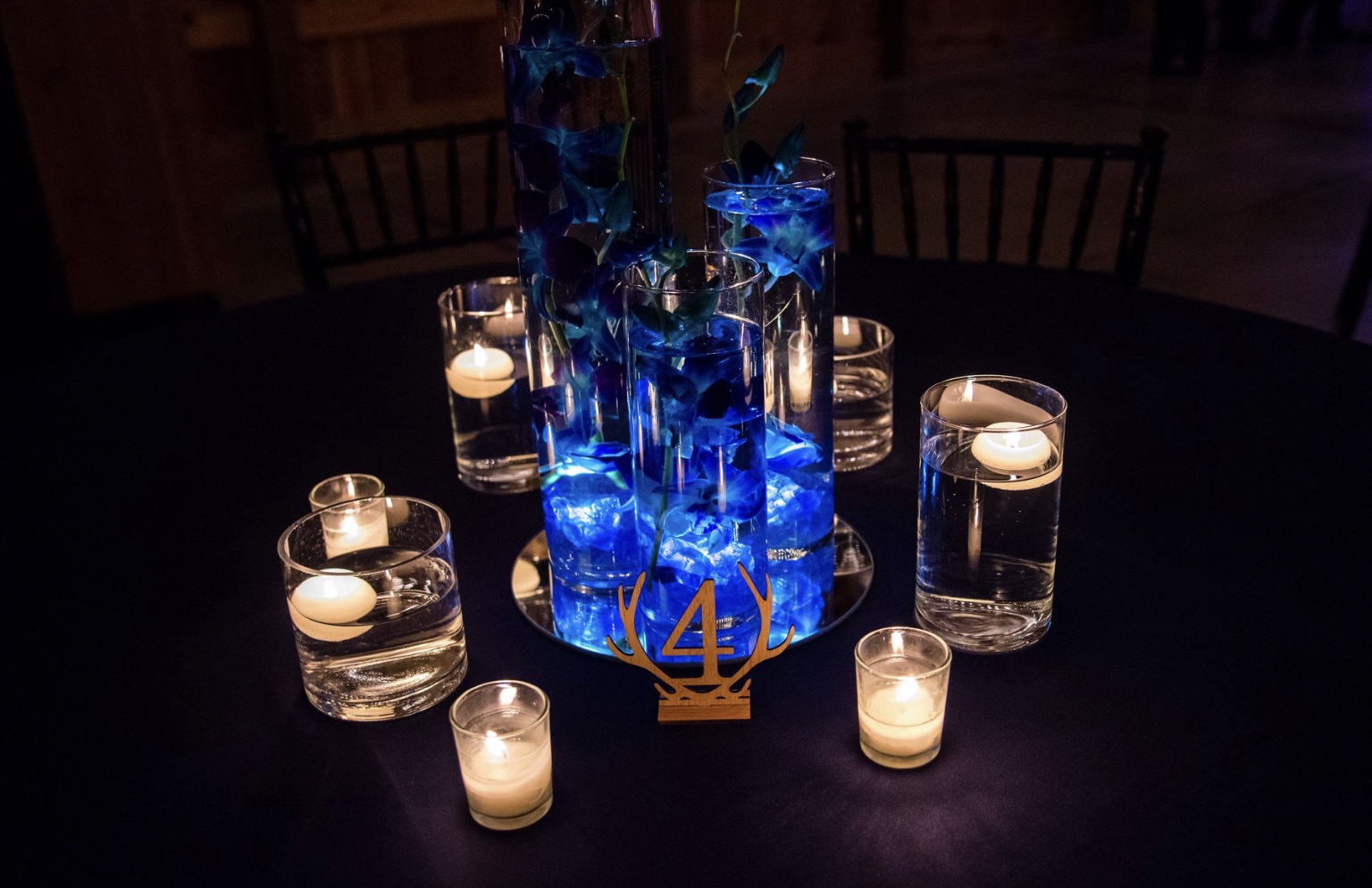
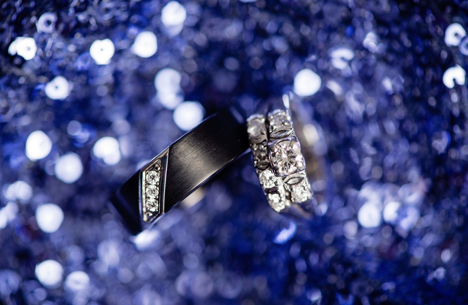
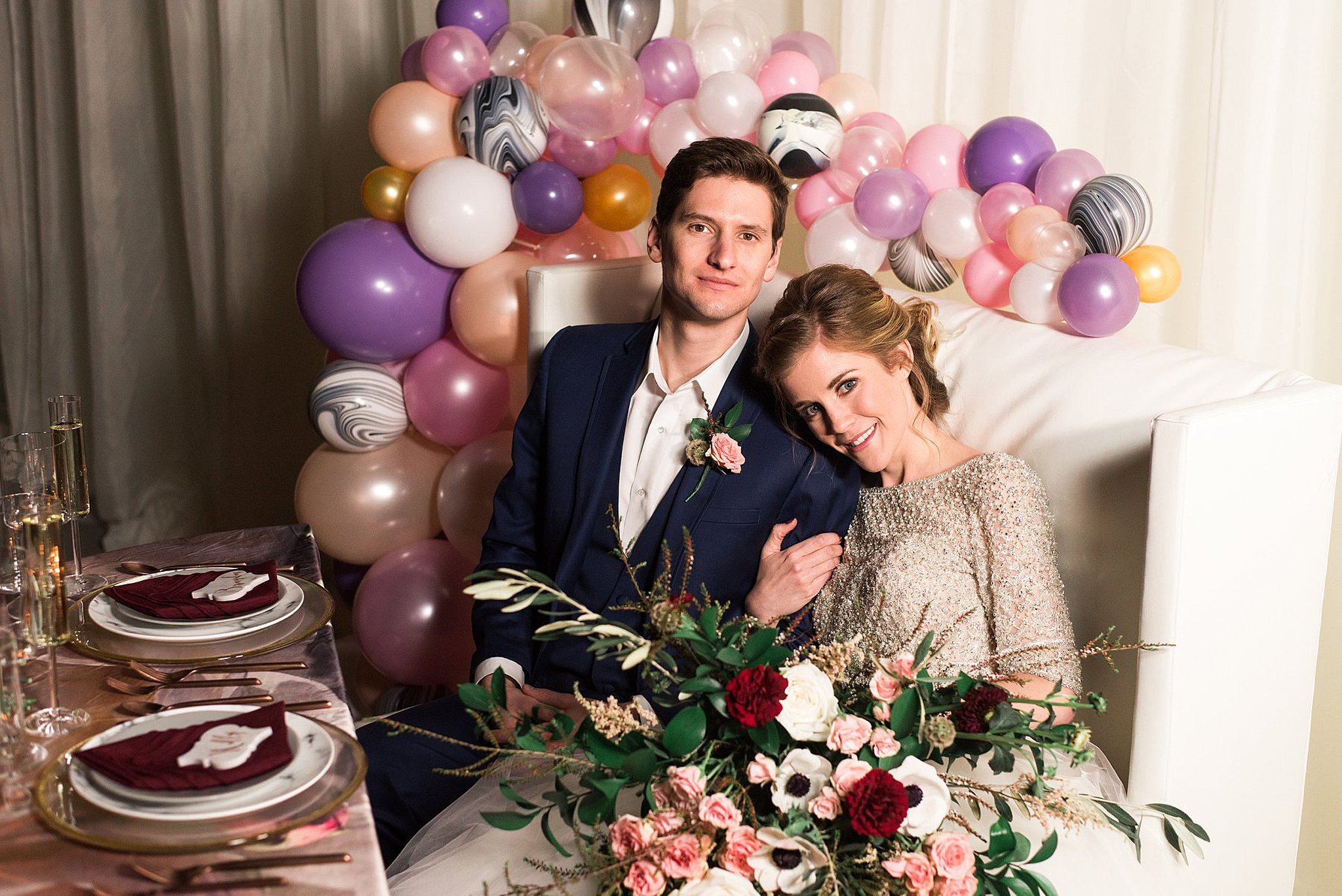
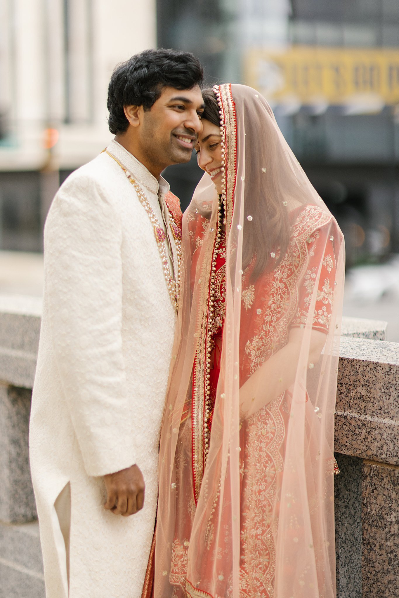
It would seem to us that Pantone’s selection seems quite perfectly aligned with the gradual return to a more traditional style of decor at weddings. Classic Blue unites as it is bright and beautiful in its own right, however, it can also uniquely work as a neutral base tone for a host of many other vivid accent colors. In terms of table decor, we predict a resurgence of lustrous blue taffeta and velvet linens.
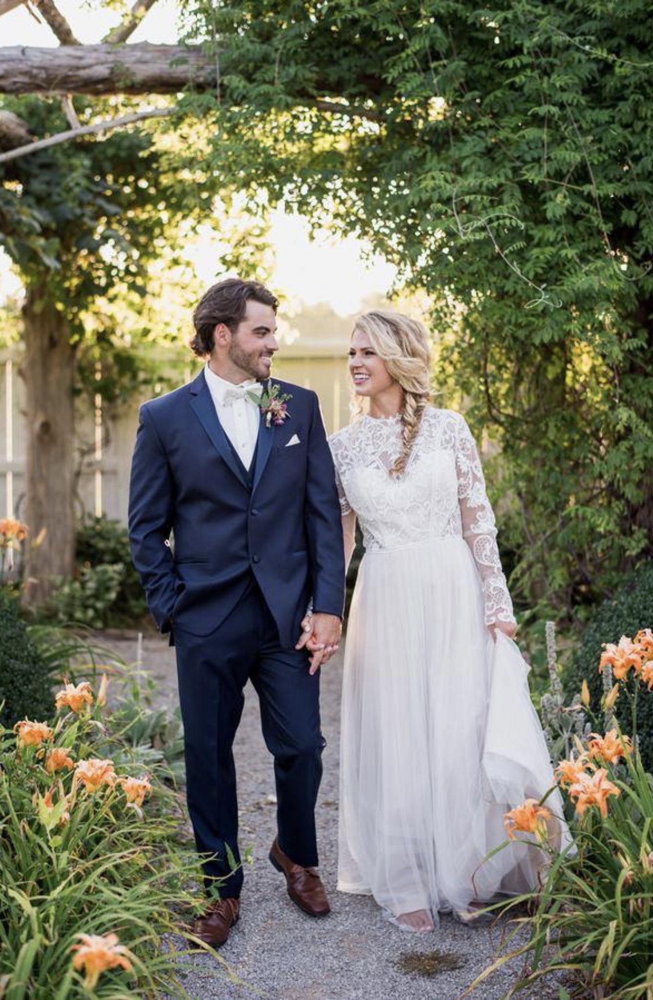
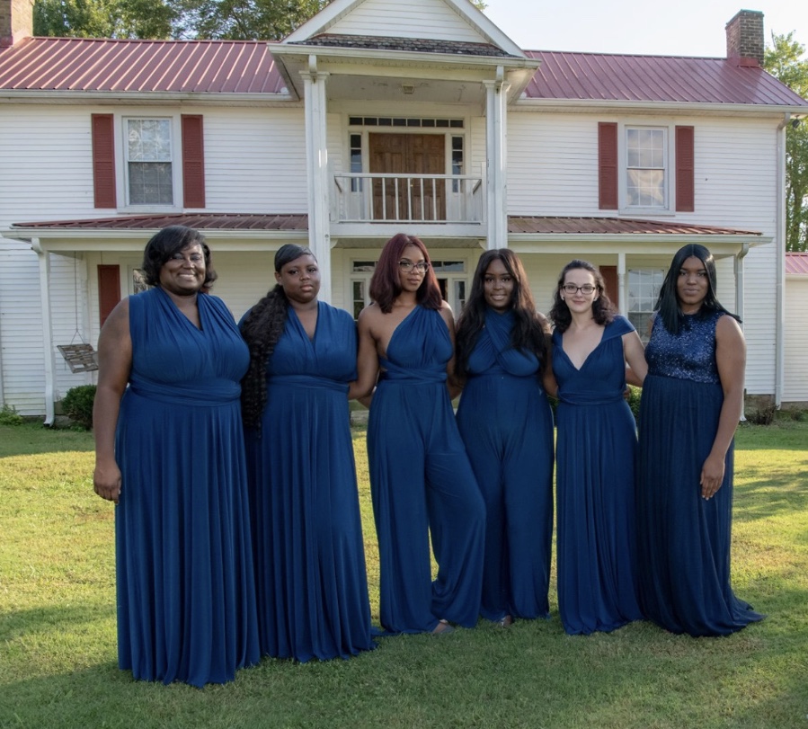
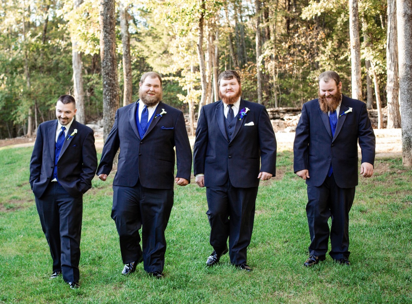
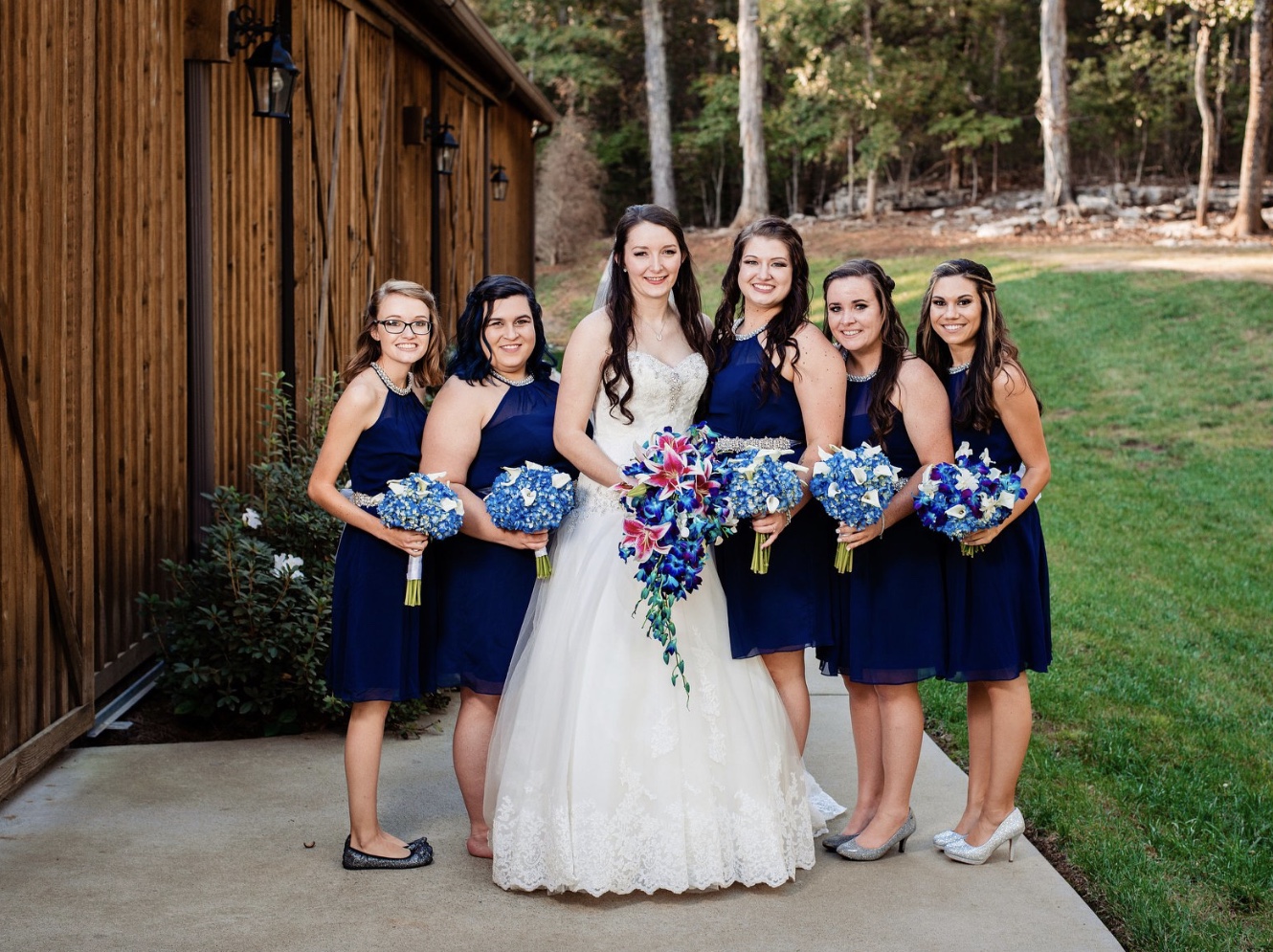
Previous blues of the Pantone Color of the Year palate include 2010’s Turquoise, 2008’s Blue Iris, and 2000’s Cerulean. “There are many different blues in the Pantone system, but this particular shade really gave us that feeling of confidence and stability,” Leatrice Eiseman, the executive director of the company’s Color Institute explains.
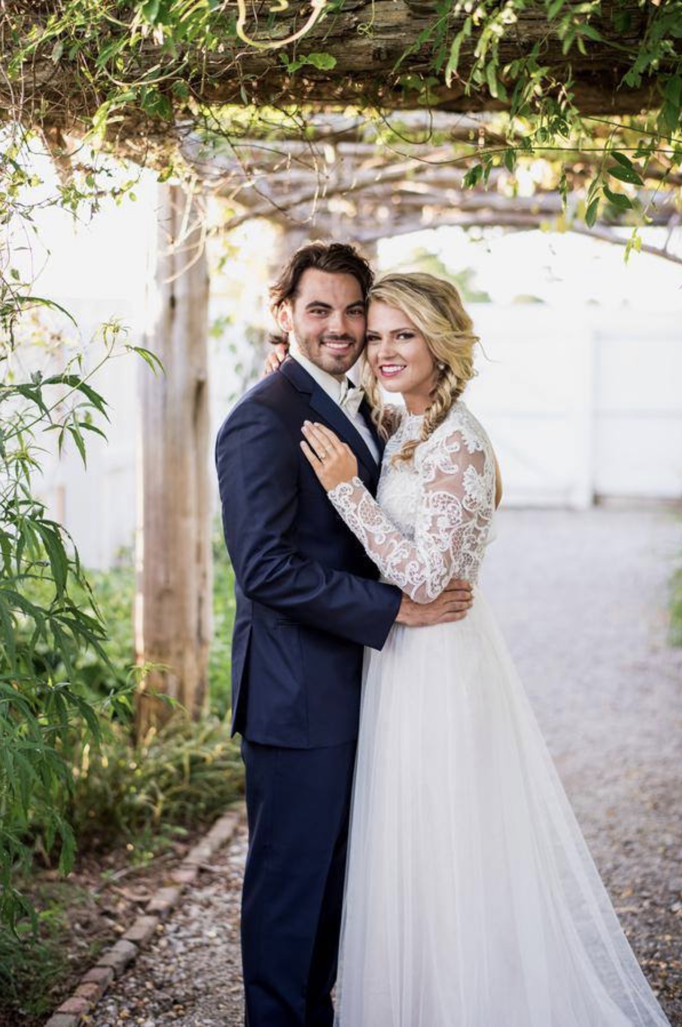
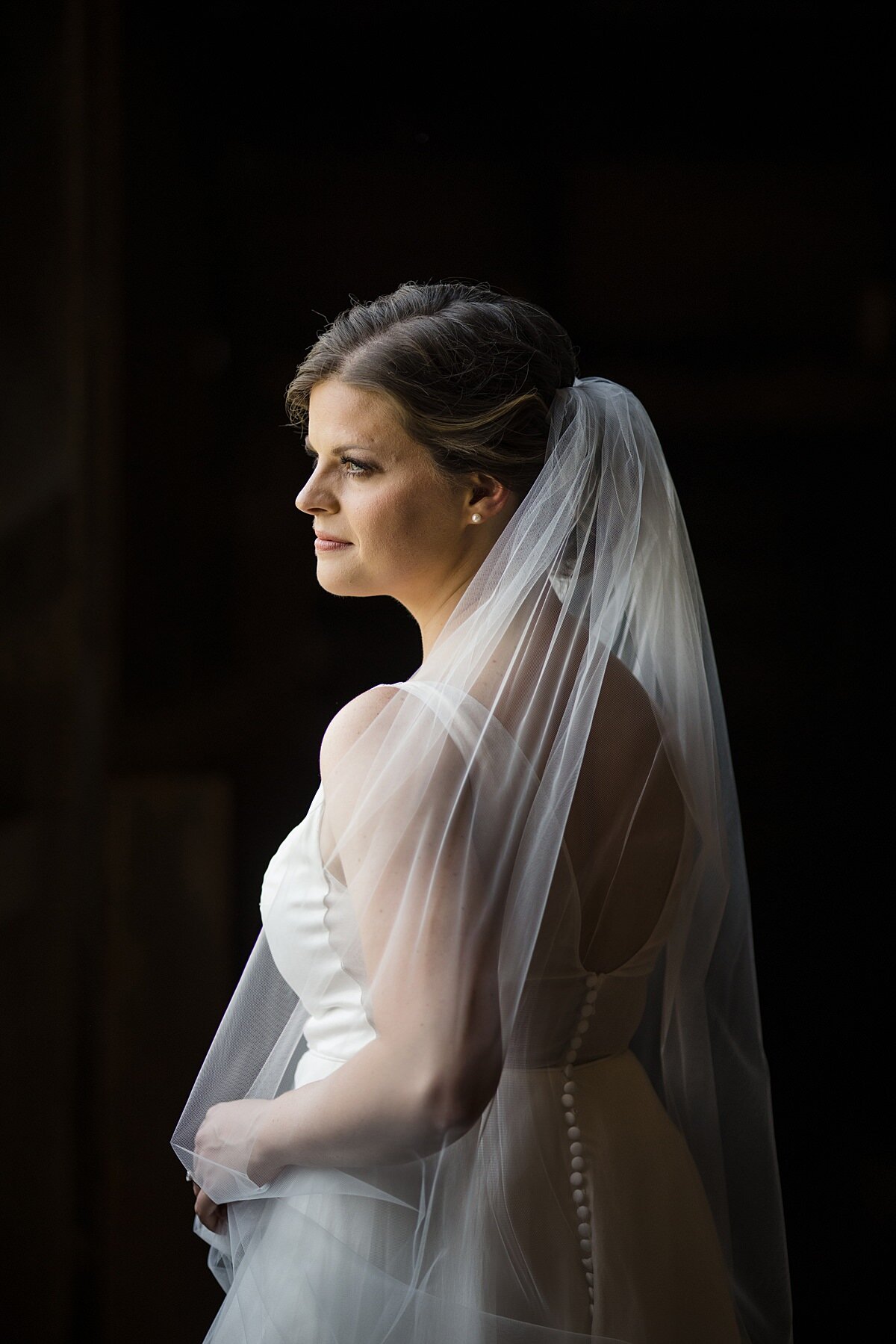
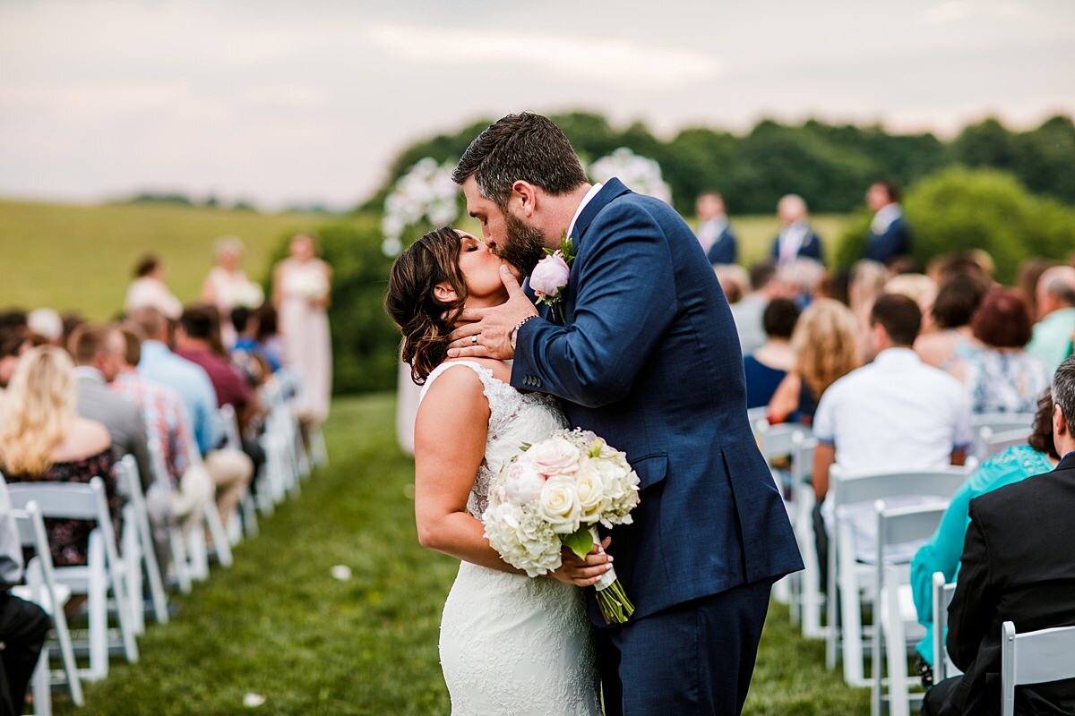
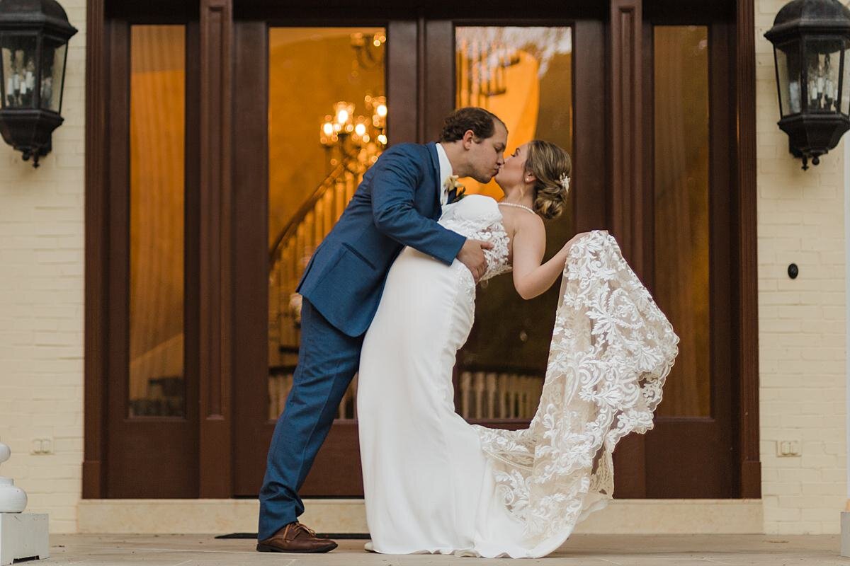
Beloved by brides far and wide, we are sure to see a lot of this shade in the coming months and we aren’t mad about it!