25 Colors That Are Better Than Pantone’s 2025 Color of the Year
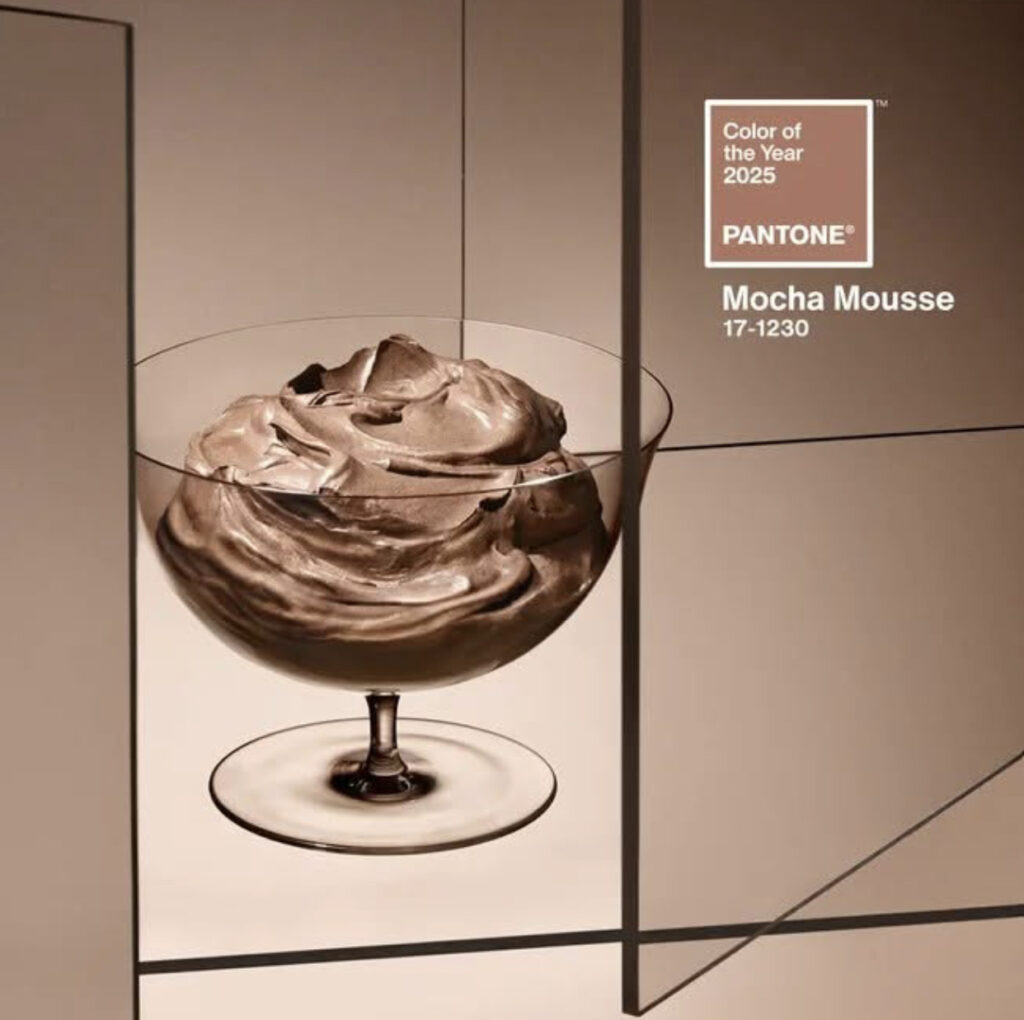
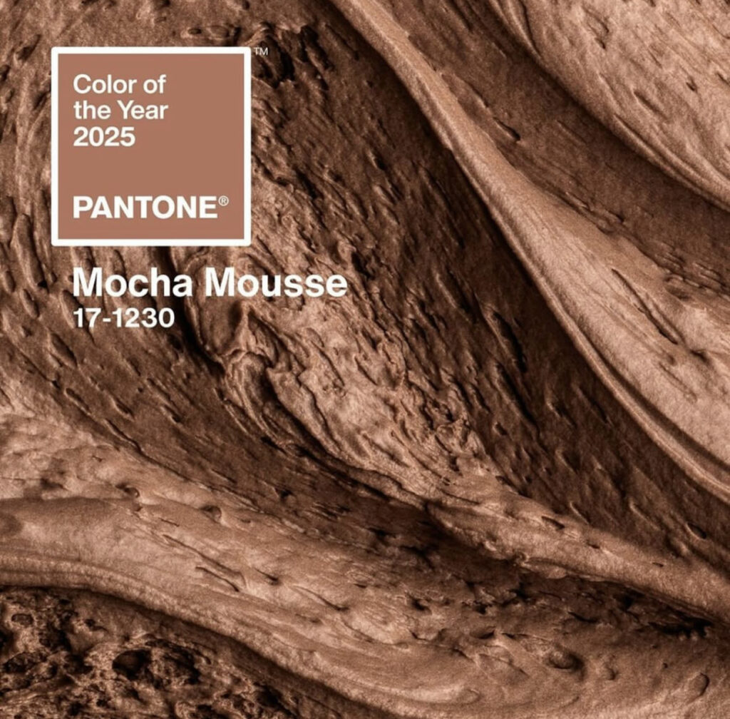
Pantone’s Color of the Year for 2025 has been announced: Mocha Mousse. A rich, warm brown with subtle undertones, it’s meant to evoke comfort and sophistication. Initially, I thought this announcement was satire, after all, it’s not every day a brown shade takes center stage.
Pantone’s Color of the Year often sets trends for everything from fashion to wedding palettes, but if 2025’s pick happens to fall into the neutral zone of brown or beige (as predicted by many trend forecasters), we’re here to say, “No, thank you!” Brown might be a decent neutral to complement other shades, but it doesn’t deserve star billing. Especially when it comes to wedding aesthetics. Brides, grooms, and newly engaged couples deserve colors that pop, inspire, and create a magical ambiance for wedding decor, flowers, outfits, and table settings. From cheerful pastels to vibrant hues, we’ve rounded up 25 stunning colors that are simply better than brown.
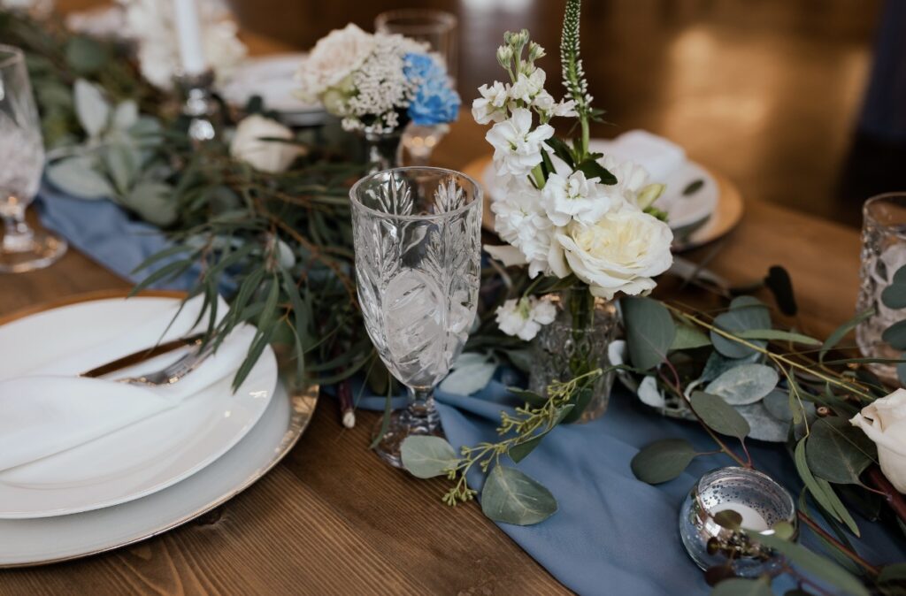
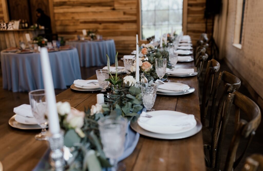
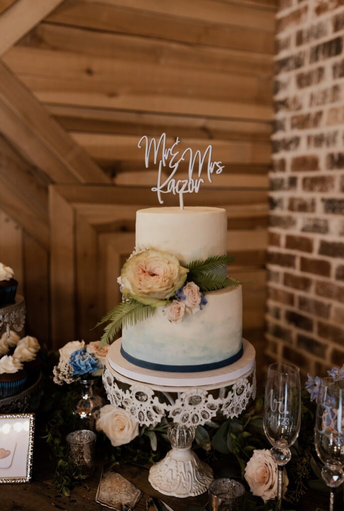
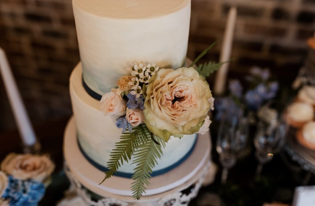
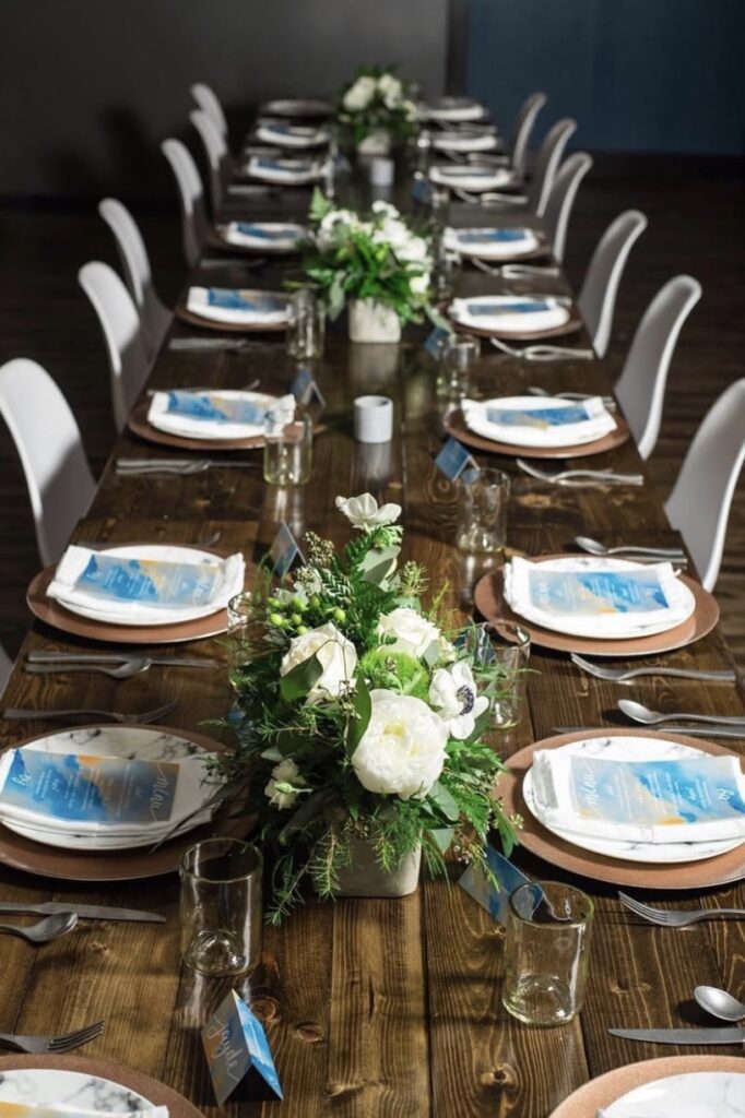
1. Dusty Blue
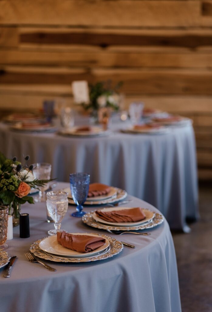
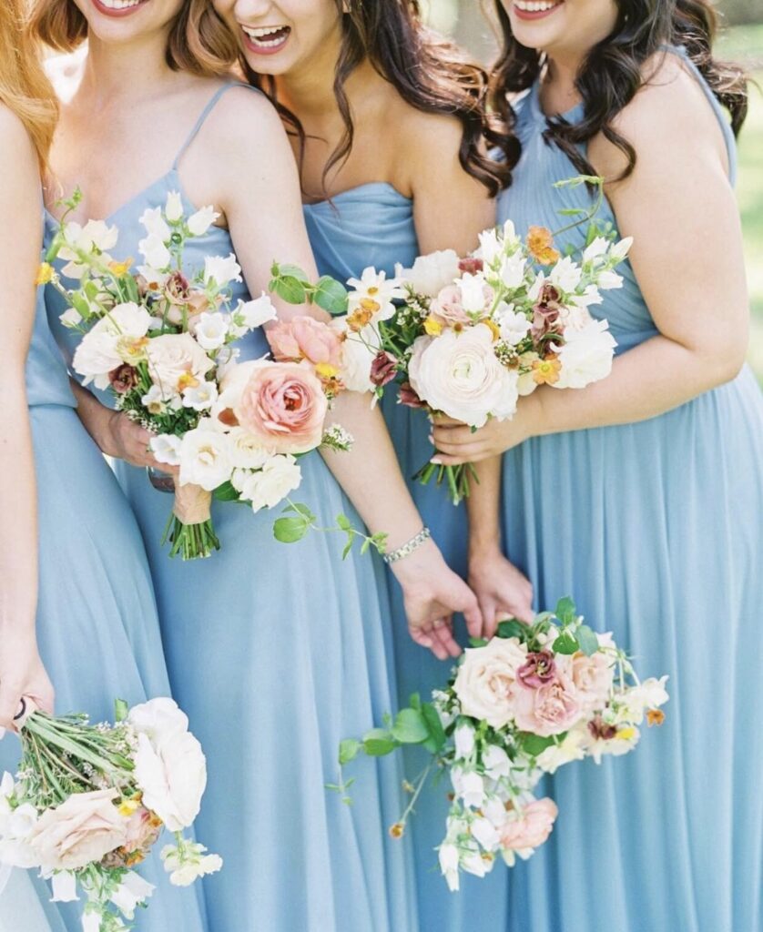
Romantic, and utterly timeless, dusty blue is perfect for everything from bridesmaid dresses to ethereal reception backdrops. It complements nearly every wedding theme, whether boho or formal. And mocha mousse, the Pantone Color of the Year would make a nice accent color with dusty blue at center stage.
2. Sage Green
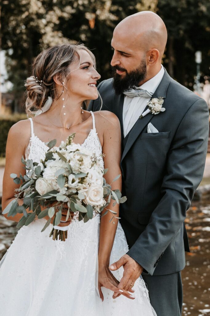
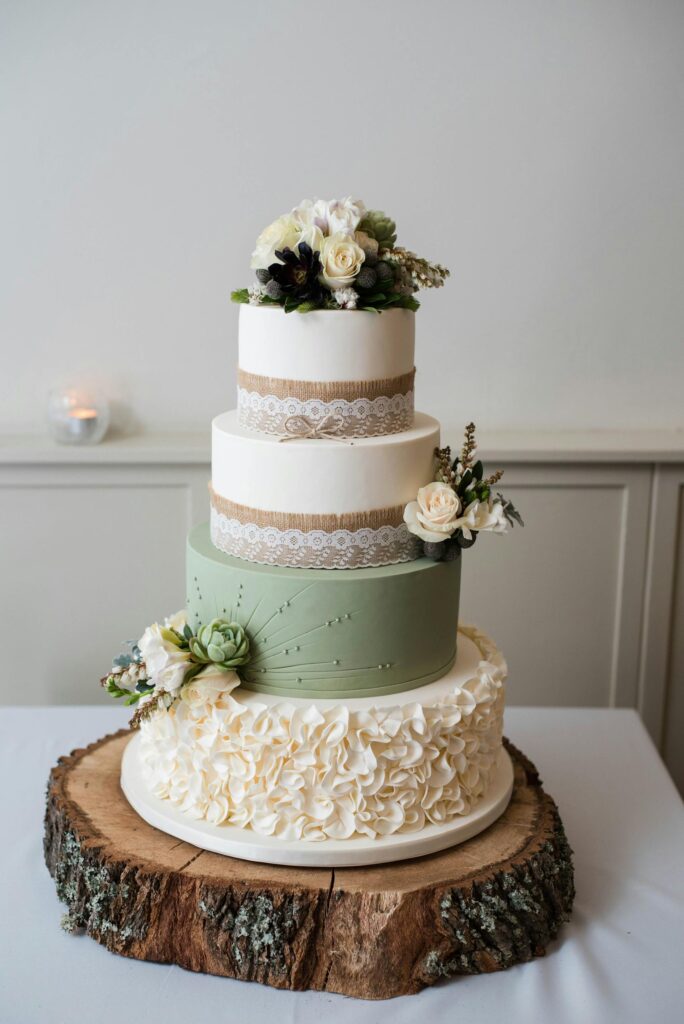
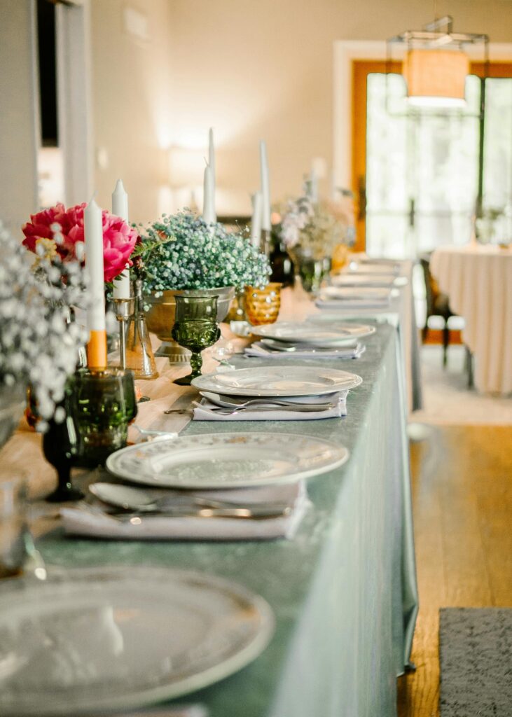
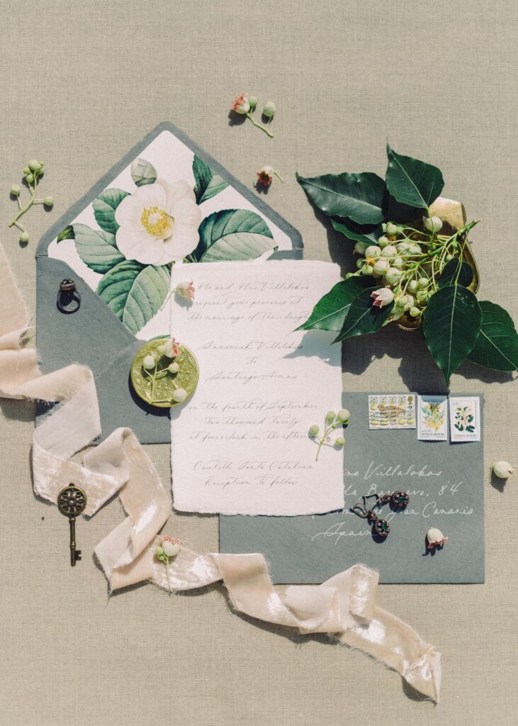
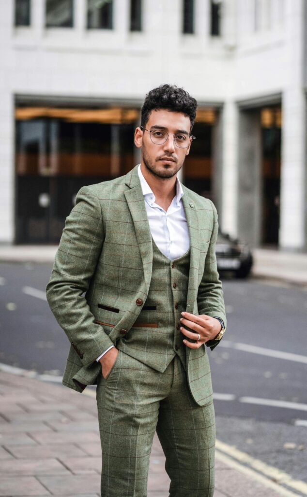
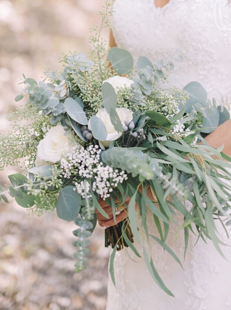
This muted green brings a fresh, earthy vibe to your palette without feeling heavy. It pairs beautifully with soft pastels or even a bold accent like deep burgundy.
3. Blush
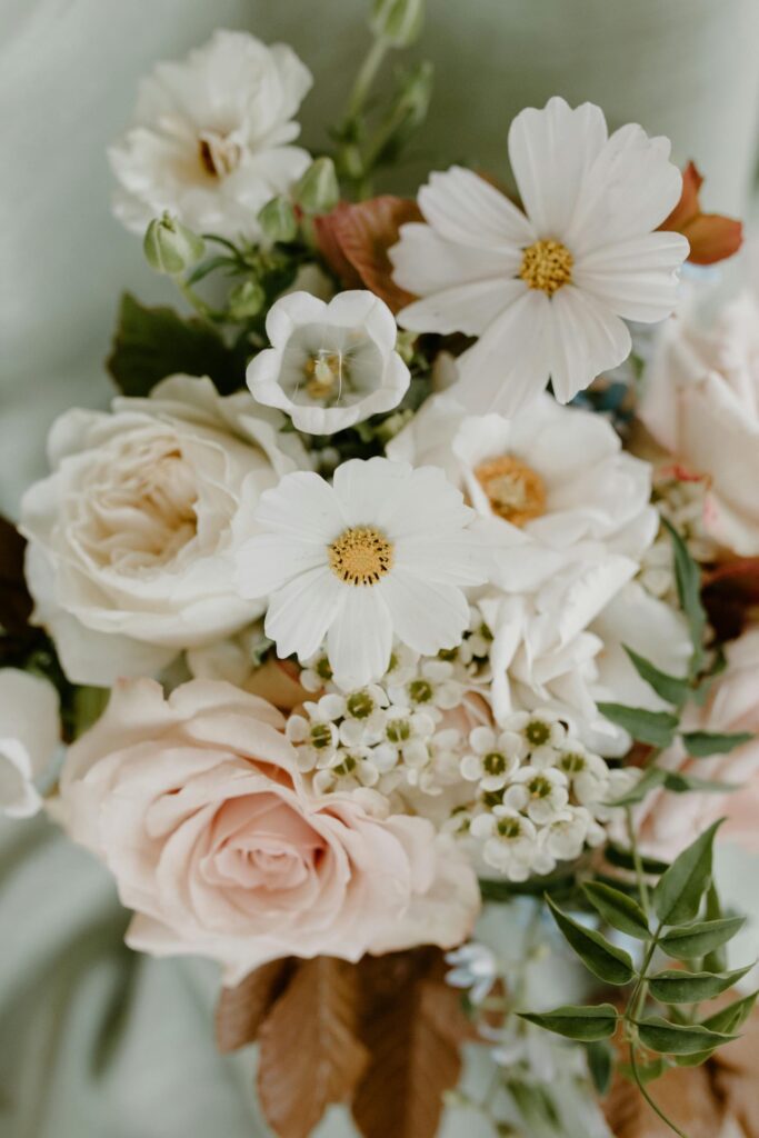
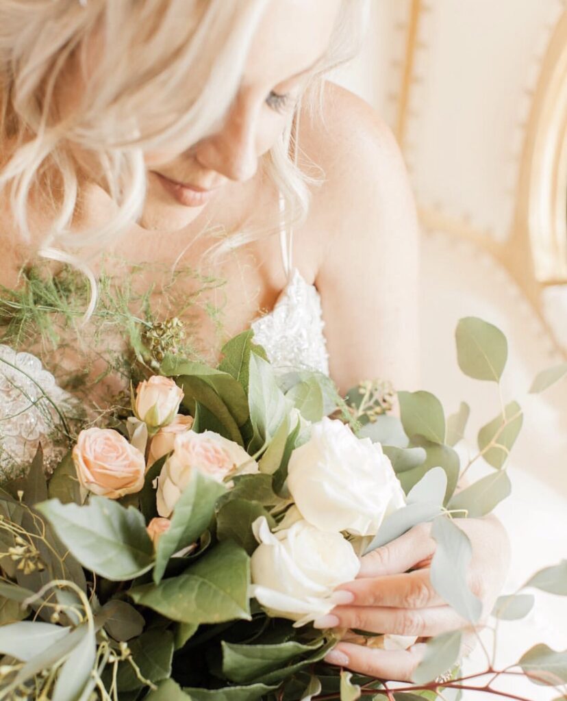
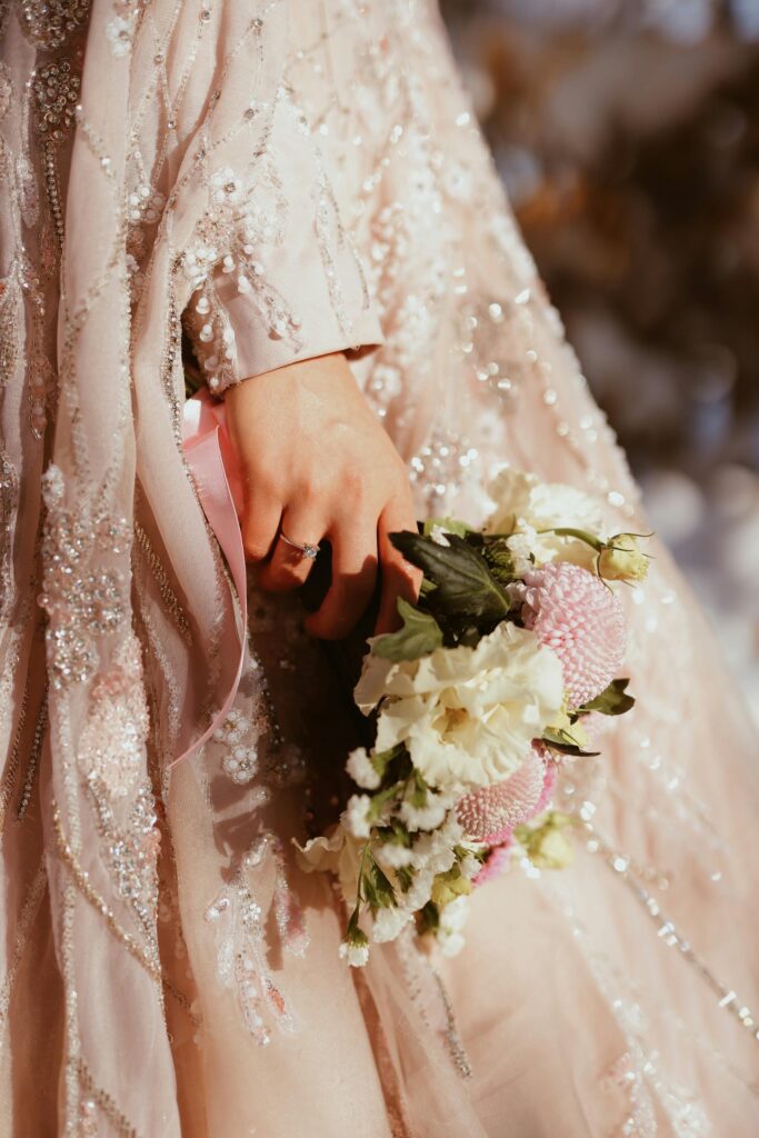
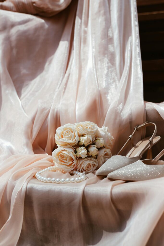
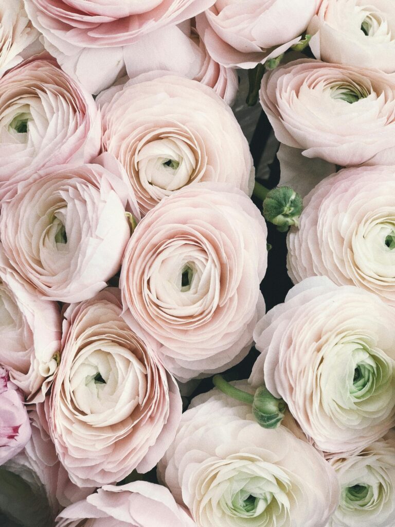
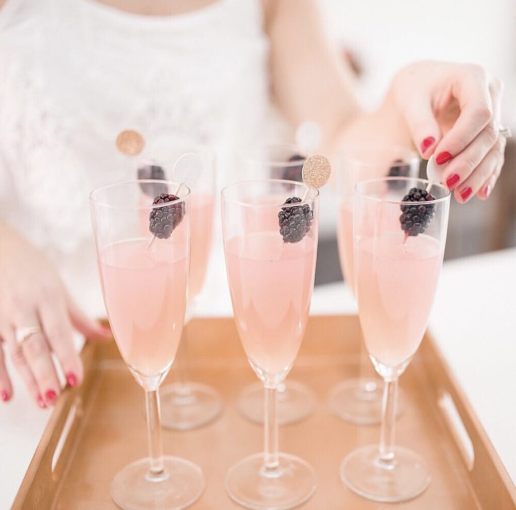
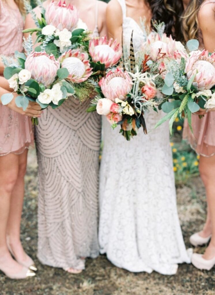
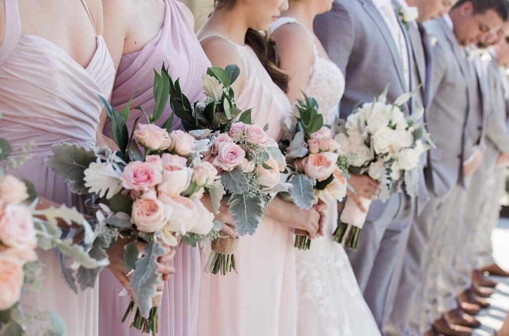
Blush continues to reign supreme as a go-to wedding color. It’s flirty, romantic, and incredibly versatile—ideal for floral arrangements, accent decor, and cake designs.
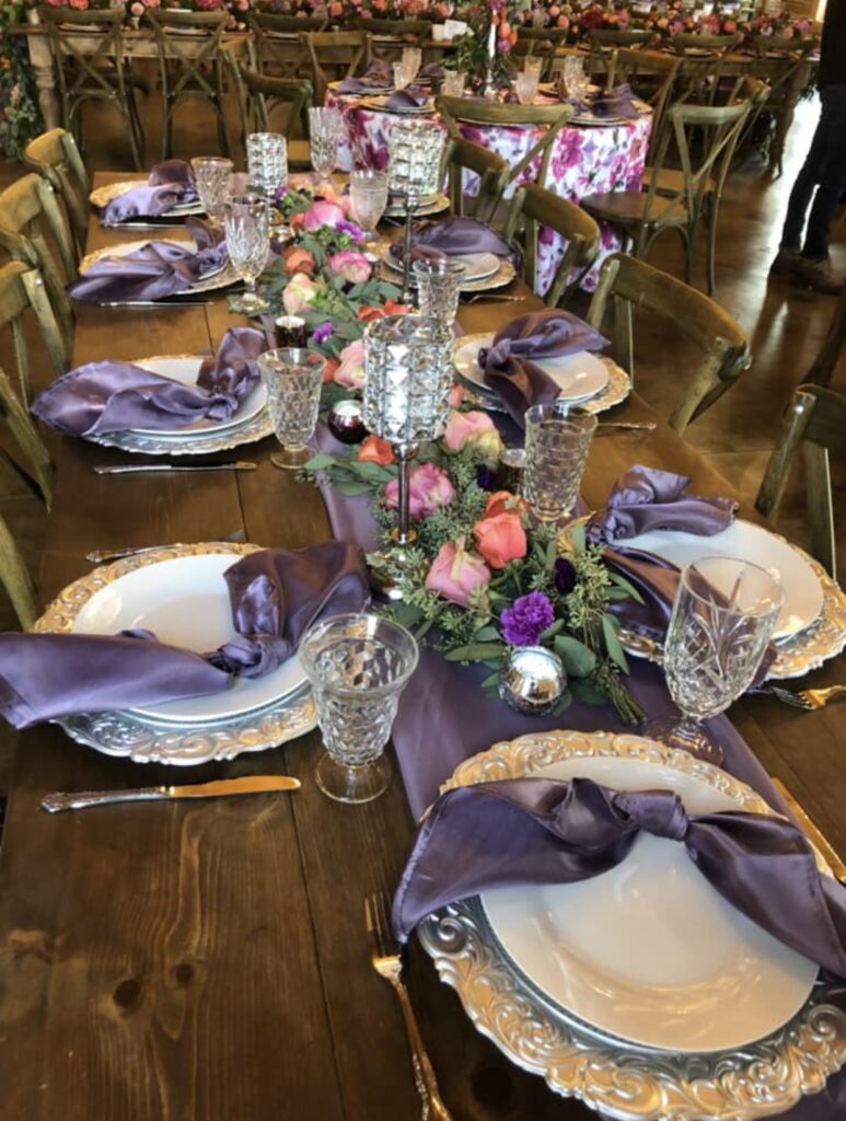
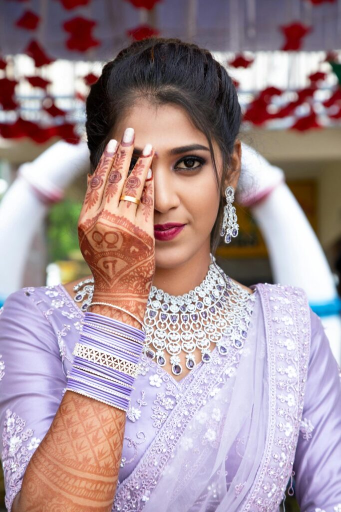
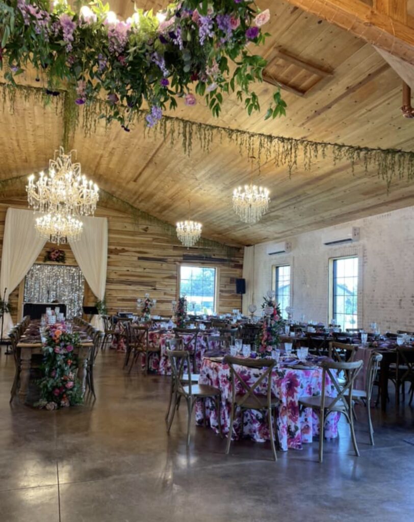
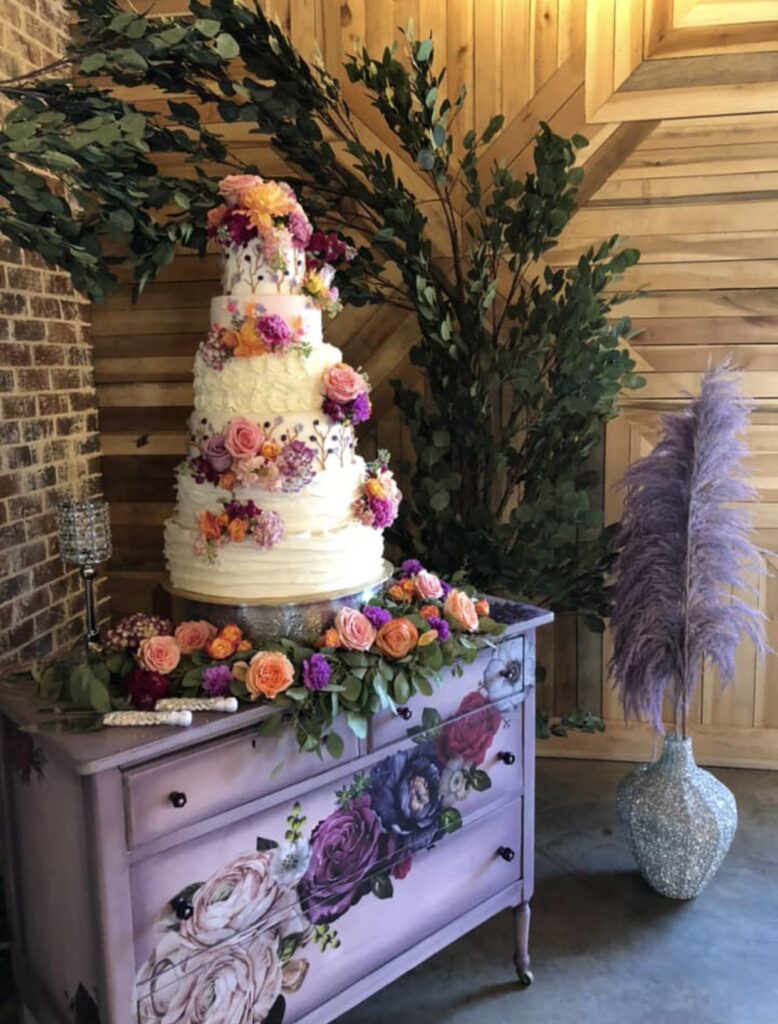
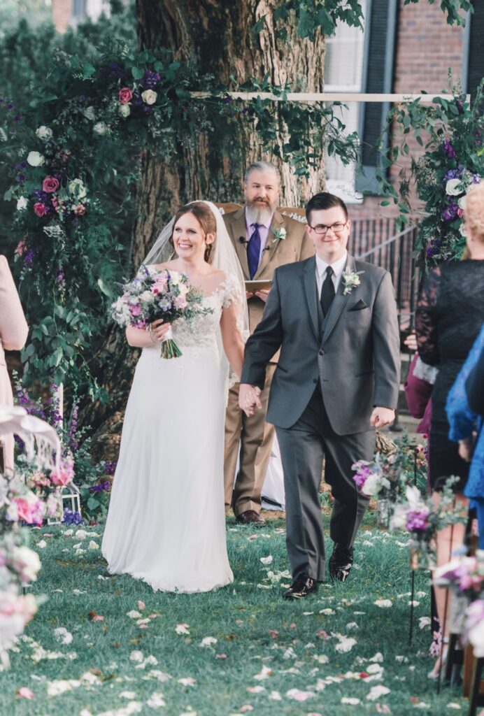
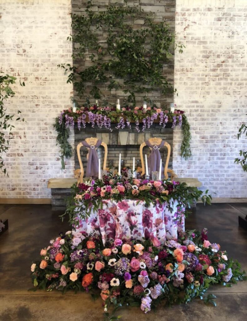
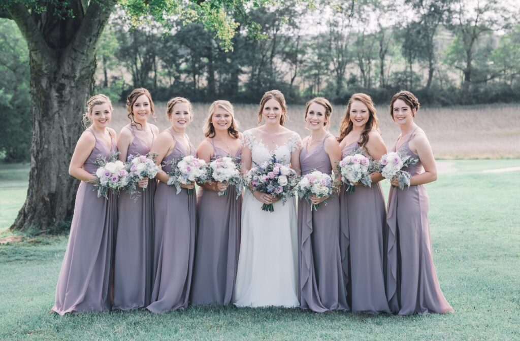
4. Lavender
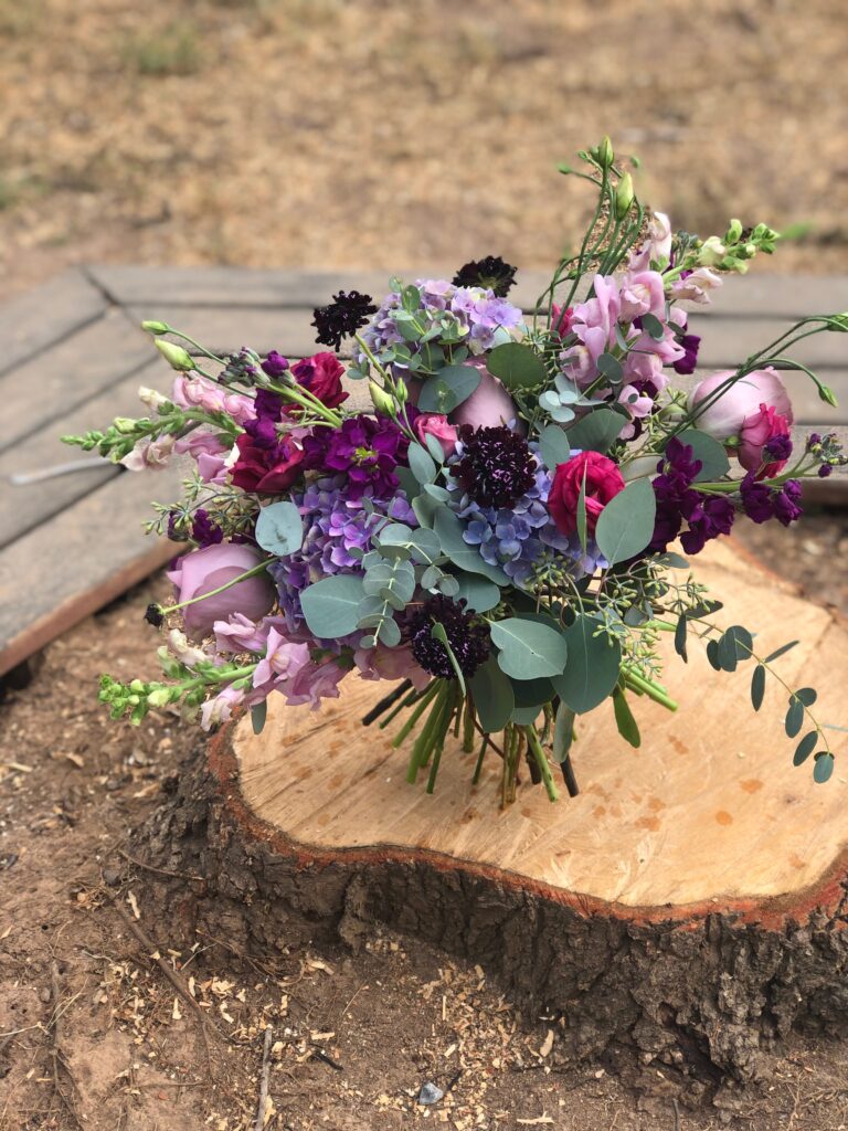
Lavender’s soft pastel shade is gentle yet speaks volumes when paired with greens, whites, or even metallics like gold.
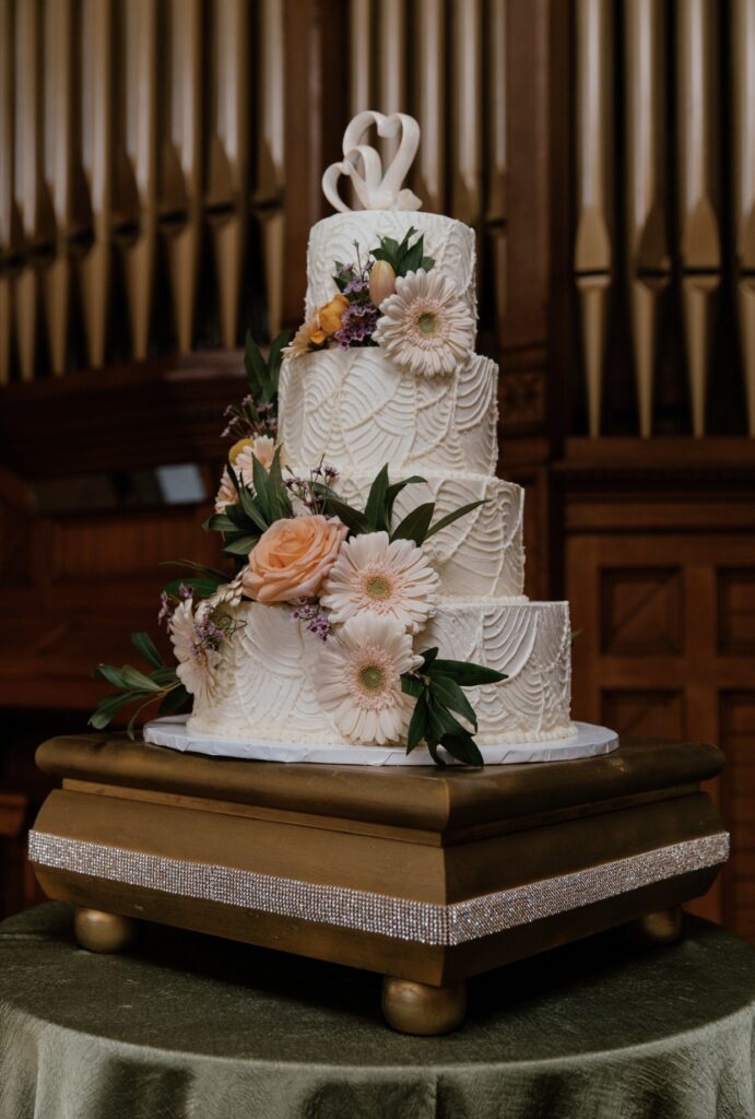
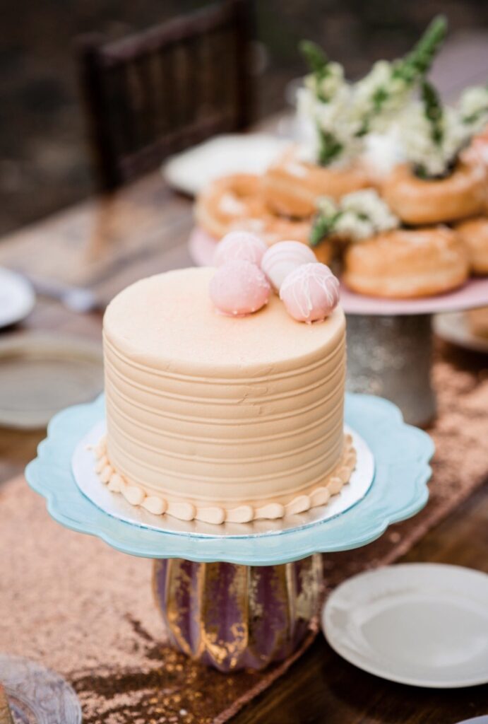
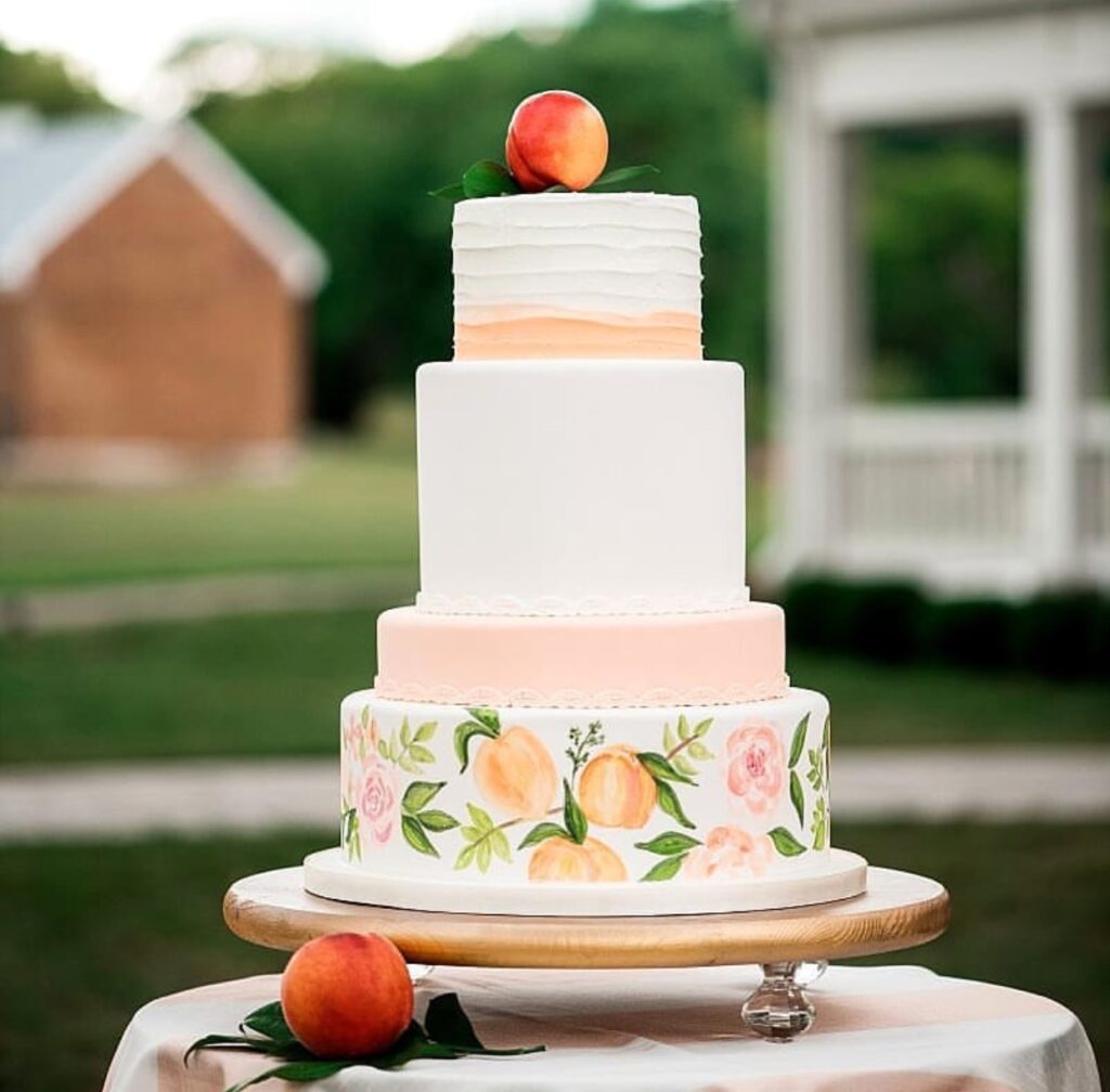
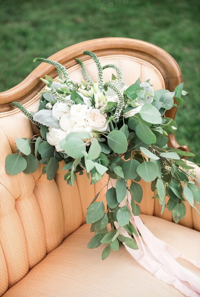
5. Peach Fuzz
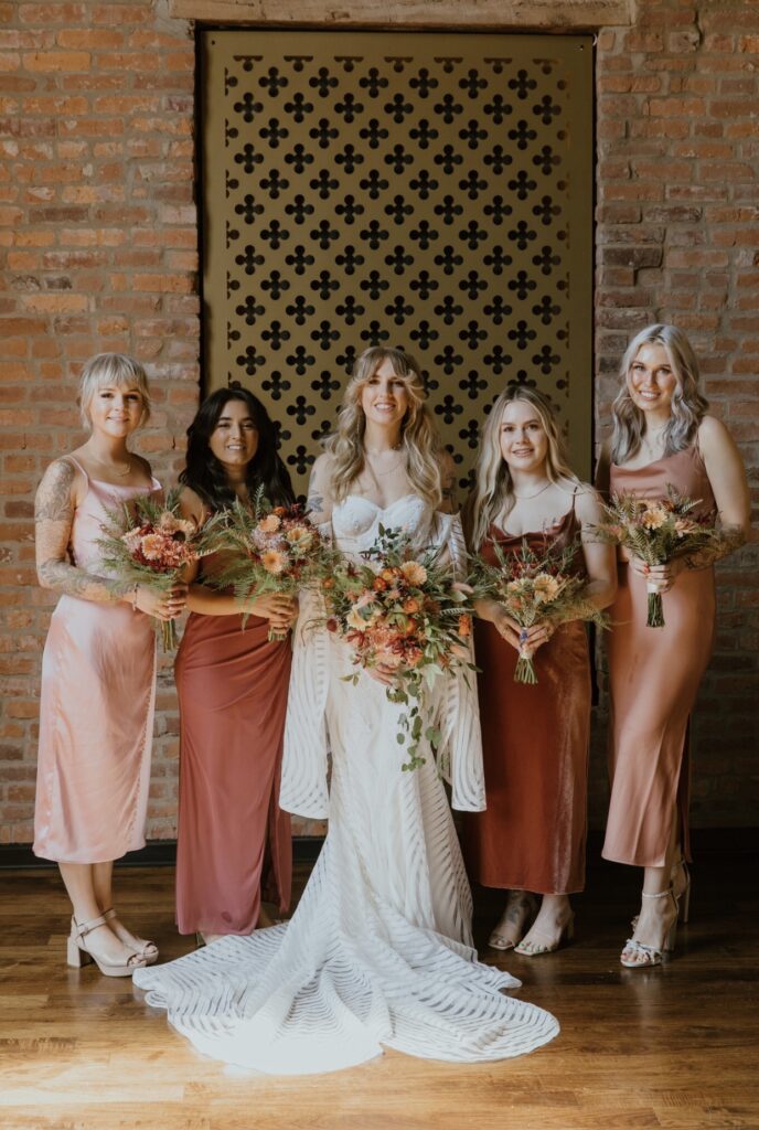
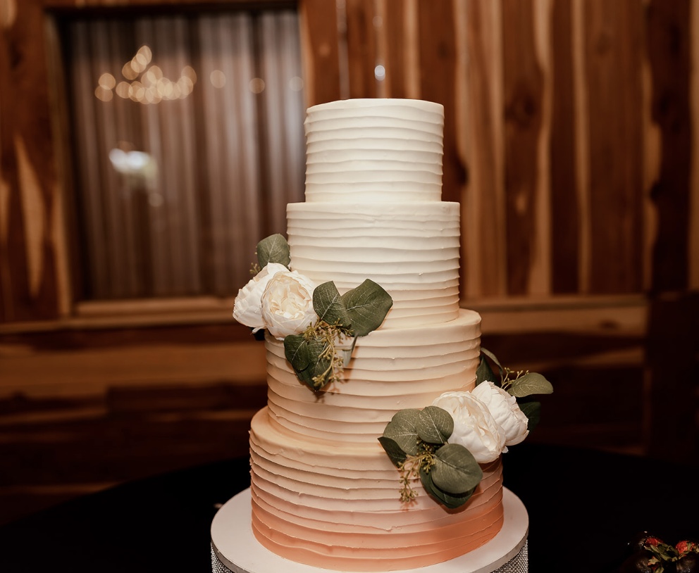
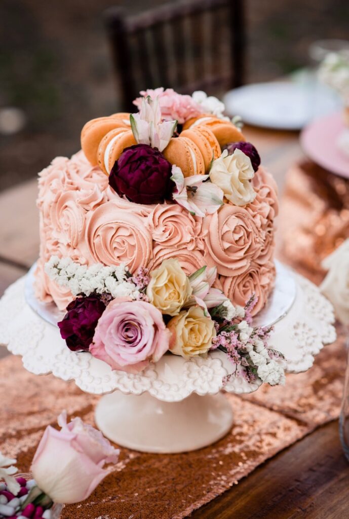
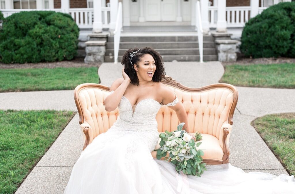
Why settle for brown when Pantone’s Color of the Year 2024, Peach Fuzz can bring warmth without the dreary undertone? This lively shade shines in summer weddings or tropical floral arrangements. It’s sophisticated and sweet, peach is the unsung hero of pastel palettes. It pairs beautifully with gold or darker shades like navy blue for a modern twist.
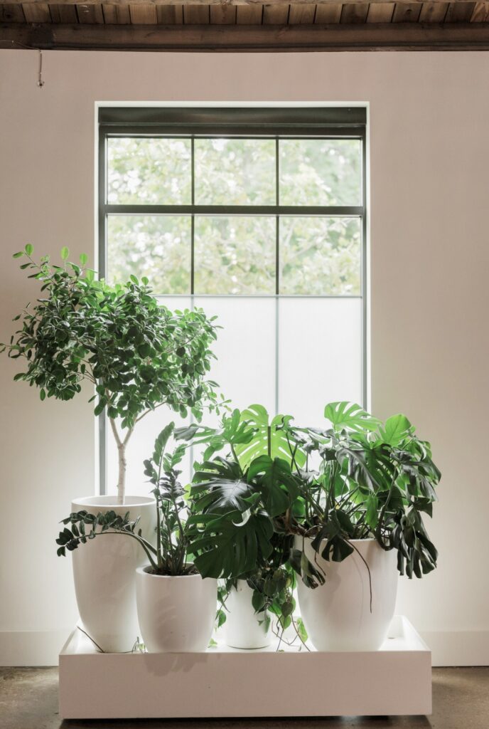
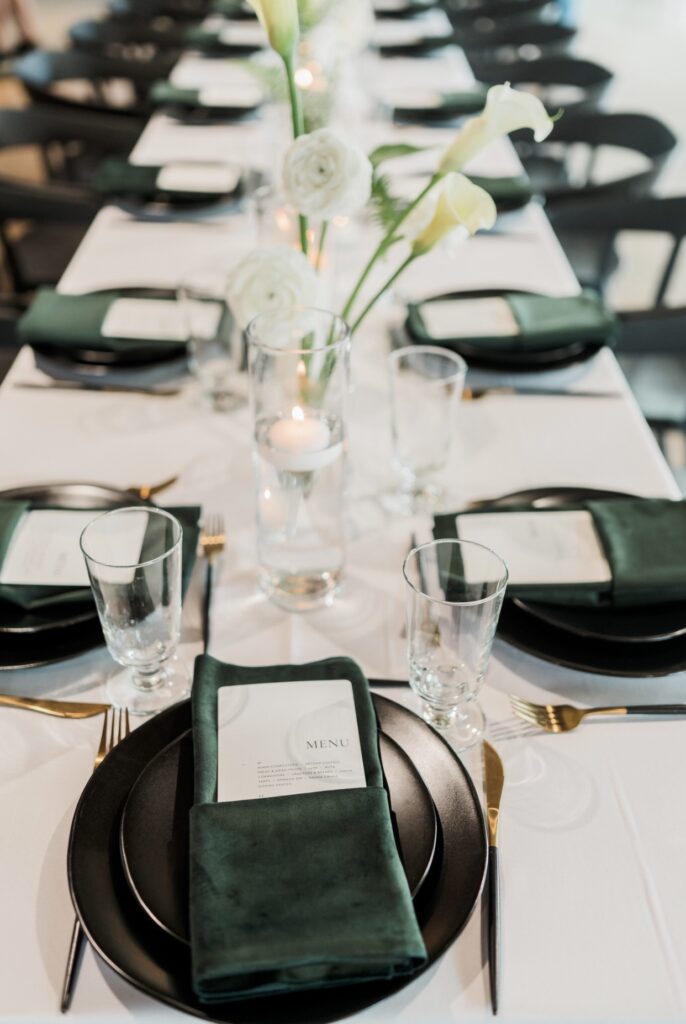

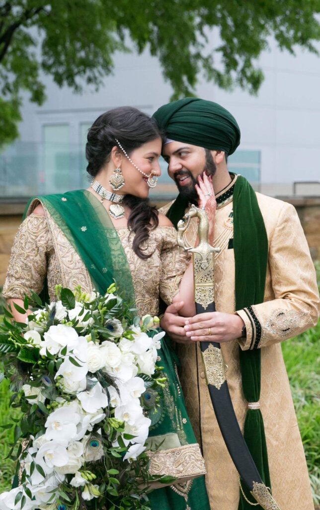
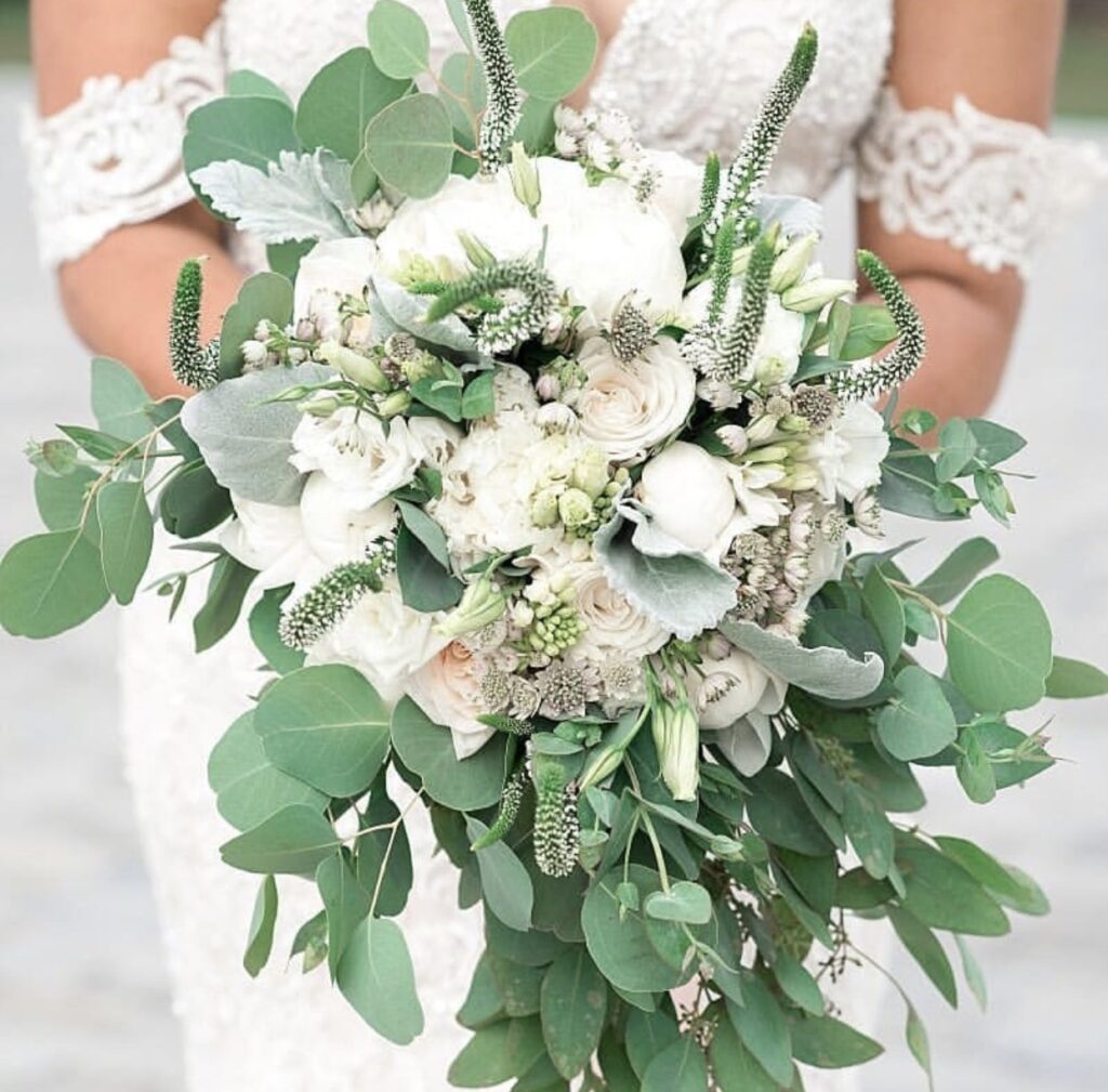
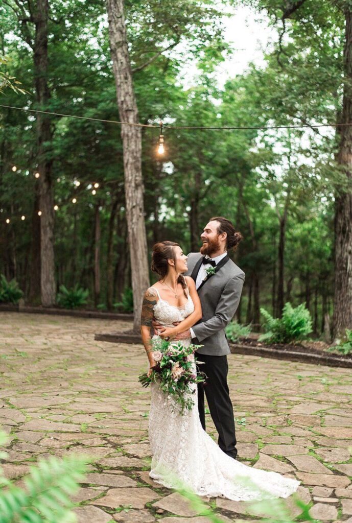
6. Emerald
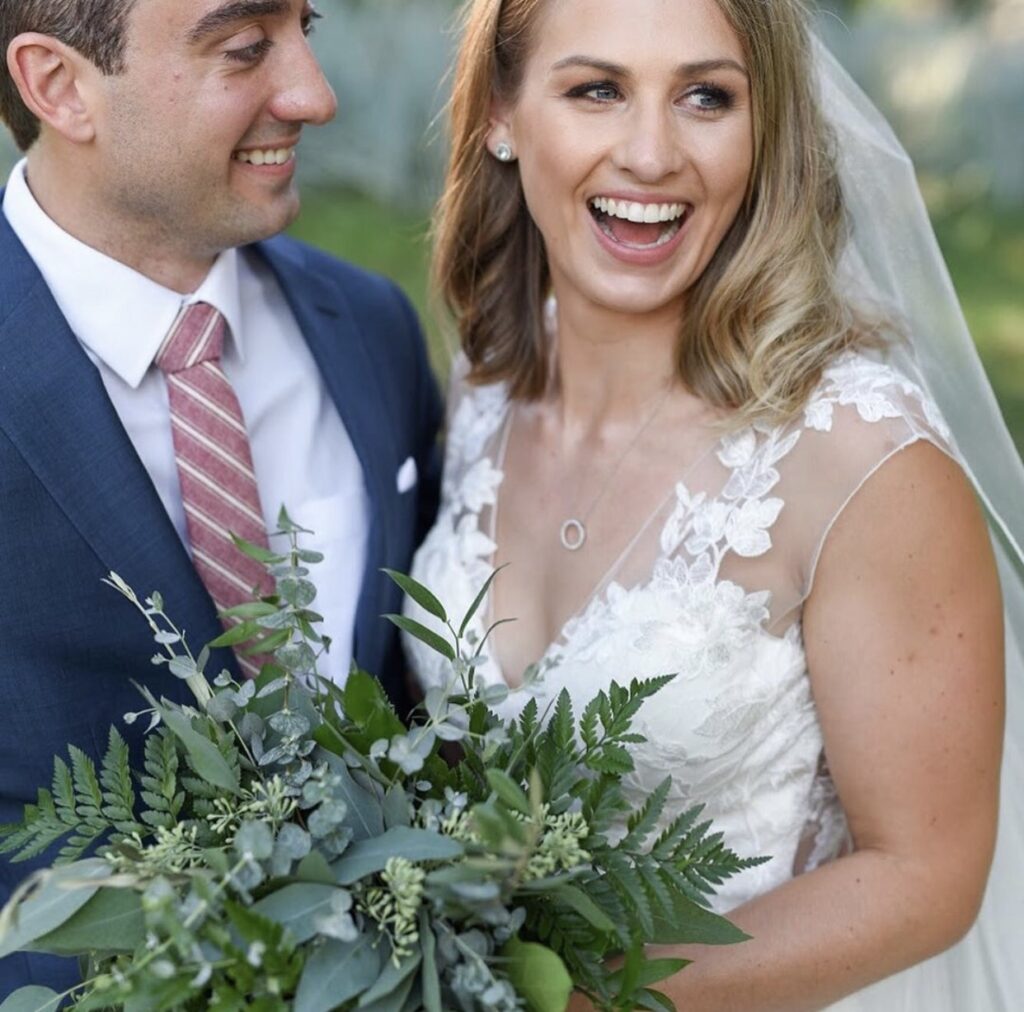
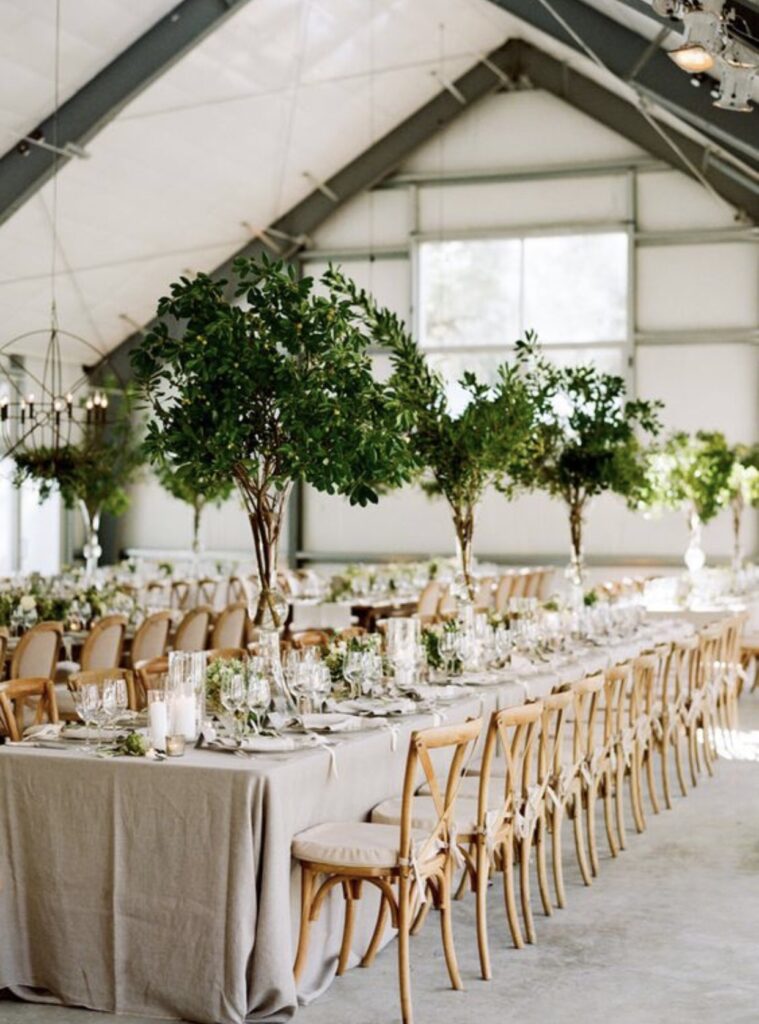
Emerald is refreshing, light, and cheerful—a delightful alternative to neutral tones. Use it for bridesmaid dresses or subtle table accents or go green and really let this gem shimmer!
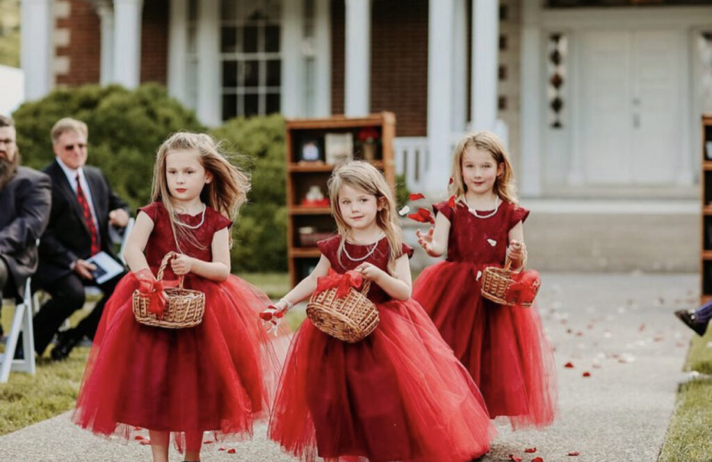
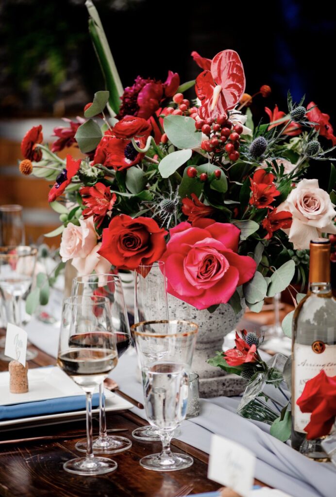
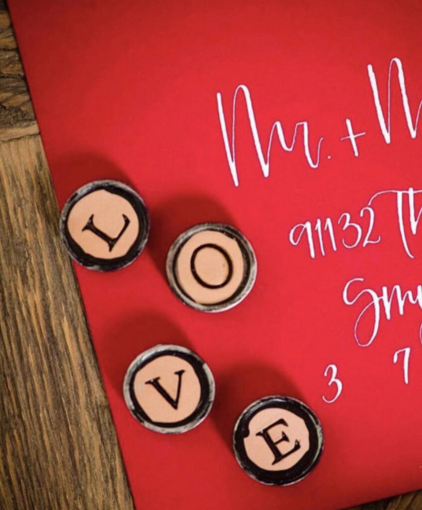
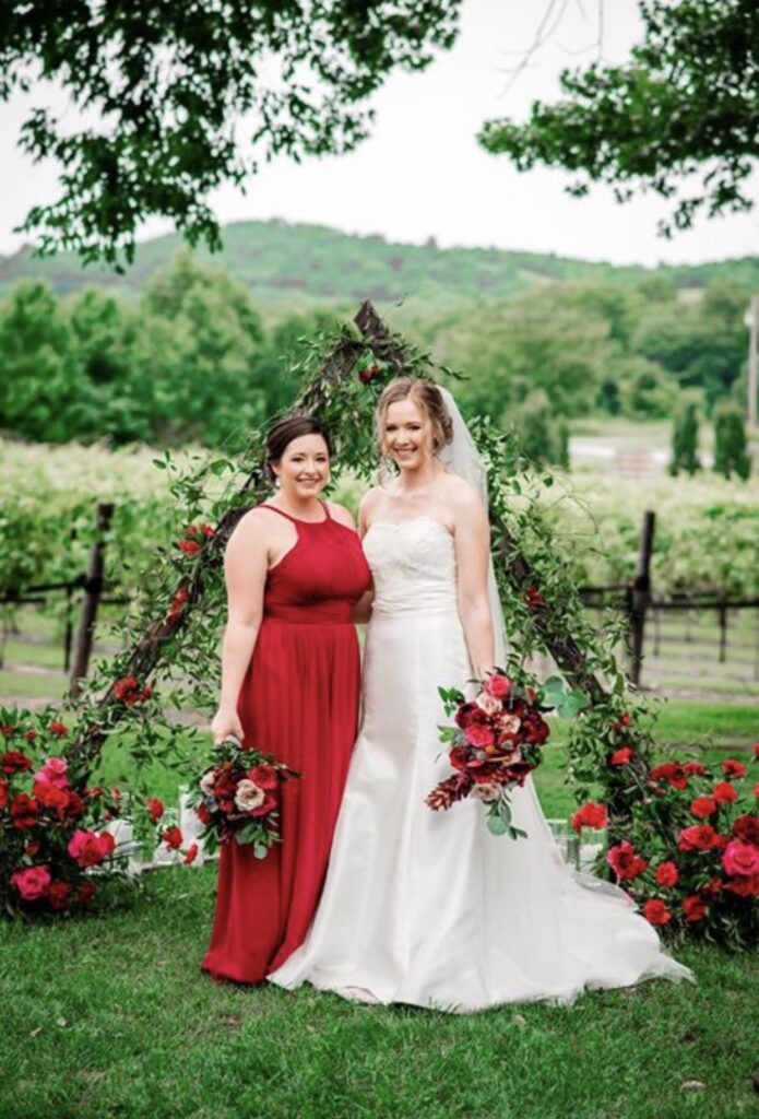
7. Ruby Red
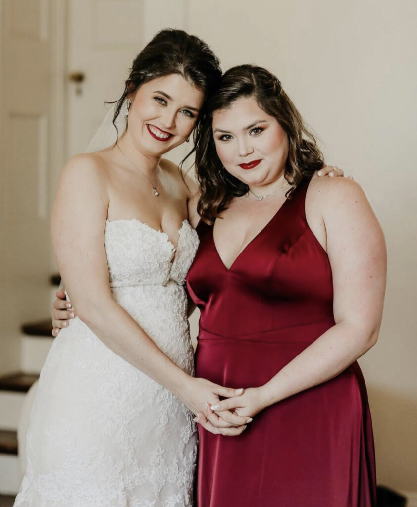
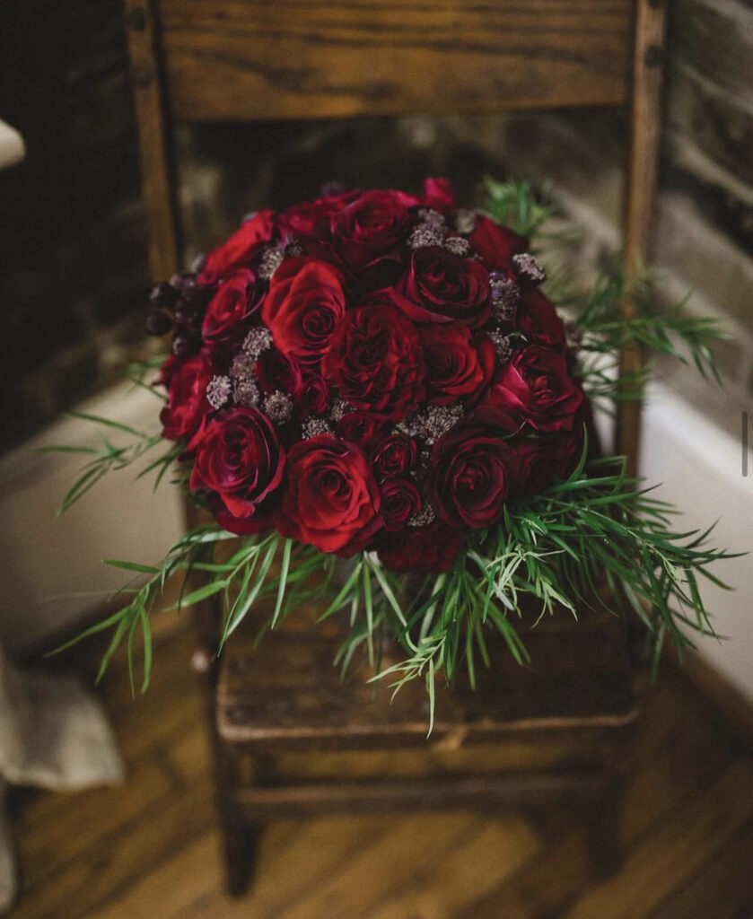
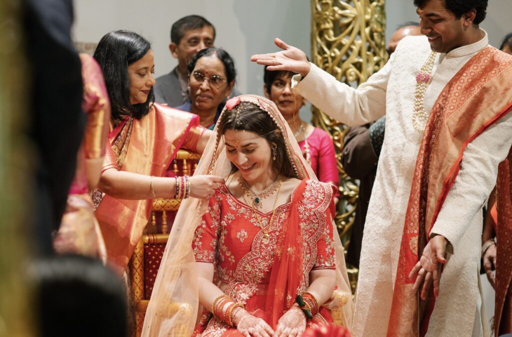
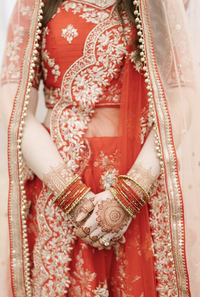
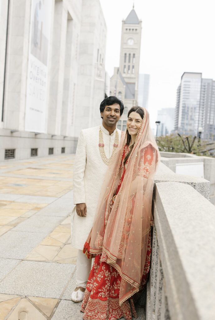
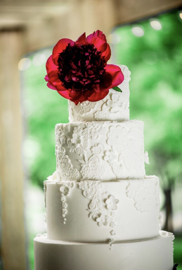
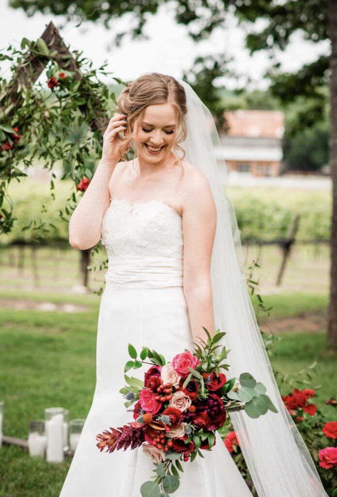
Red is a bold and timeless choice symbolizing love and passion. It creates a warm, romantic atmosphere. Perfect for everything from vibrant bouquets to luxurious table settings, red adds a dramatic flair that leaves a lasting impression.
8. Terracotta
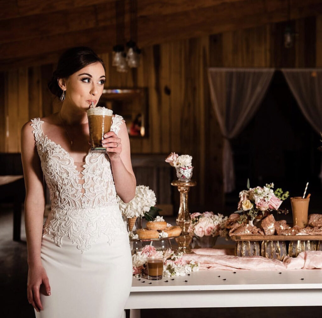
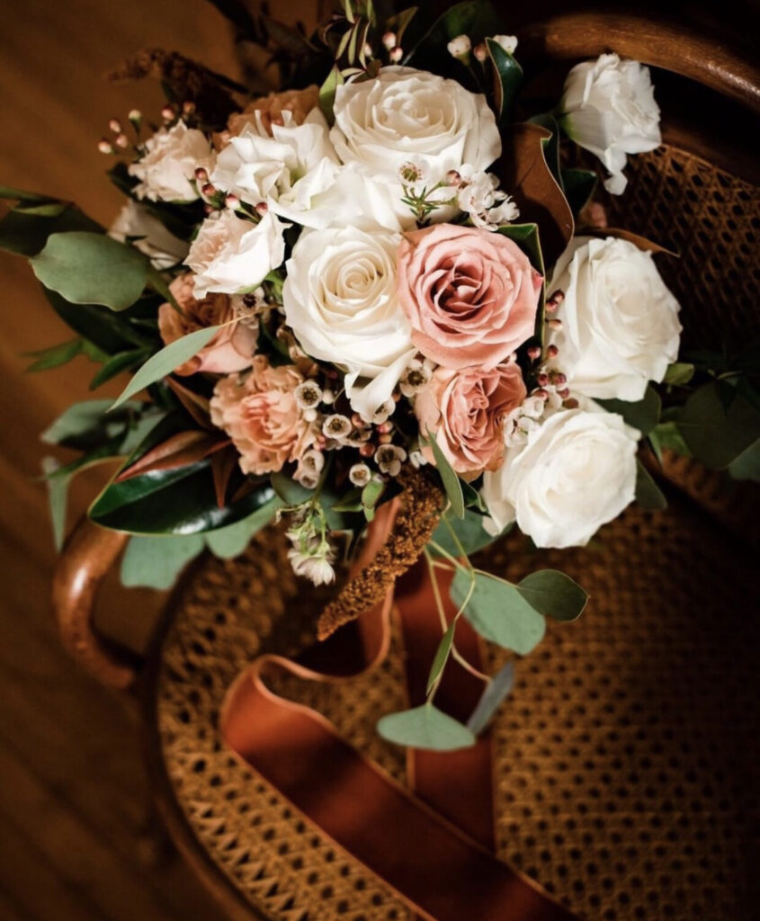
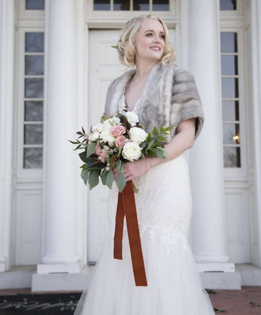
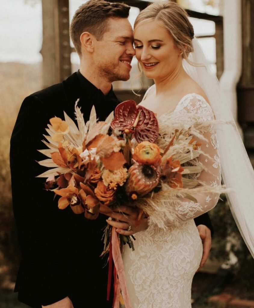
While some may lump terracotta into the “brownish tones,” it’s fuller of life. Its warm orange undertones make it perfect for autumn weddings. So much more vibrant and dynamic than Mocha Mousse.
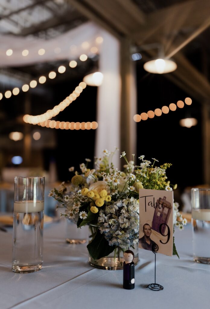
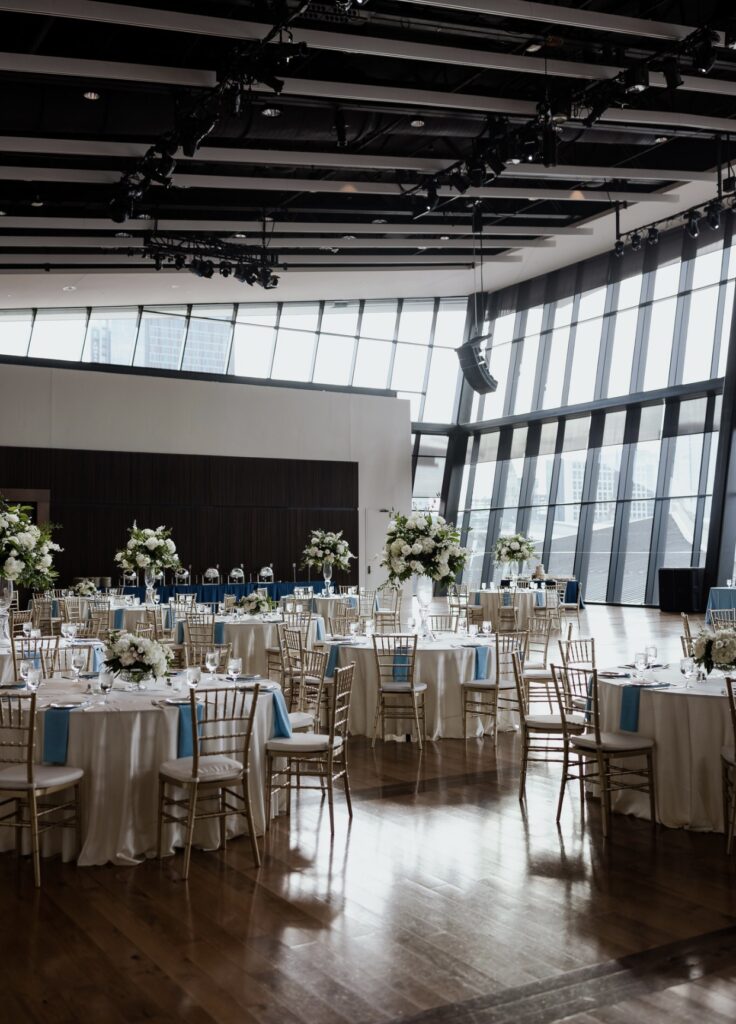
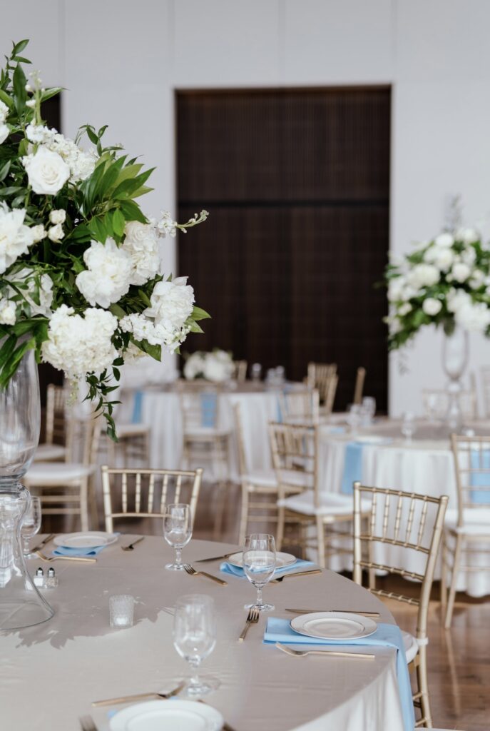
9. Sky Blue
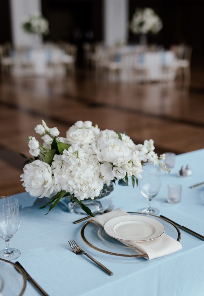
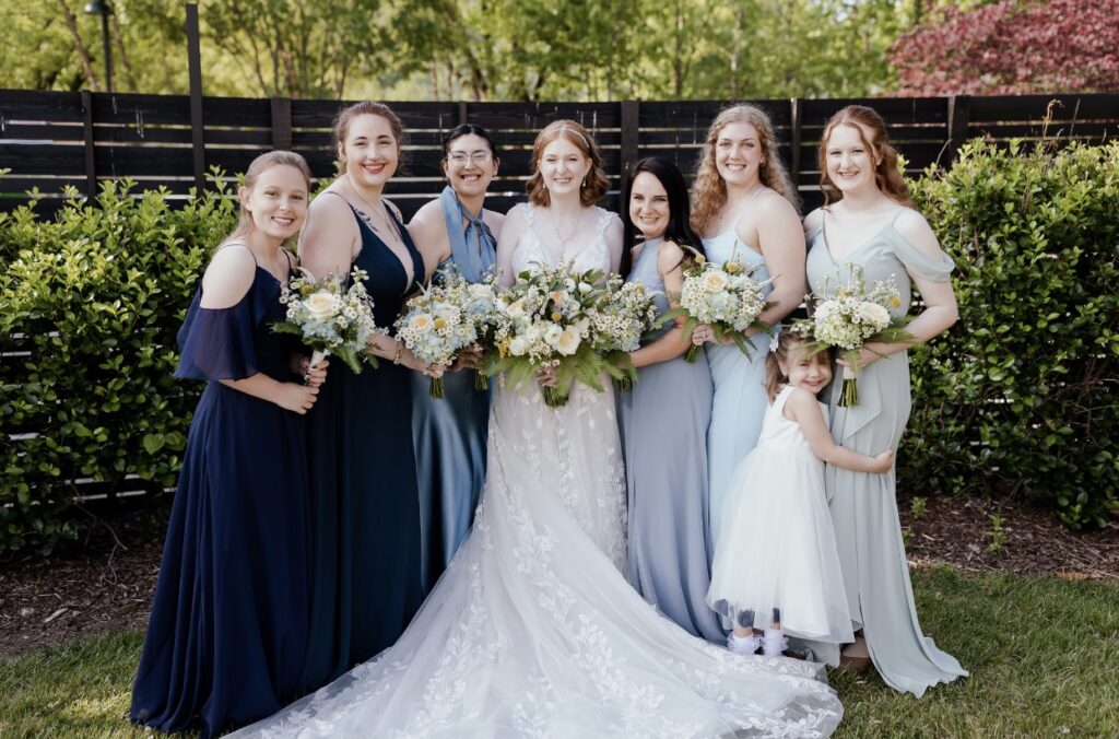
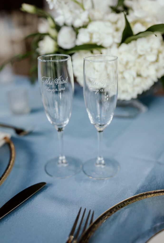
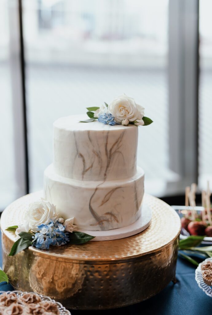
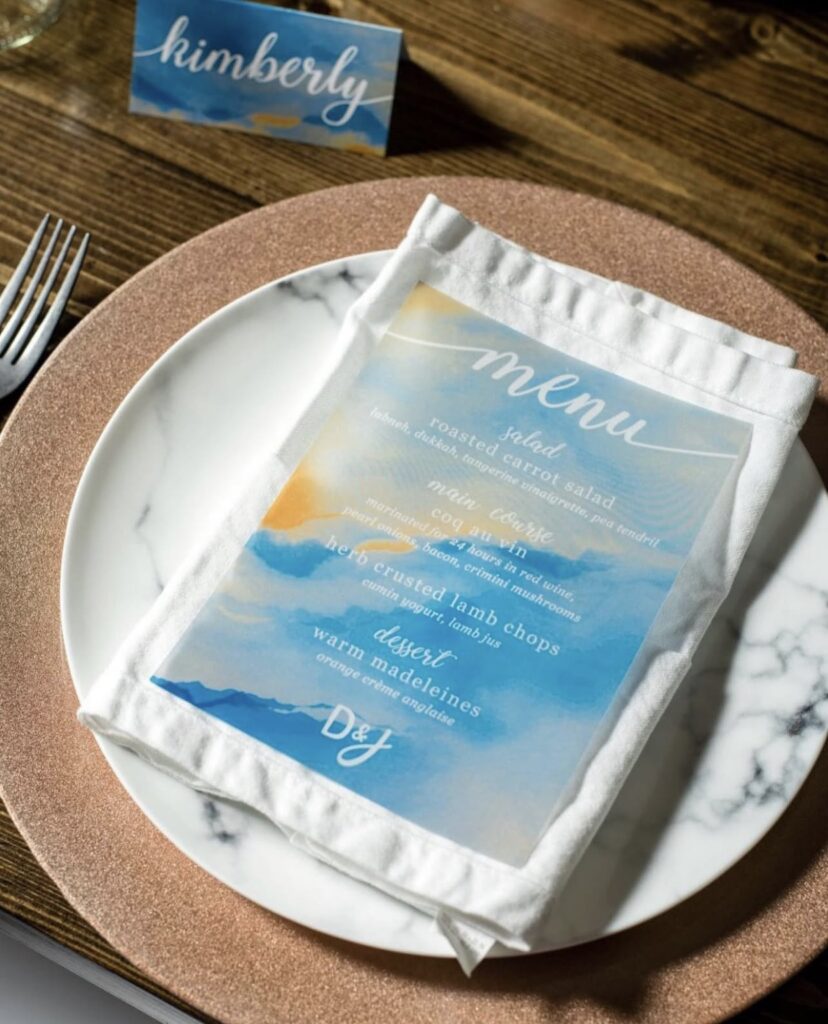
Soft but cheerful, sky blue is the ideal choice for creating a tranquil and uplifting ambiance. Its calming tones evoke feelings of serenity and optimism, making it perfect for everything from decor accents to attire. This versatile shade brings a sense of elegance to any celebration.
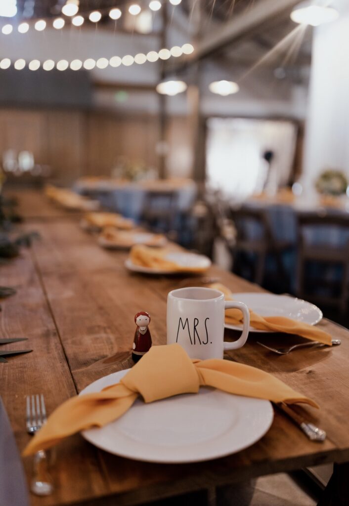
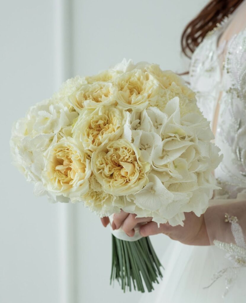
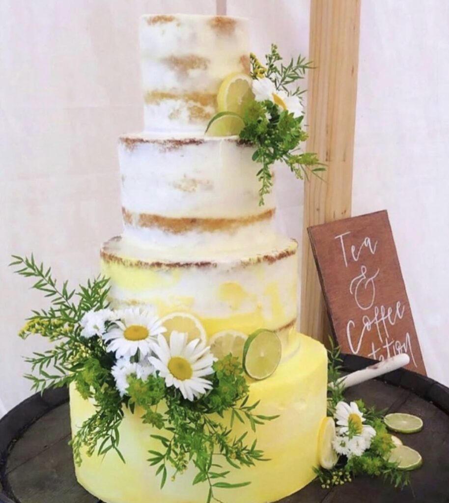
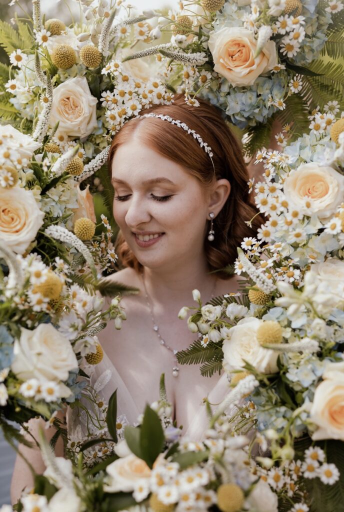
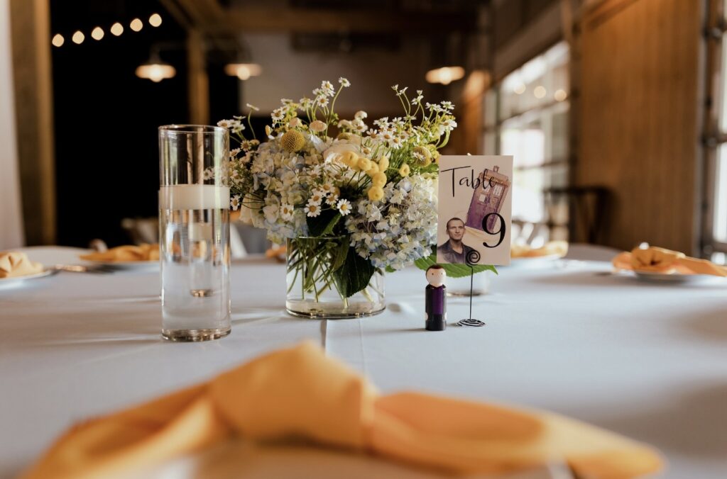
10. Canary Yellow
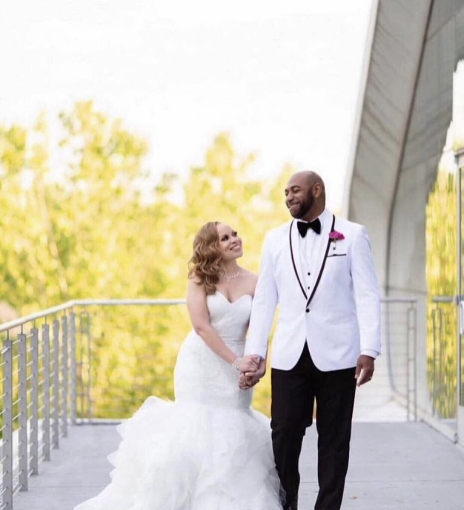
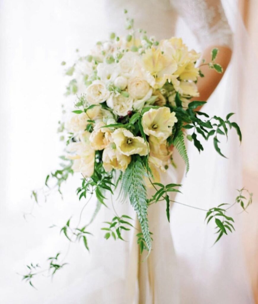
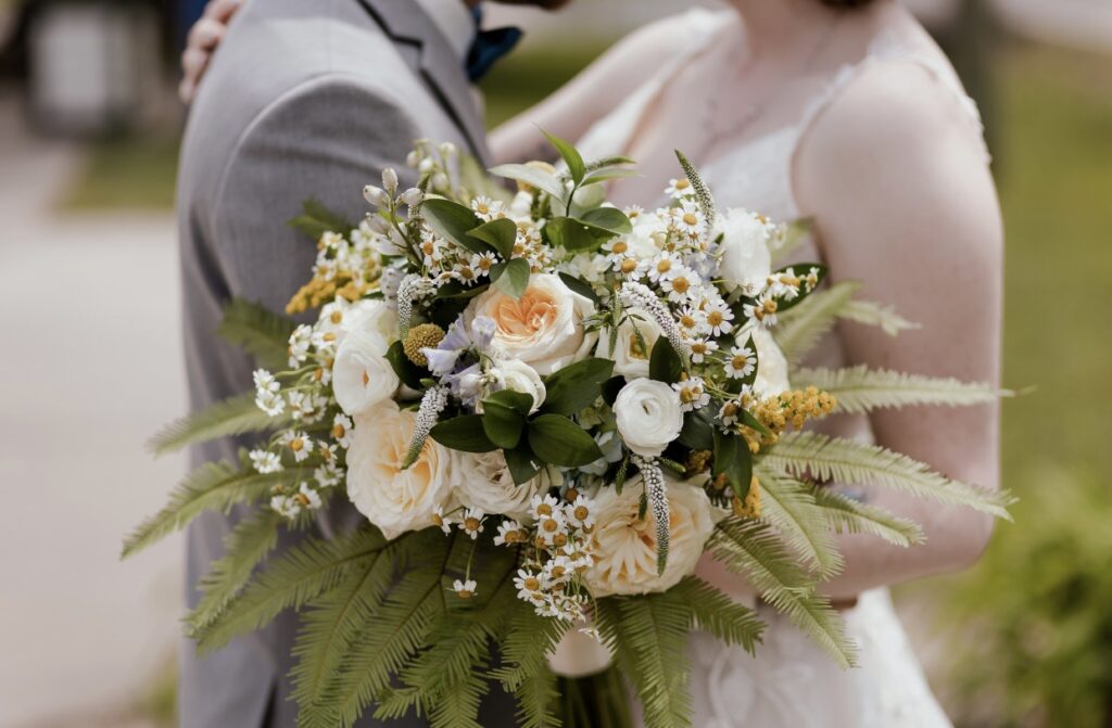
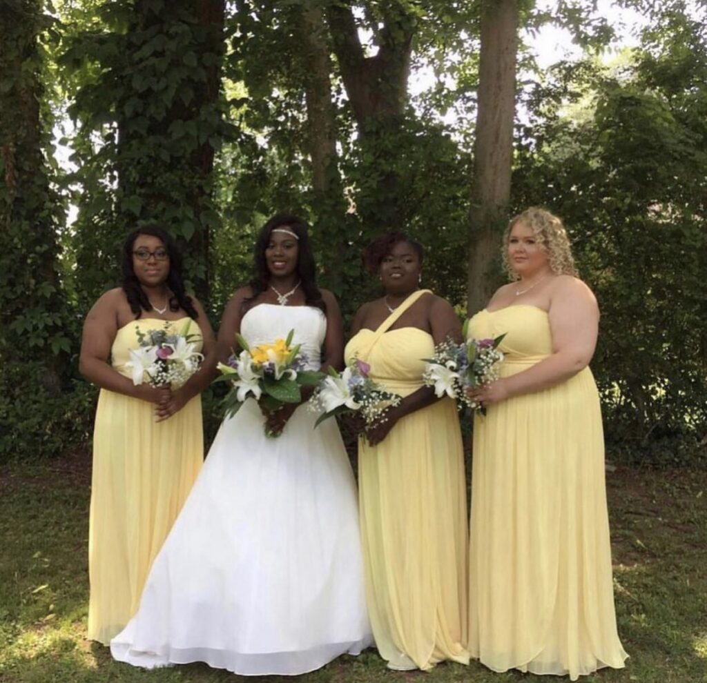
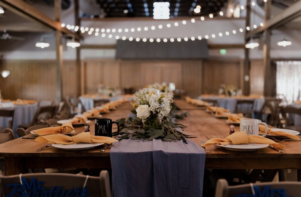
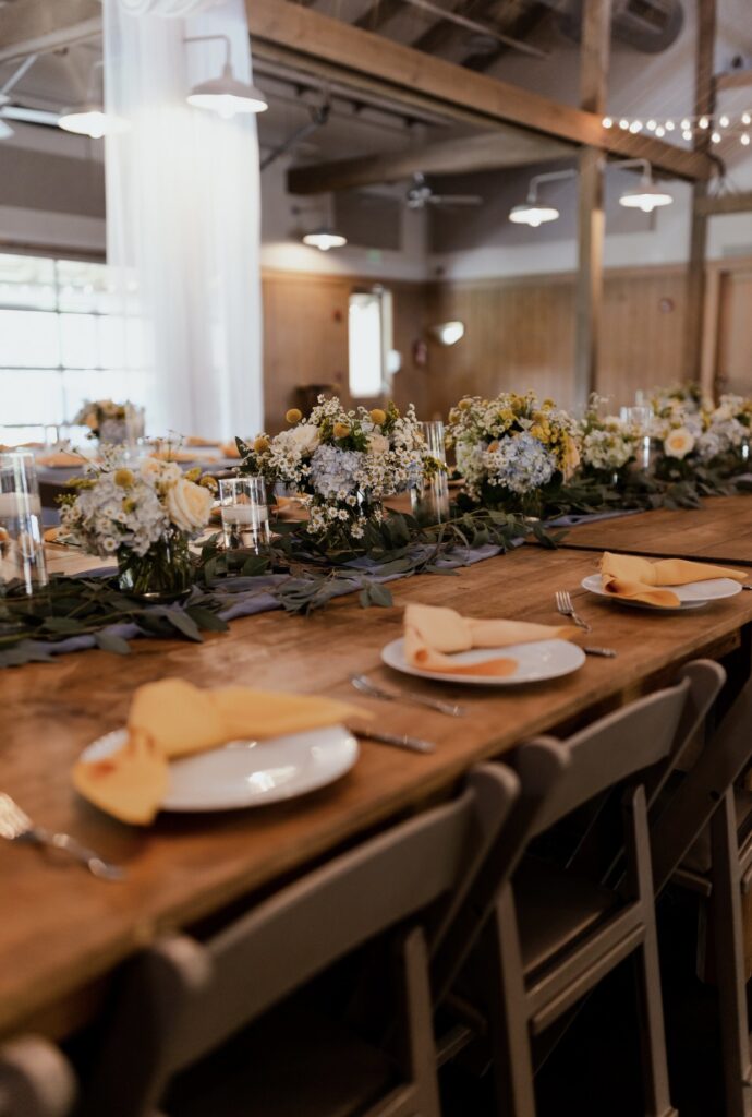
Bright and happy, yellow invokes feelings of joy, energy, and celebration. It is an excellent choice for creating uplifting designs. Its vibrant nature adds warmth and positivity, offering a stark contrast to the muted, subdued vibes of brown or beige. While it pairs beautifully with earthy brown tones for a grounded look, yellow also complements rich jewel tones like emerald or sapphire, creating bold and striking combinations.
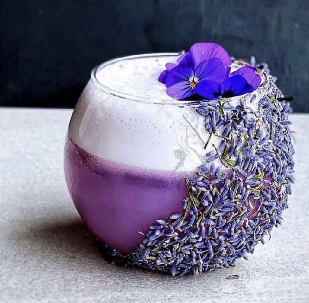
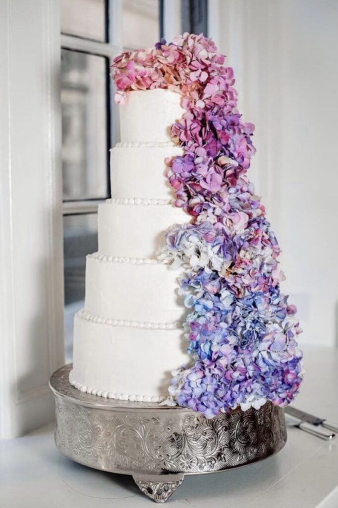
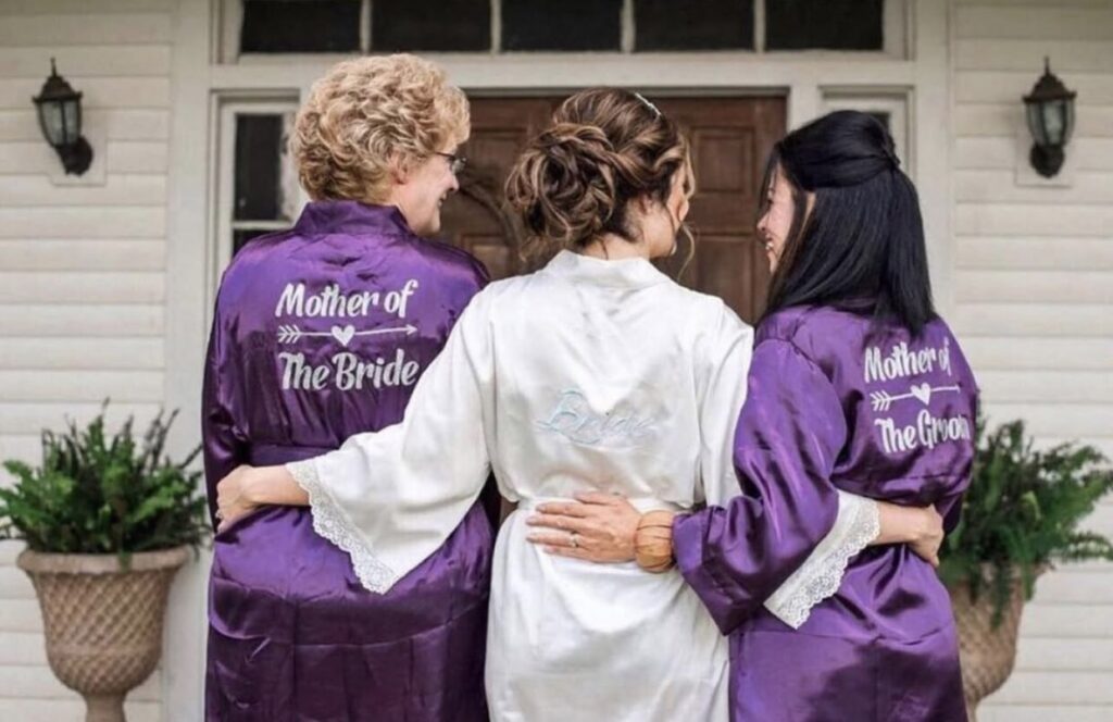
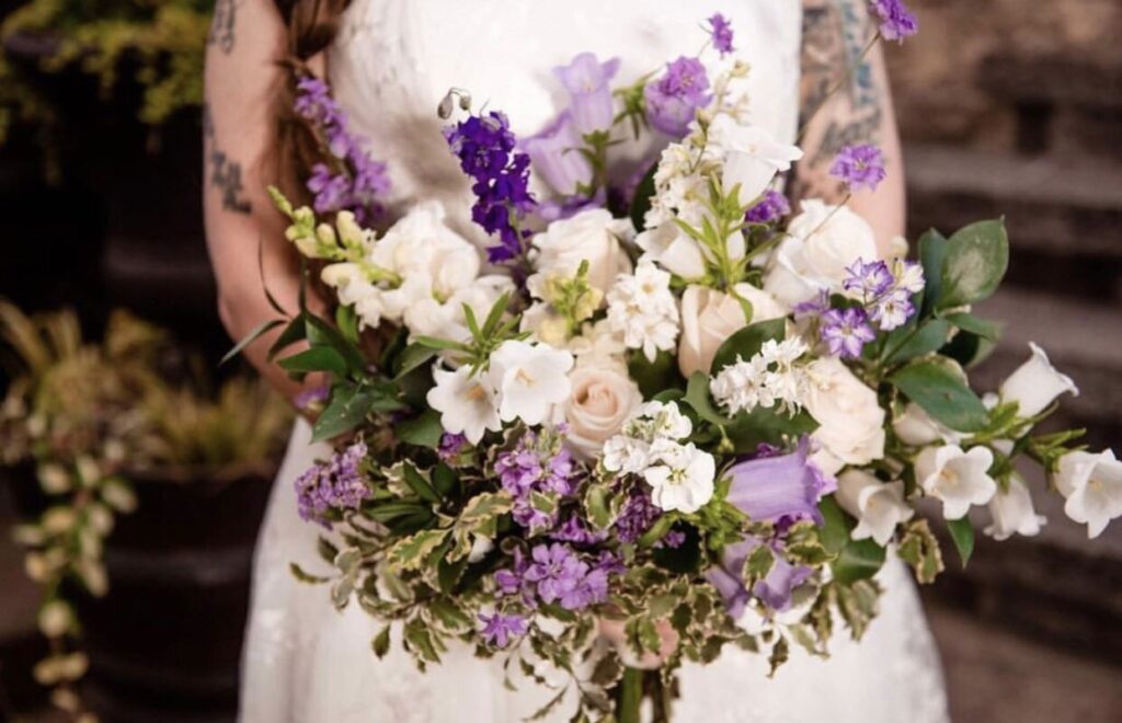
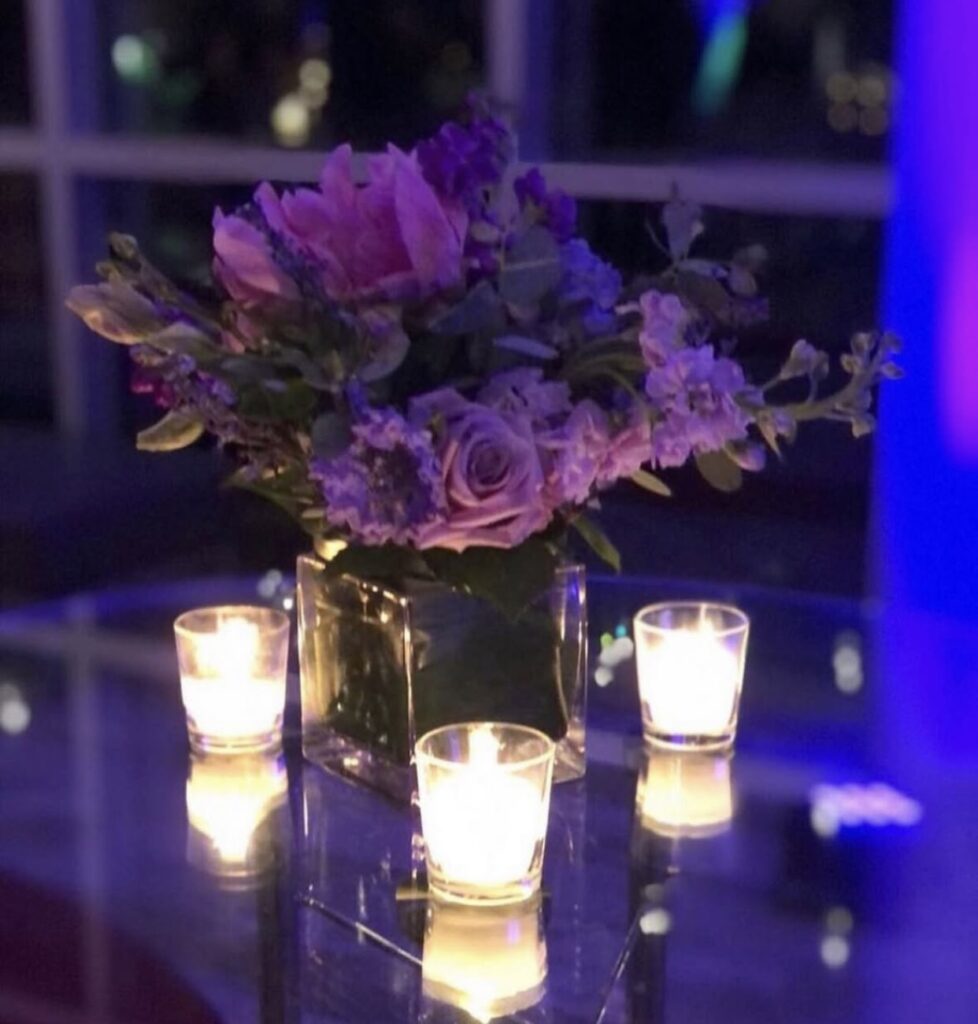
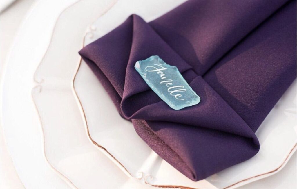
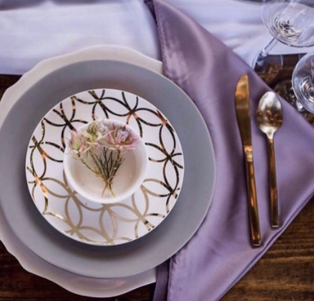
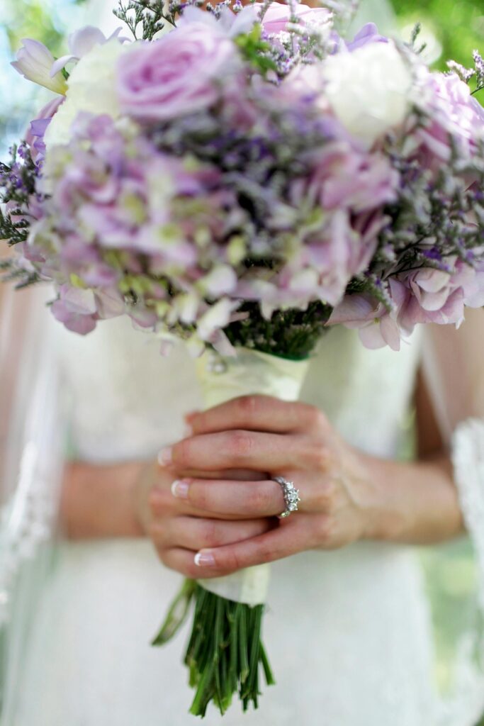
11. Ultra Violet
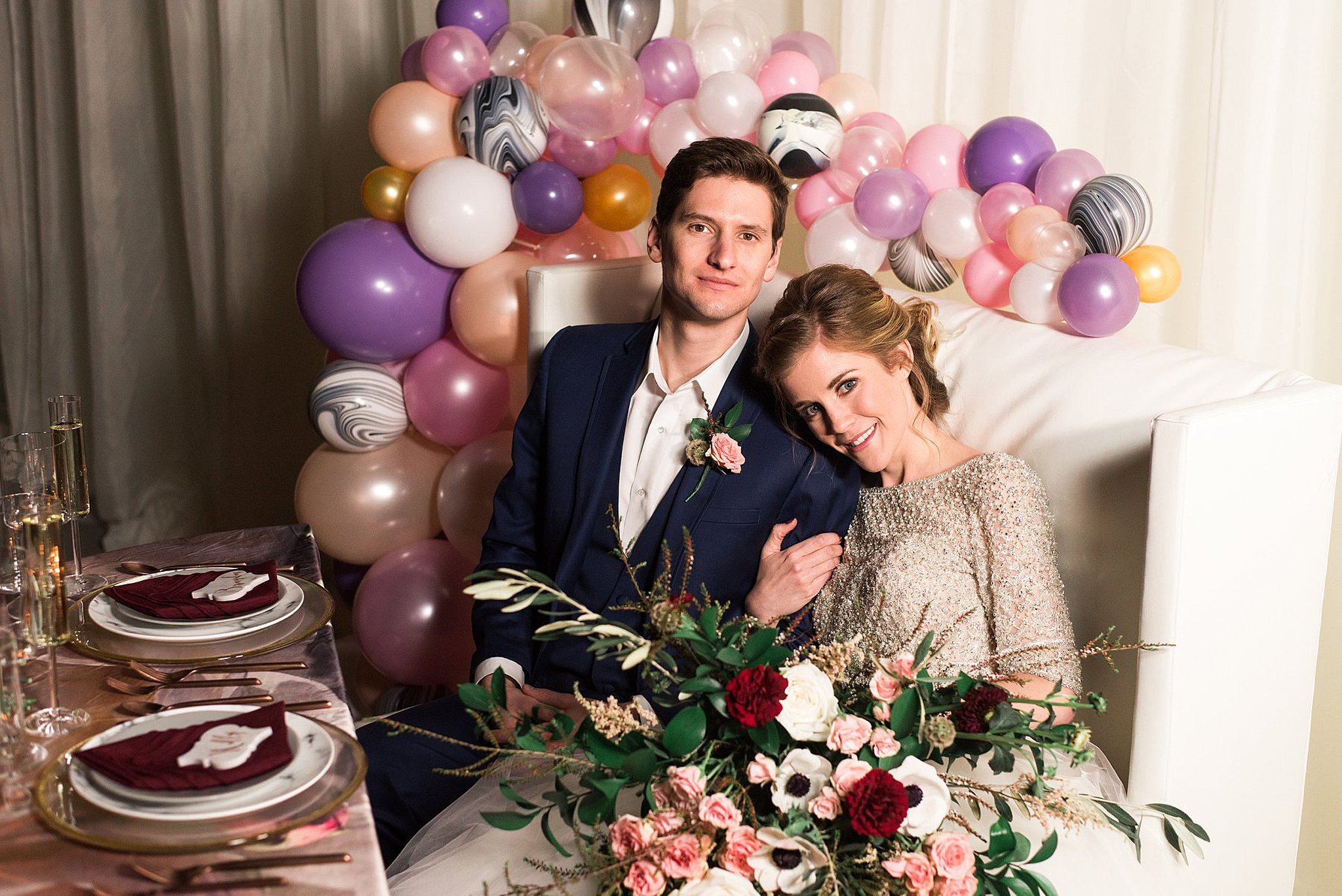
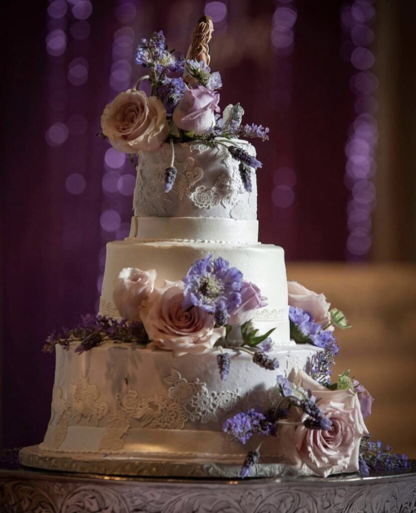
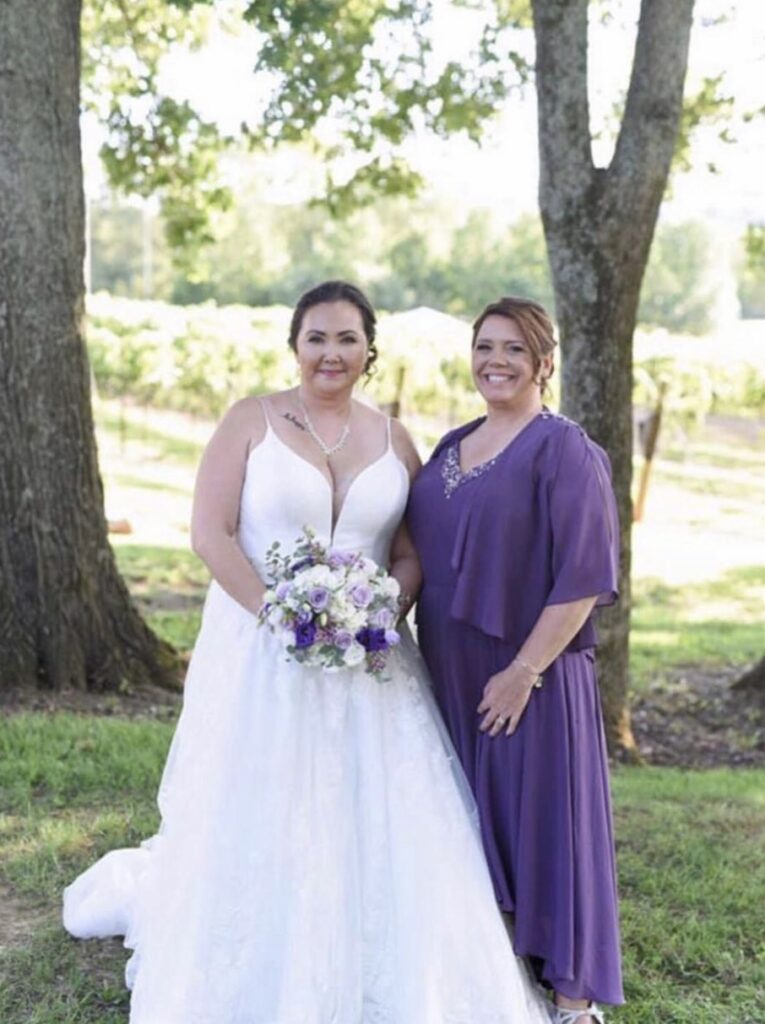
This blue-purple hybrid walked straight out of a fairy tale. Pantone’s Color of the Year 2018, Ultra Violet, is whimsical, fresh, and makes a dreamy addition to any wedding.

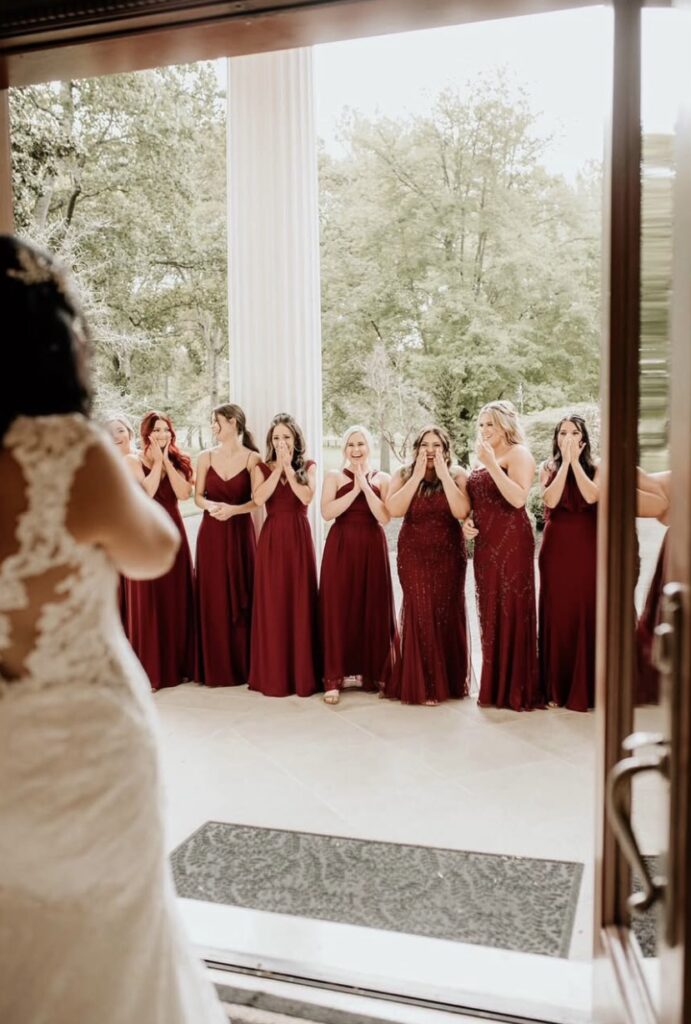
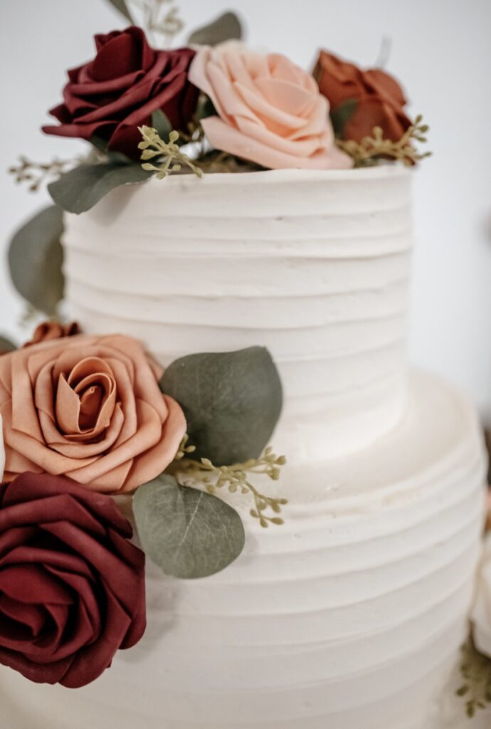
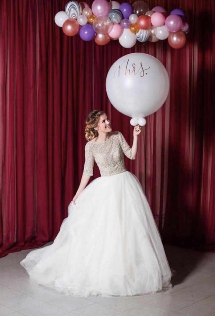
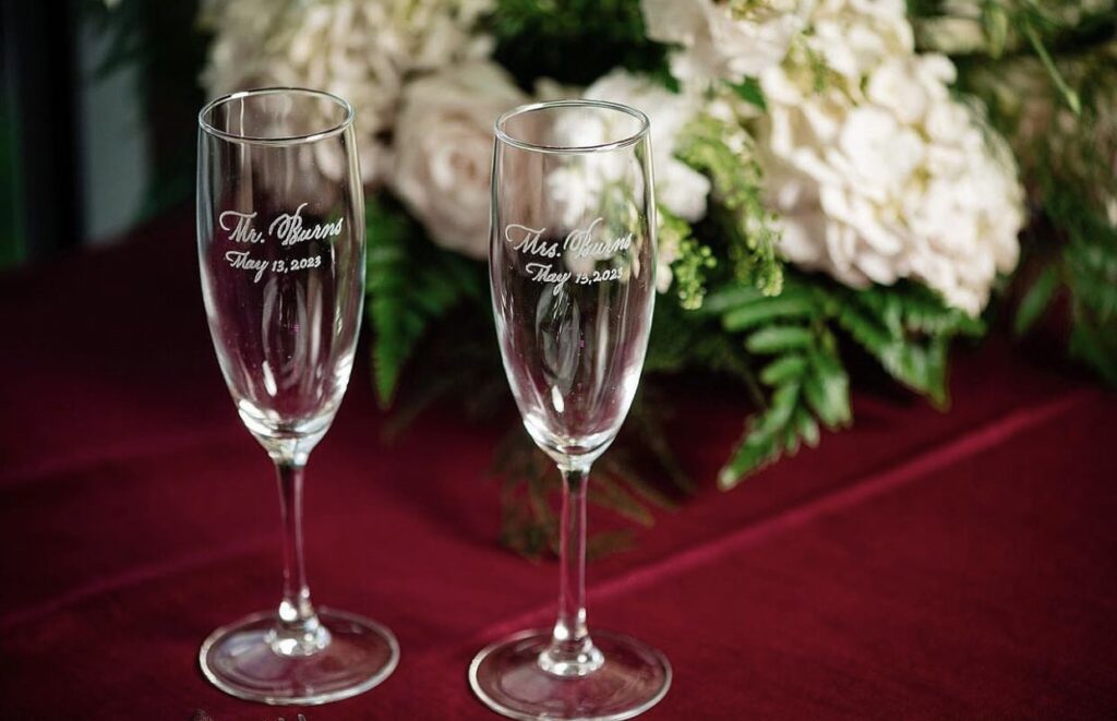
12. Burgundy
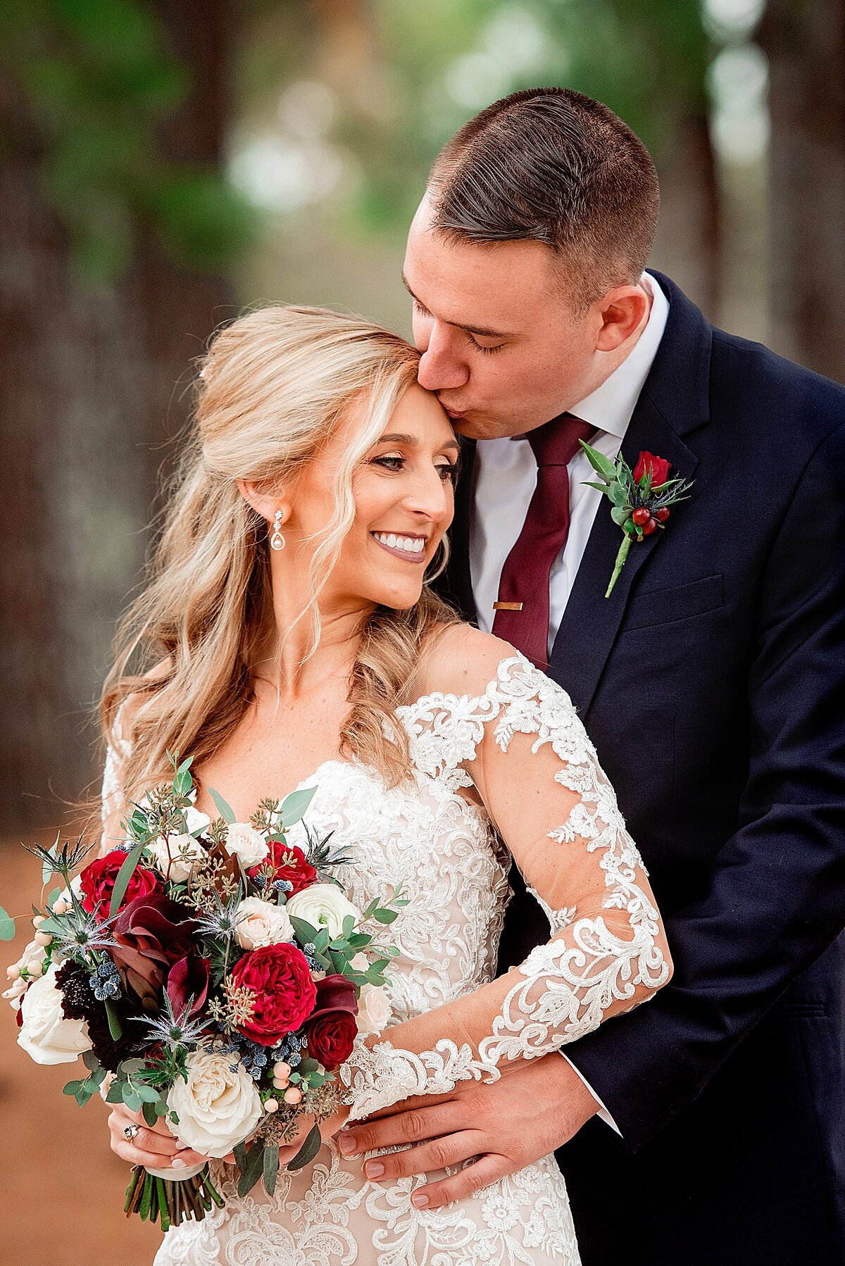
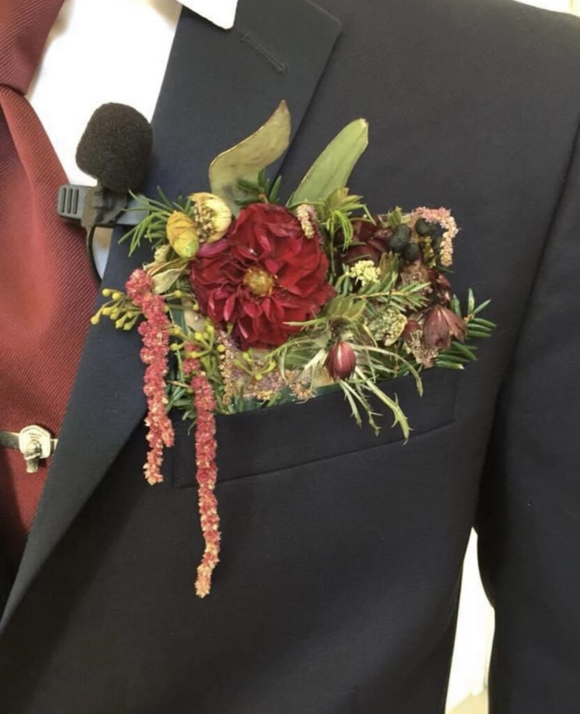
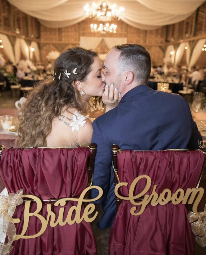
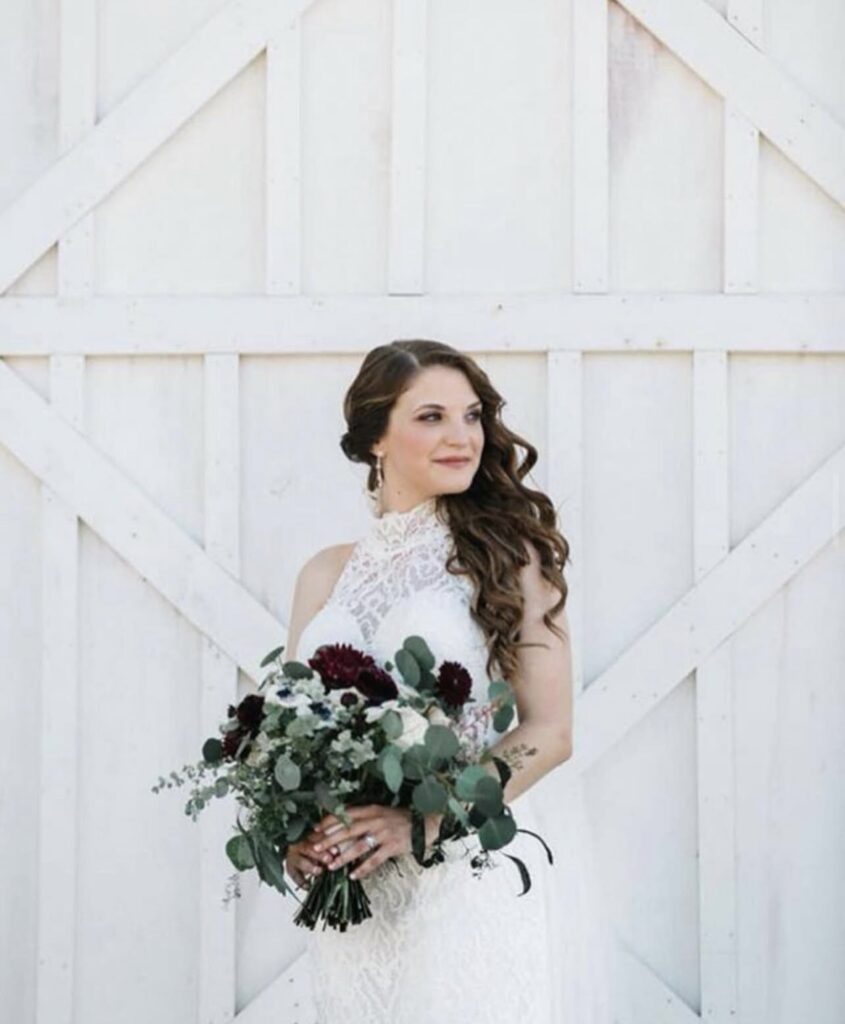
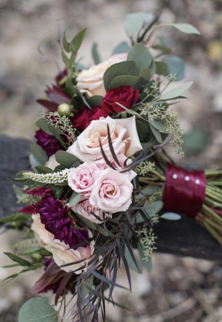
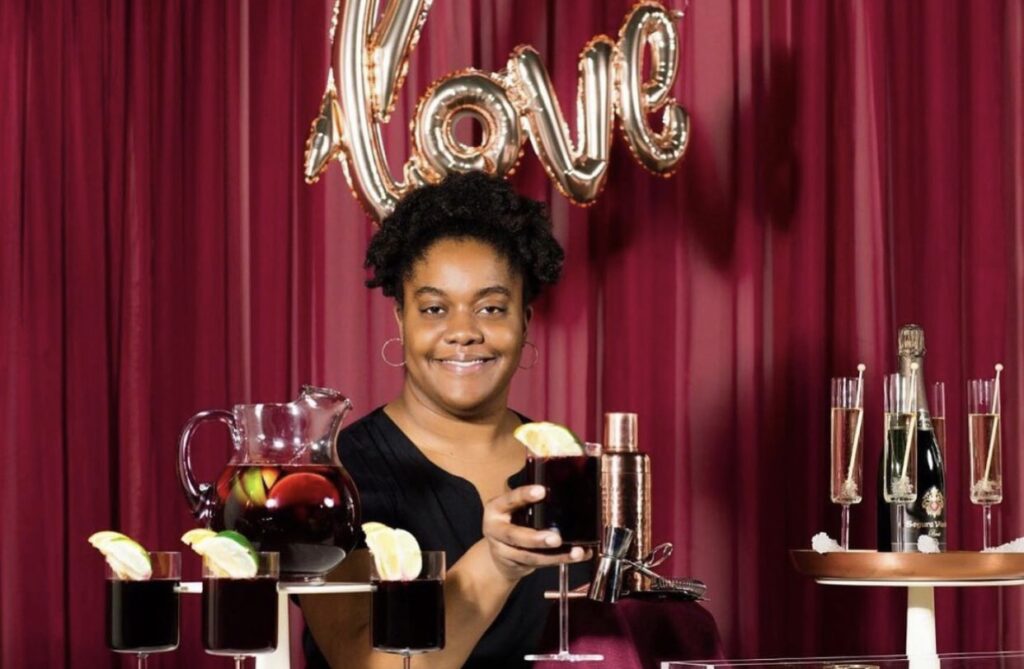
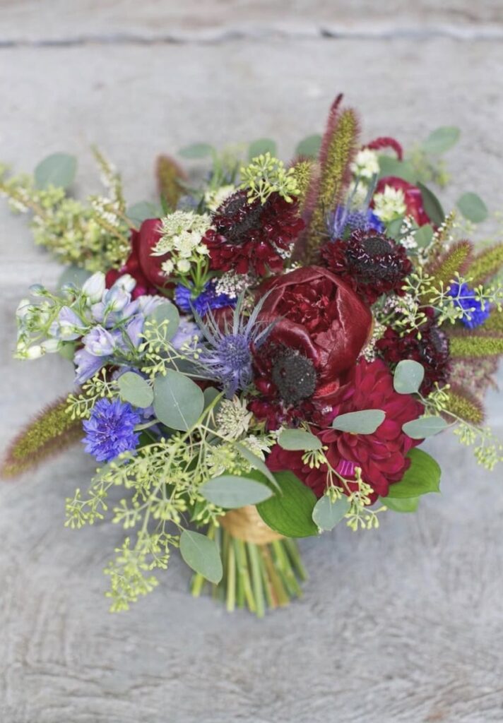
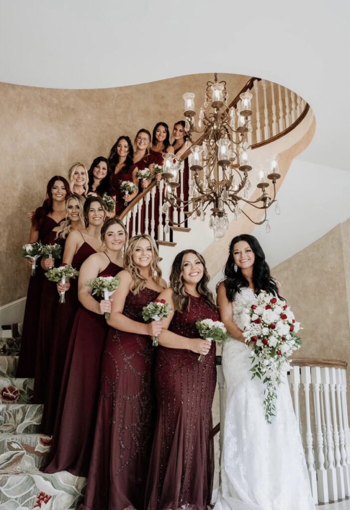
For a bold yet elegant alternative, burgundy challenges neutrals like brown to step aside, offering a sophisticated and timeless look. Its deep, rich tones exude warmth and luxury, making it the perfect choice for autumn and winter weddings. Whether incorporated into floral arrangements, bridesmaid dresses, or table settings, burgundy adds a touch of drama and refinement to any celebration.
13. Vivid Magenta
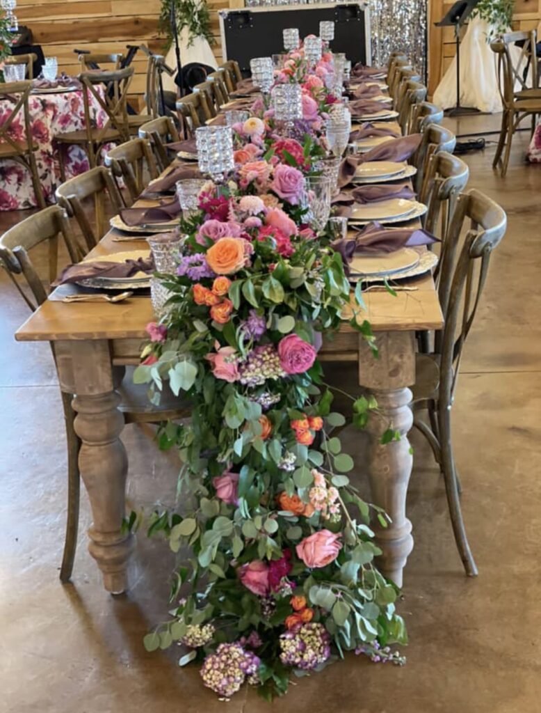
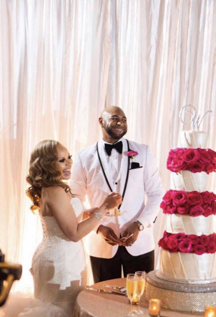
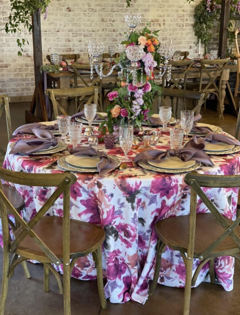
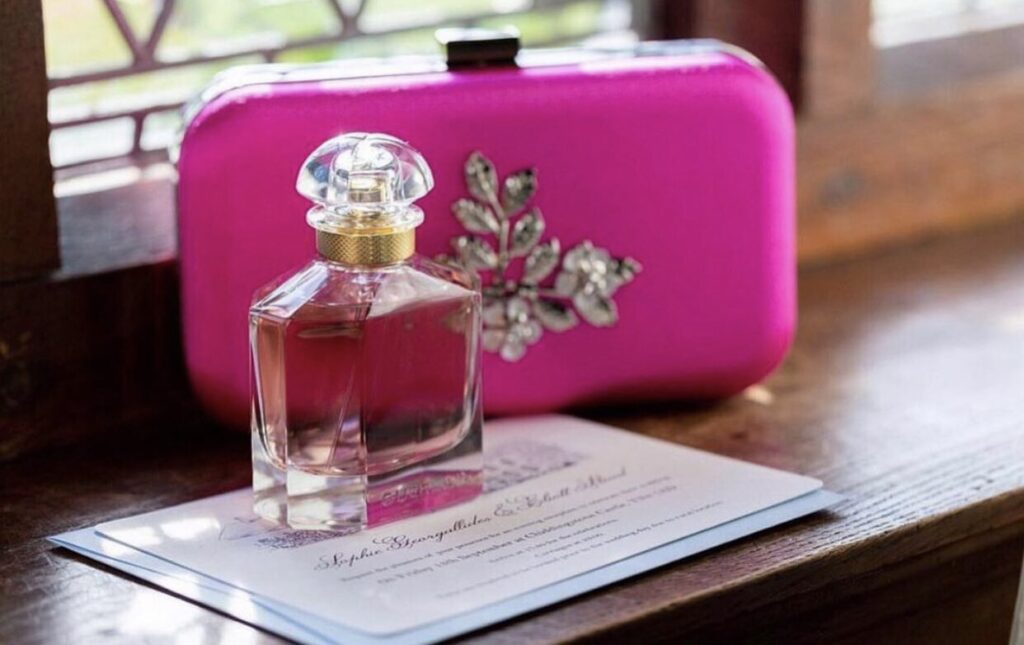
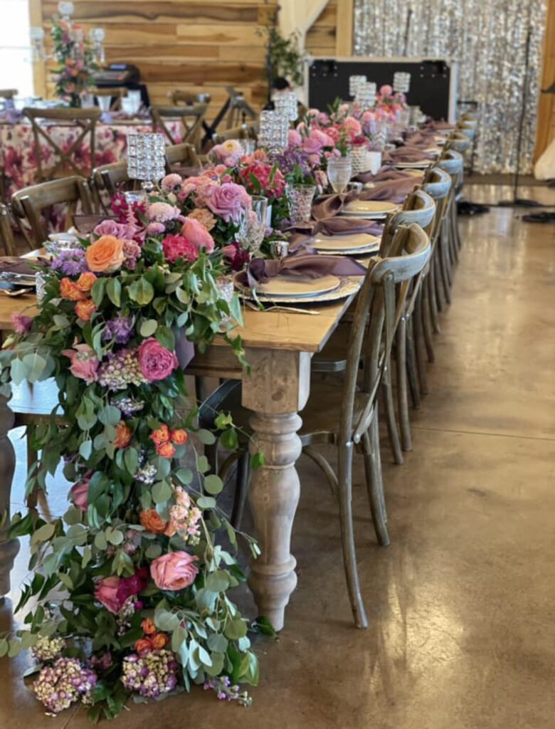
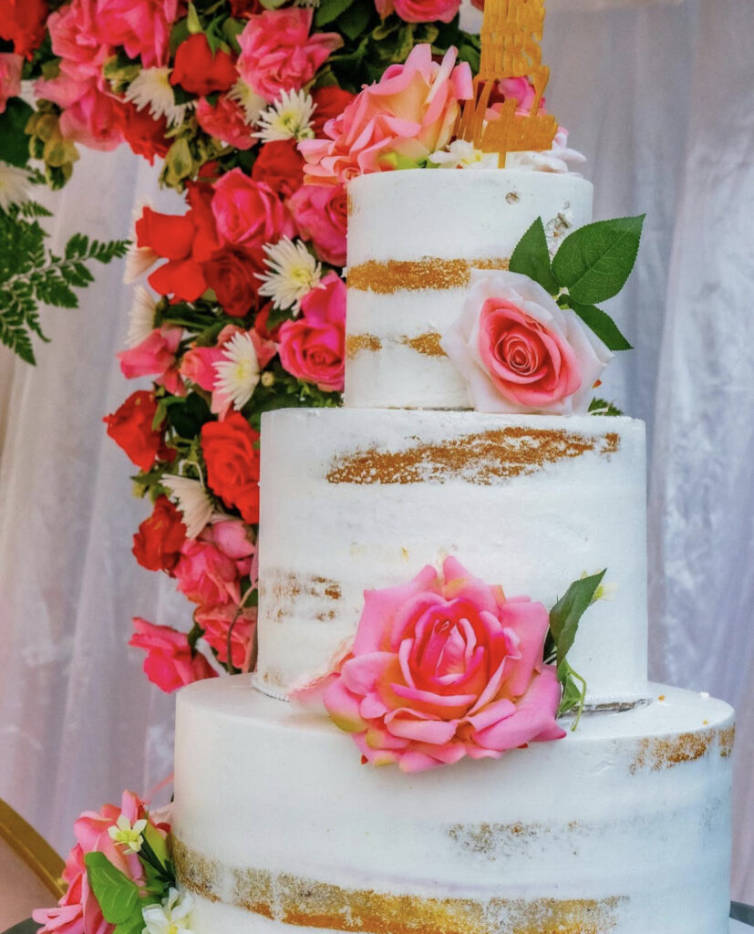
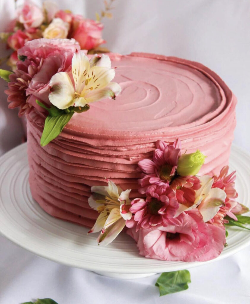
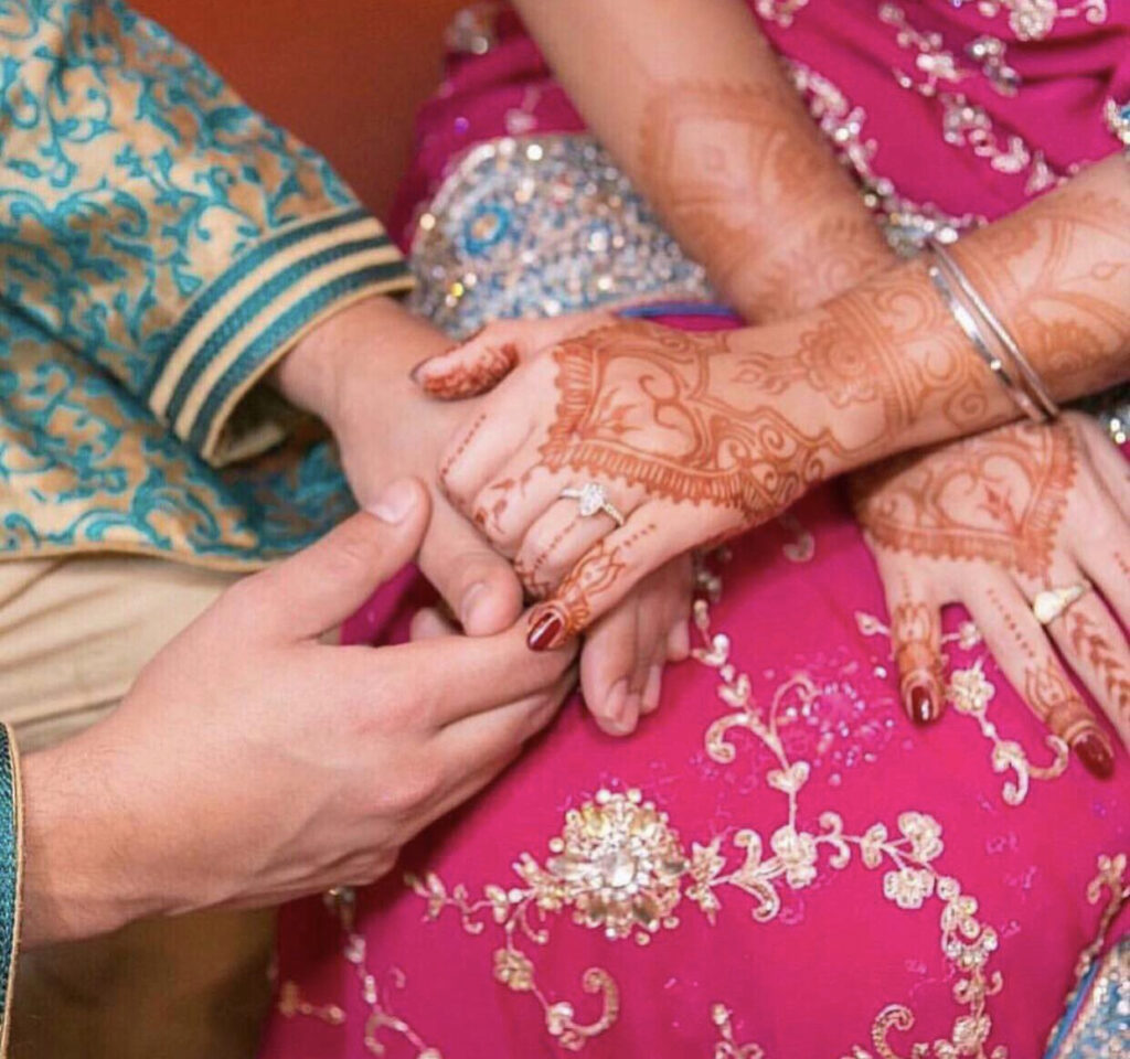
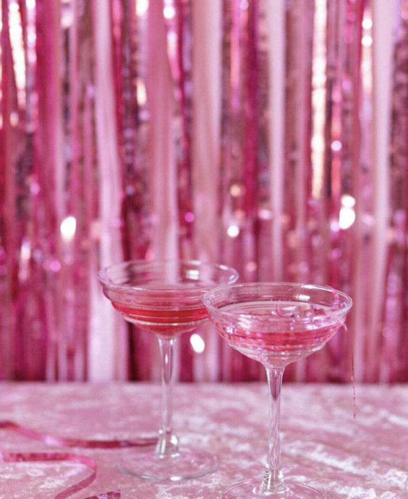
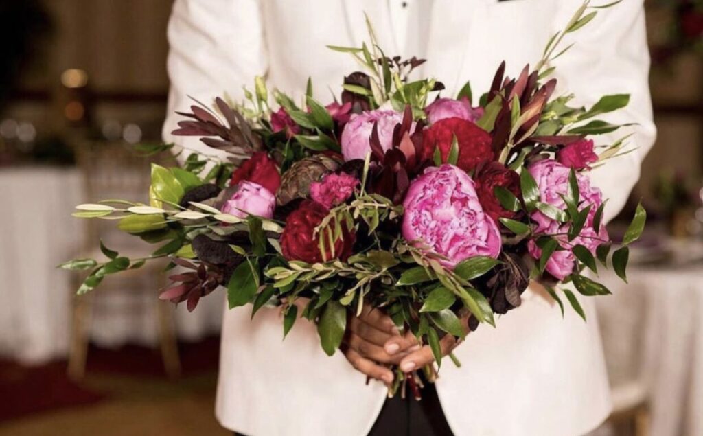
With Pantone’s 2023 Color of the Year being Viva Magenta, this bold and vibrant shade has become a favorite in wedding designs. Its rich, energetic hue adds a modern yet elegant touch to any celebration, making it perfect for everything from floral arrangements to table settings. Viva Magenta manages to stand out beautifully without overwhelming the overall aesthetic, creating a stunning balance of color and sophistication that couples adore.
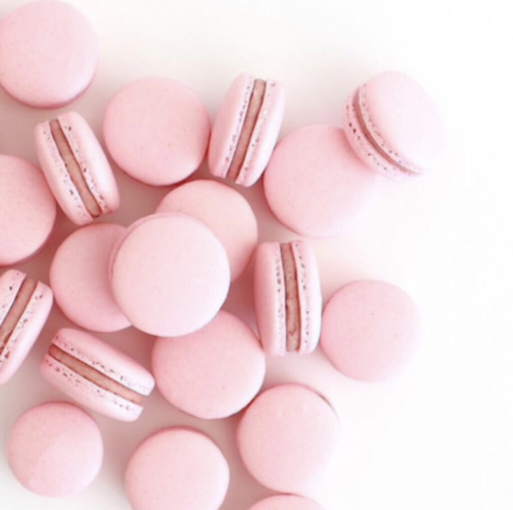
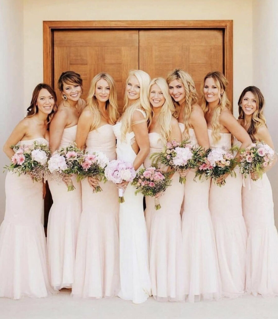
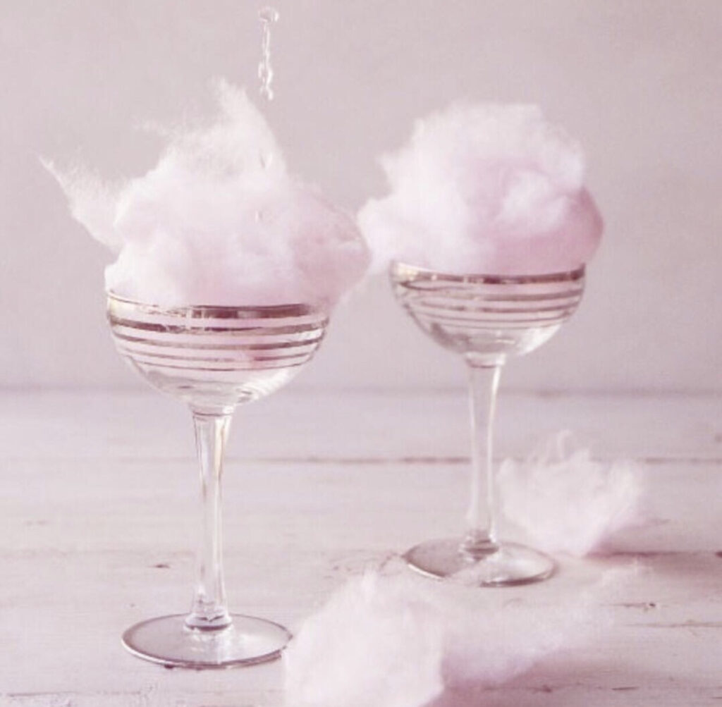
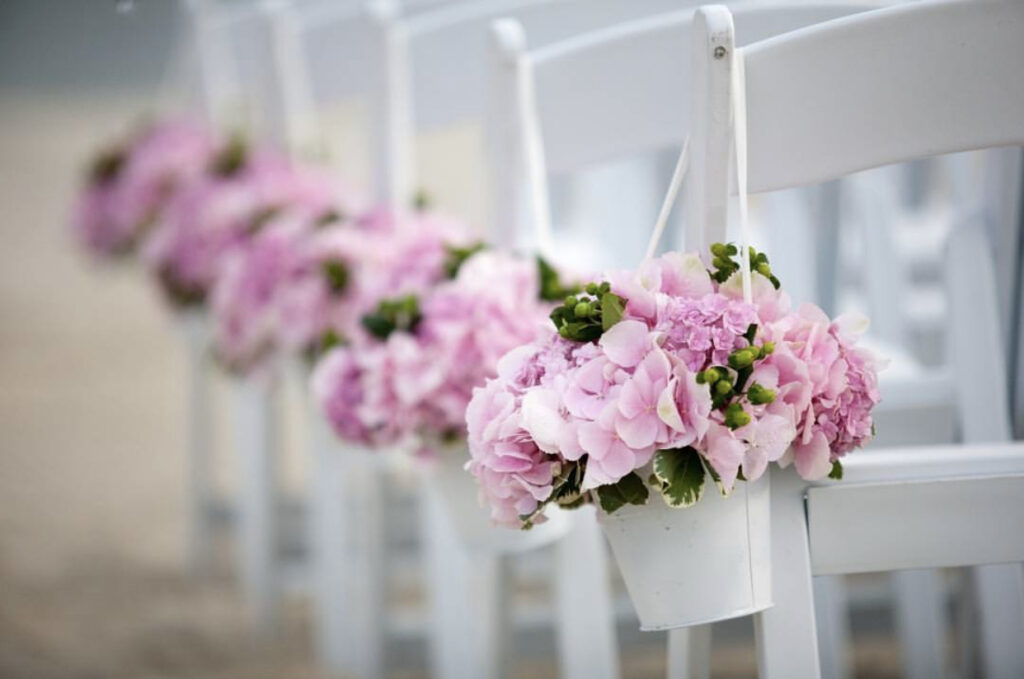

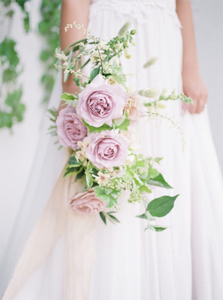
14. Baby Pink
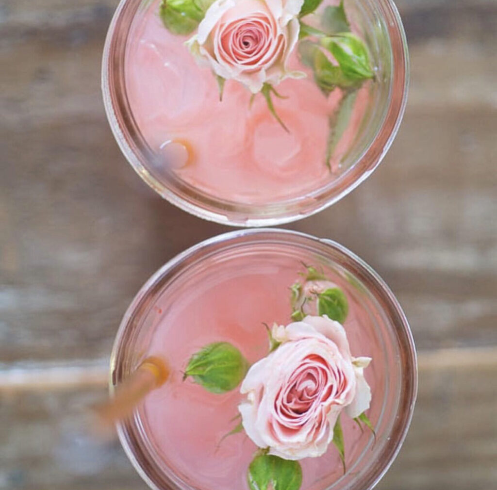
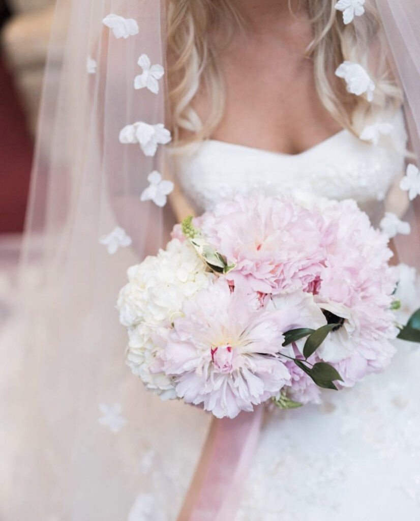
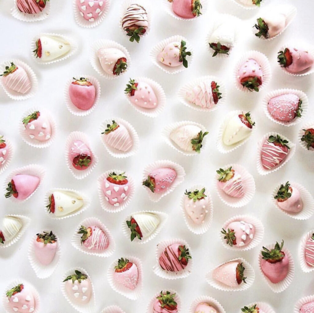
Softer than blush, baby pink remains a classic choice for weddings—gentle, innocent, and timeless. Its delicate hue evokes feelings of romance and simplicity, making it a perfect option for everything from bridesmaid dresses to floral arrangements. Whether incorporated into a modern or traditional theme, baby pink adds an elegant touch that never goes out of style.
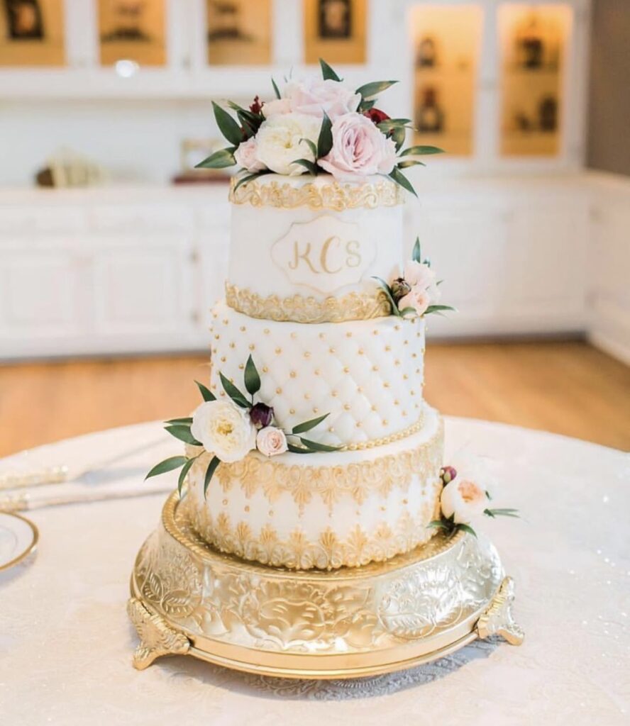
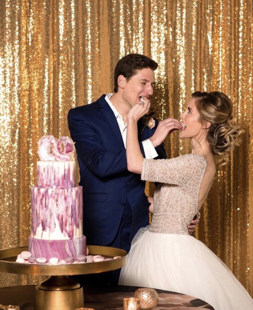
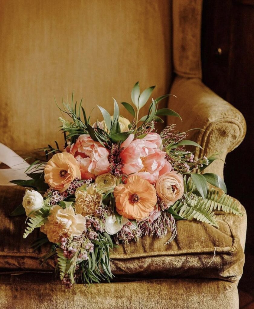
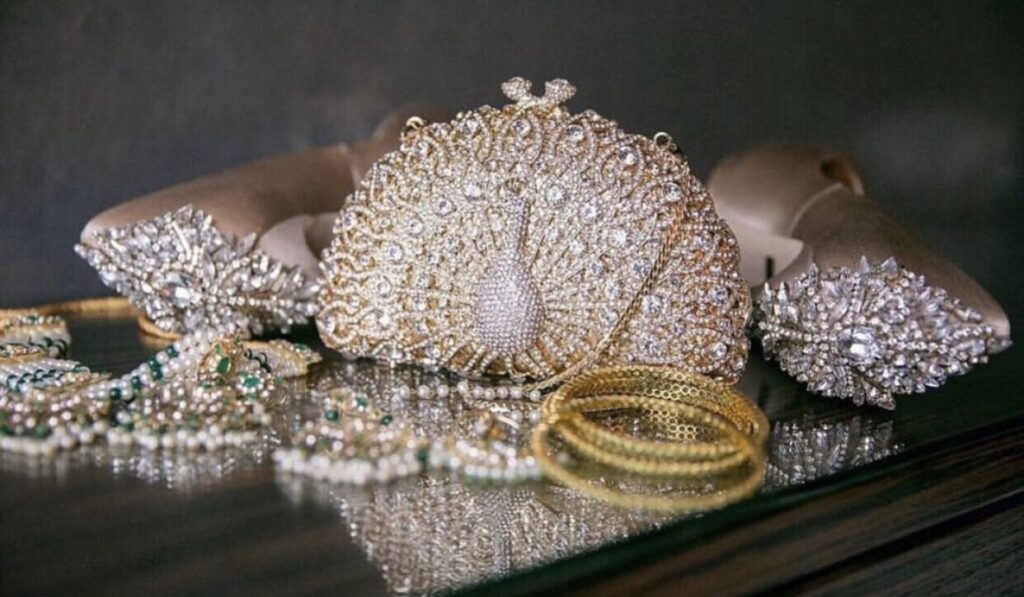
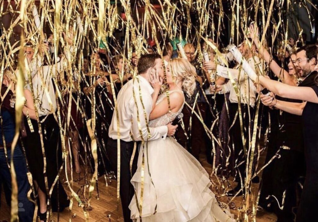
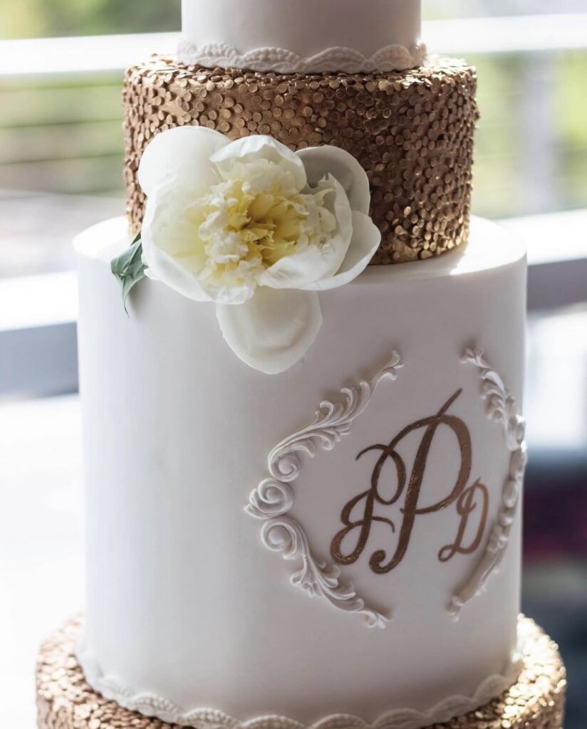
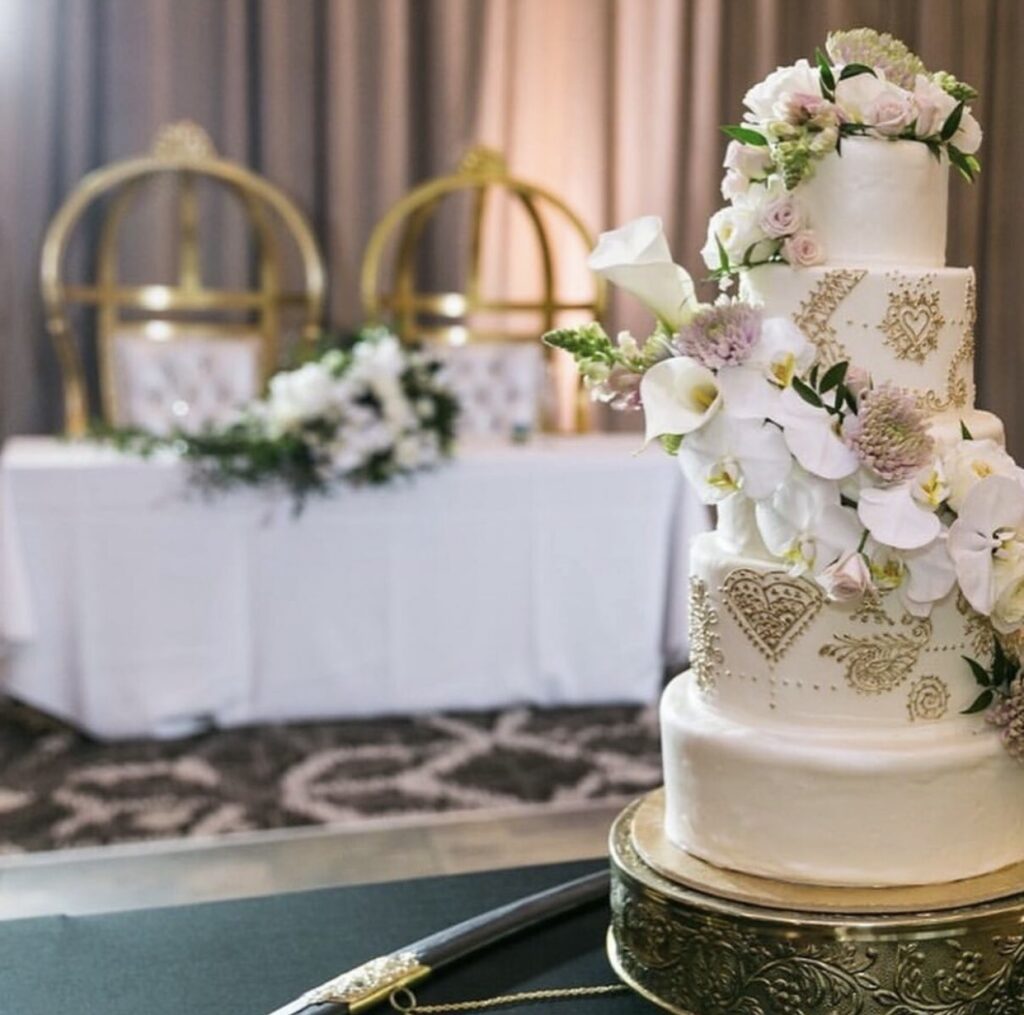
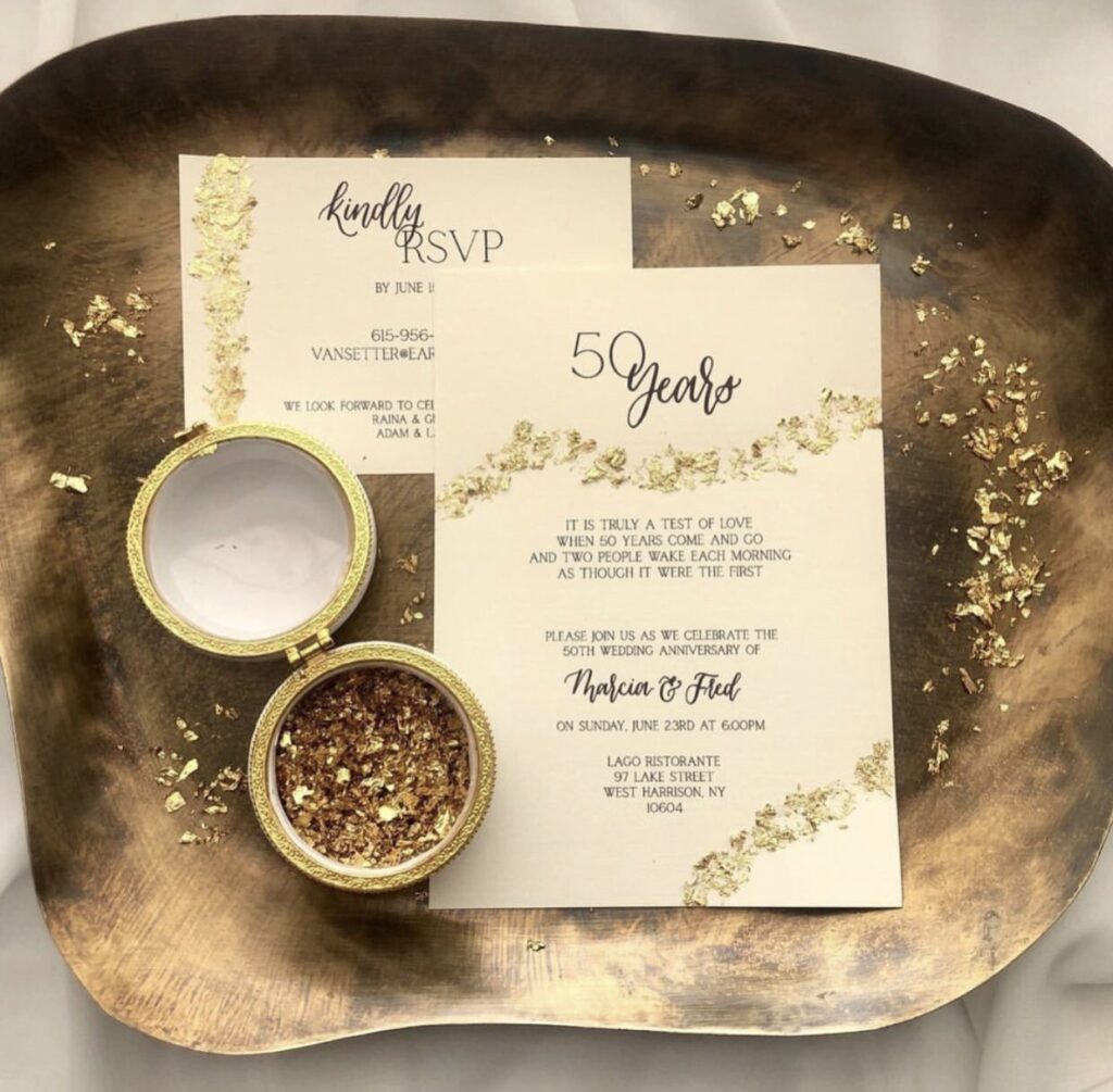
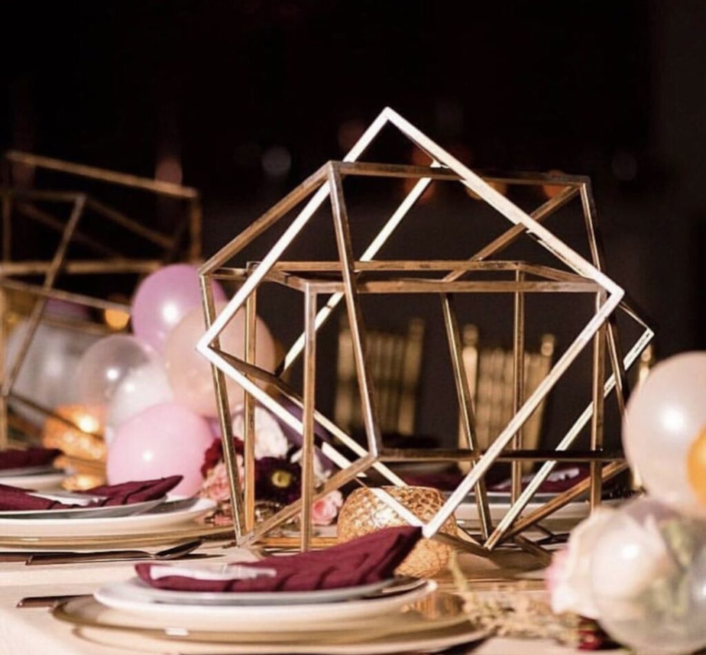
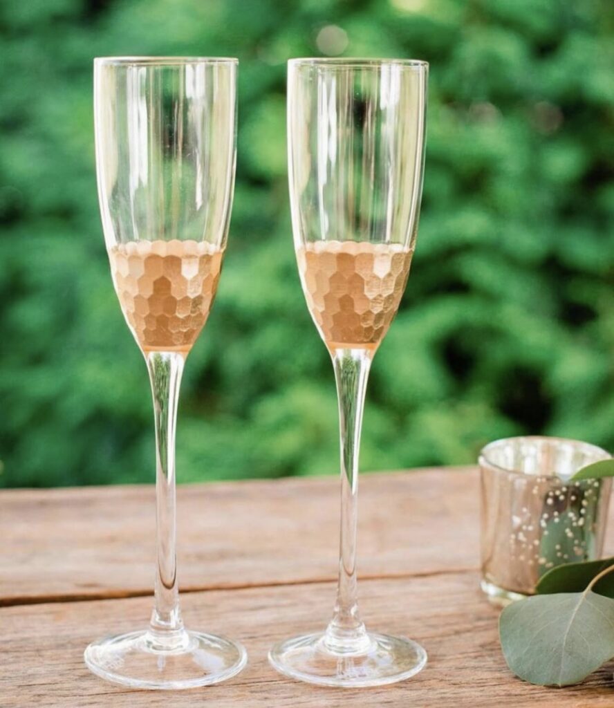

15. Gold
Gold is a tone that adds sophistication and a unique touch to everything from seating arrangements to stationery. Its timeless elegance and warm, luxurious glow make it a versatile choice for enhancing any setting, whether it’s a formal event, a wedding, or even a special celebration. Gold brings a sense of class and refinement and makes your space feel like it is being bathed in candlelight.
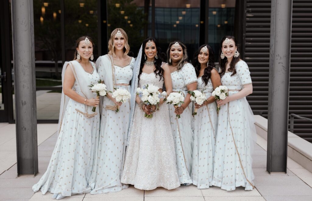
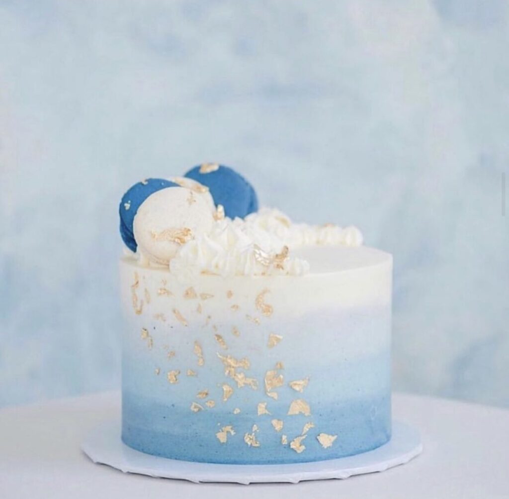
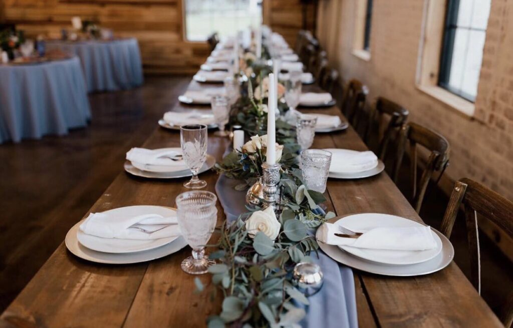
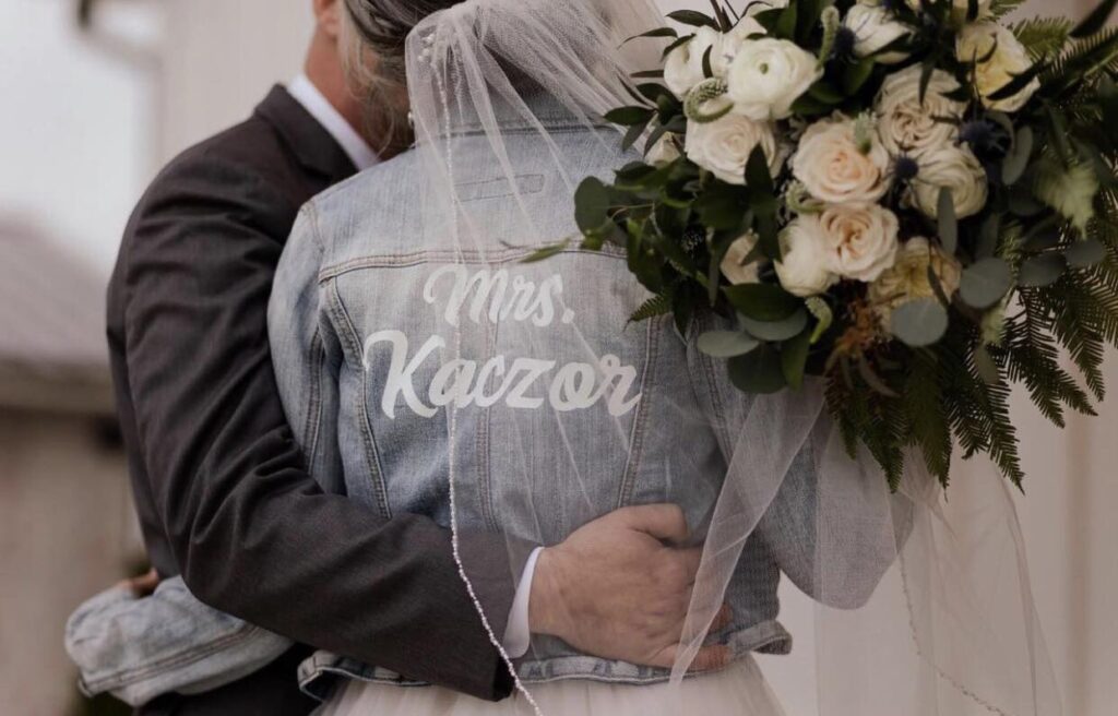
16. Powder Blue
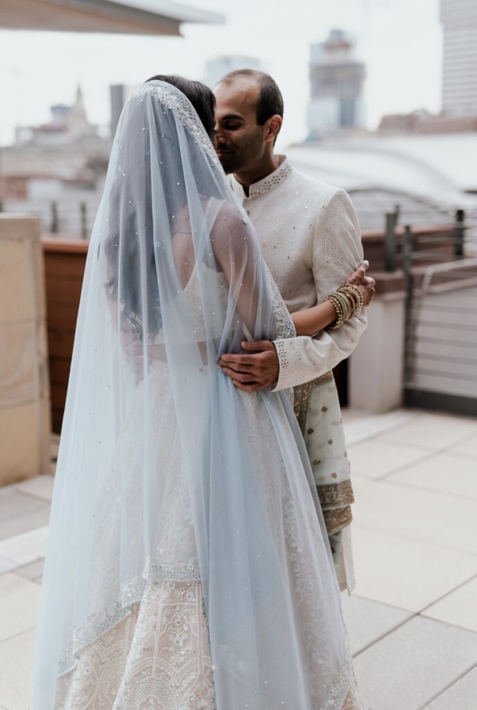
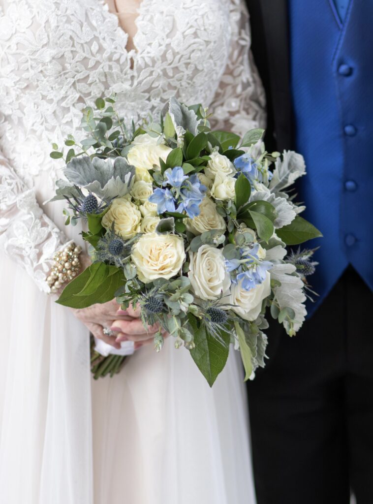
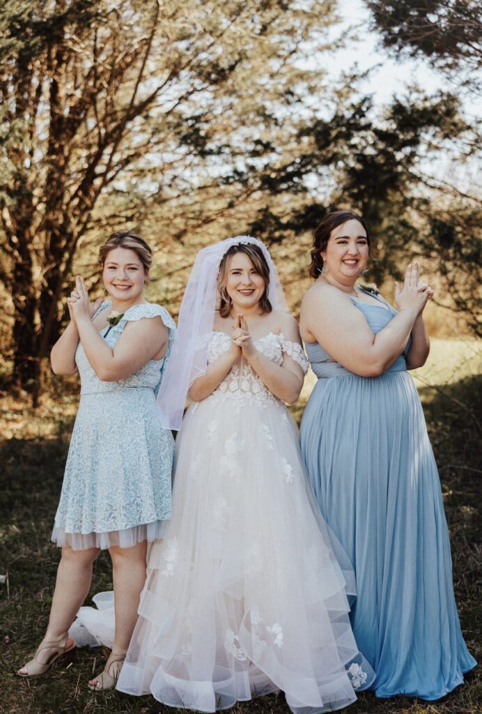
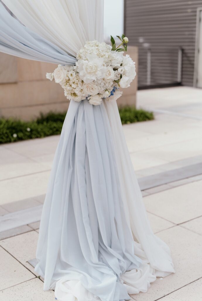
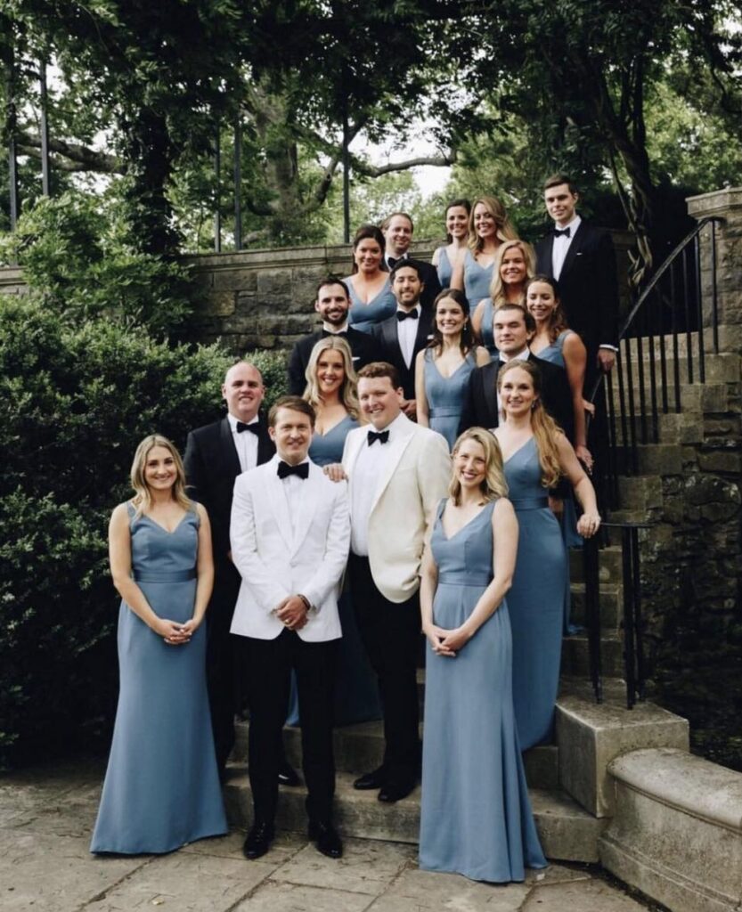
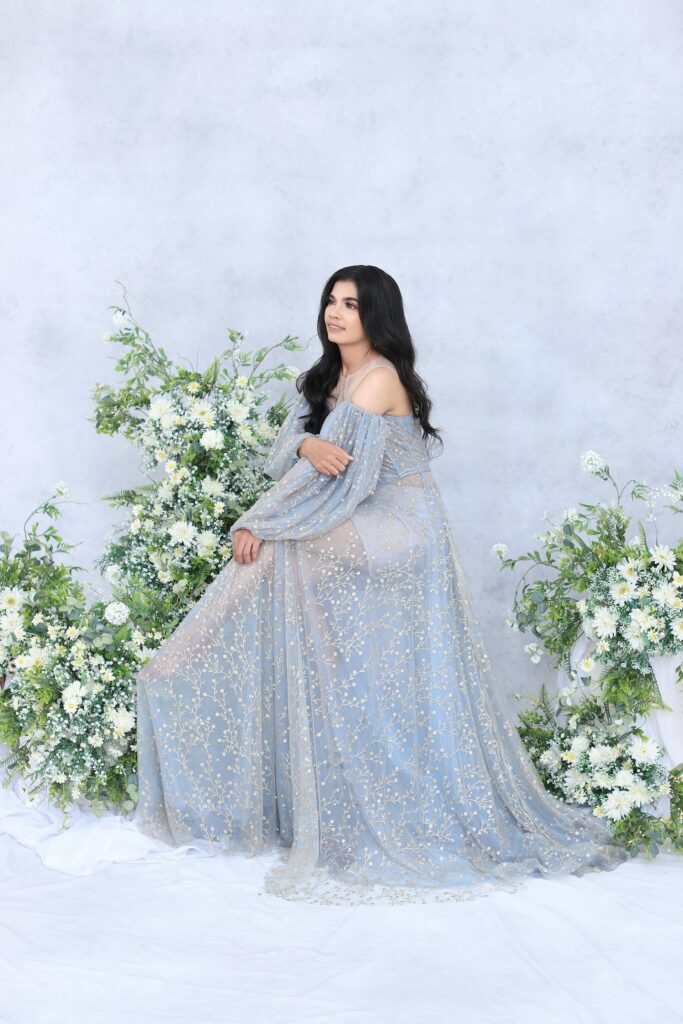
For spring or summer weddings, powder blue is a timeless and calming choice that exudes effortless style. This soft, versatile hue works beautifully in outdoor or indoor settings, creating a serene and inviting atmosphere. Pair it with white florals and touches of greenery for a crisp and fresh aesthetic that feels light and elegant, perfect for the season.

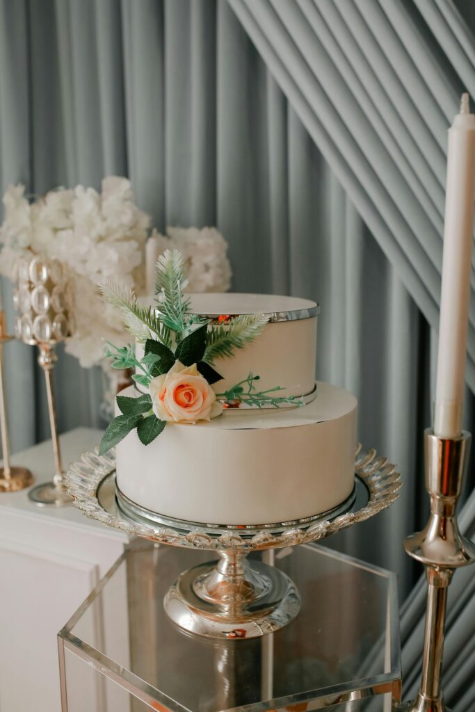
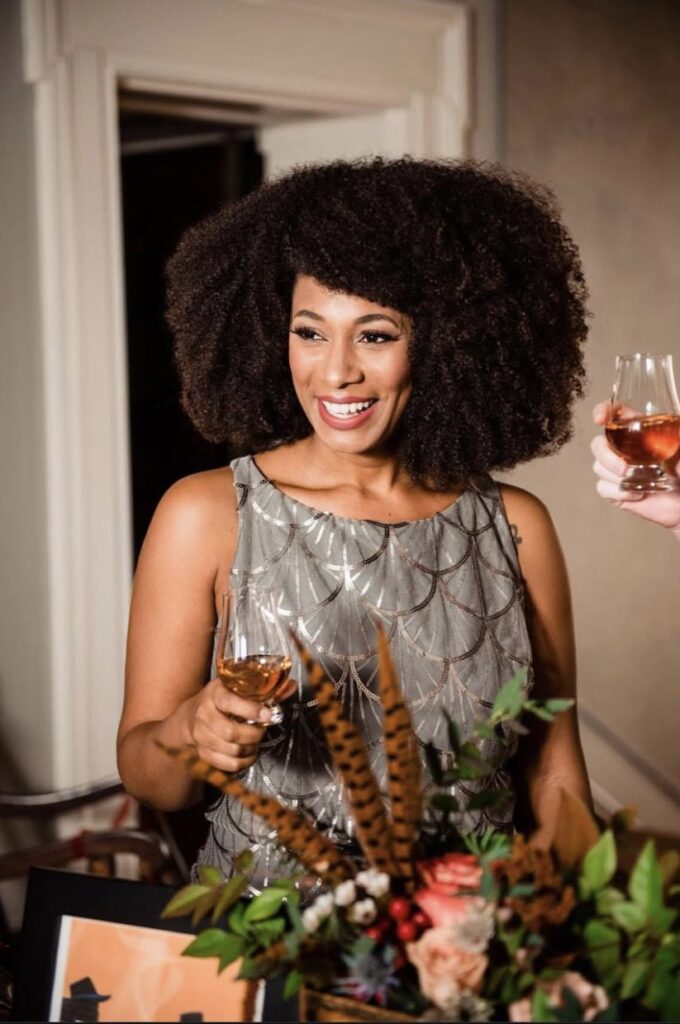
17. Silver
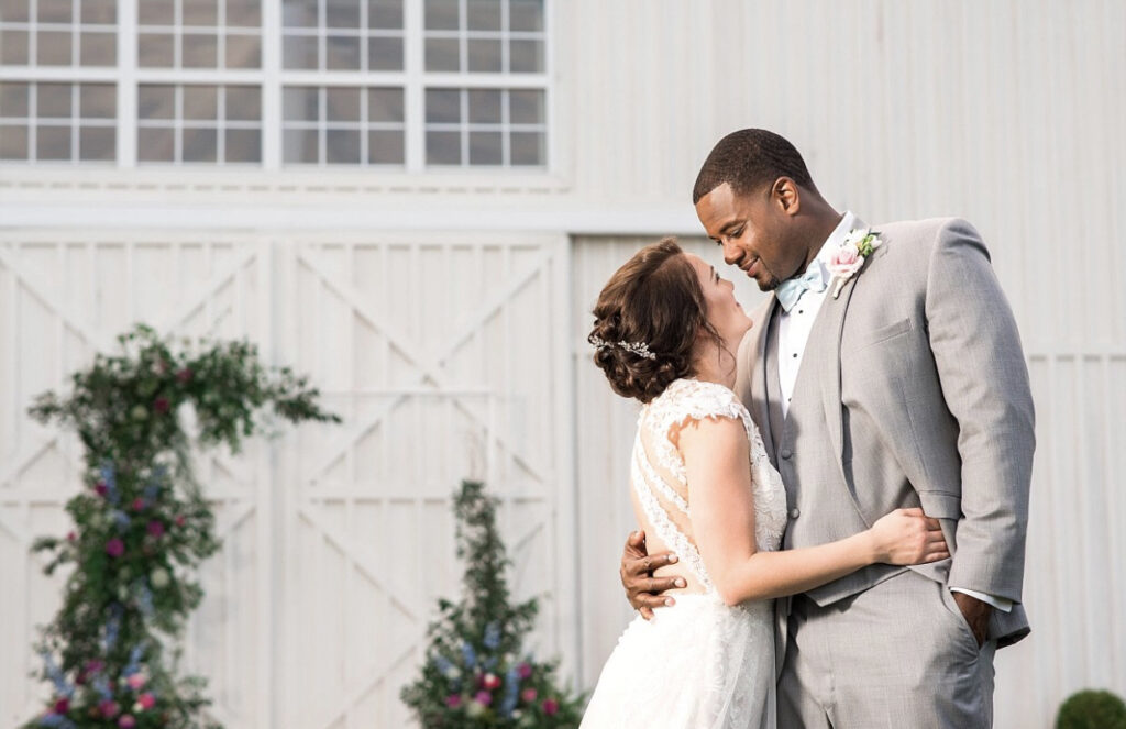
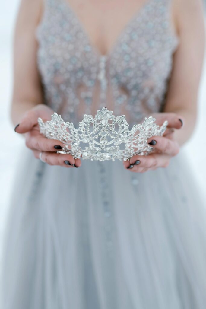
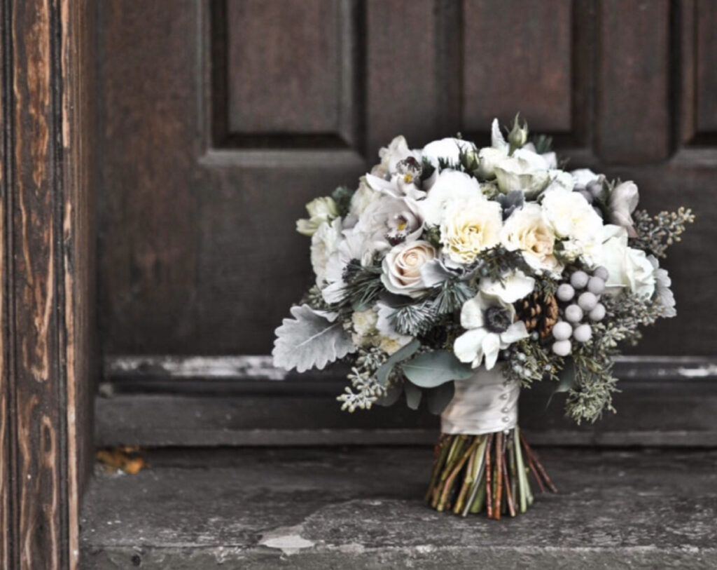
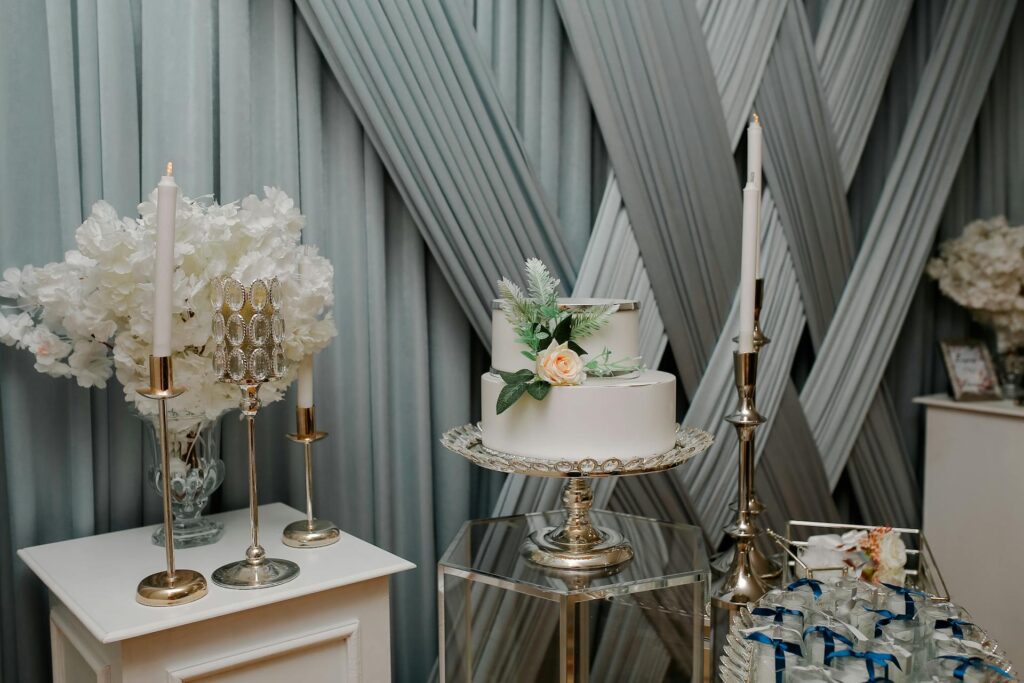
Stunning silver with a sleek, elegant finish captures timeless beauty and leaves a lasting impression. Its refined shimmer and radiant shine catch the light perfectly, whether in the soft glow of candlelight or under bright event lighting. This exquisite touch transforms any gathering into a sophisticated soiree, creating an atmosphere of class and elegance that your guests won’t forget.
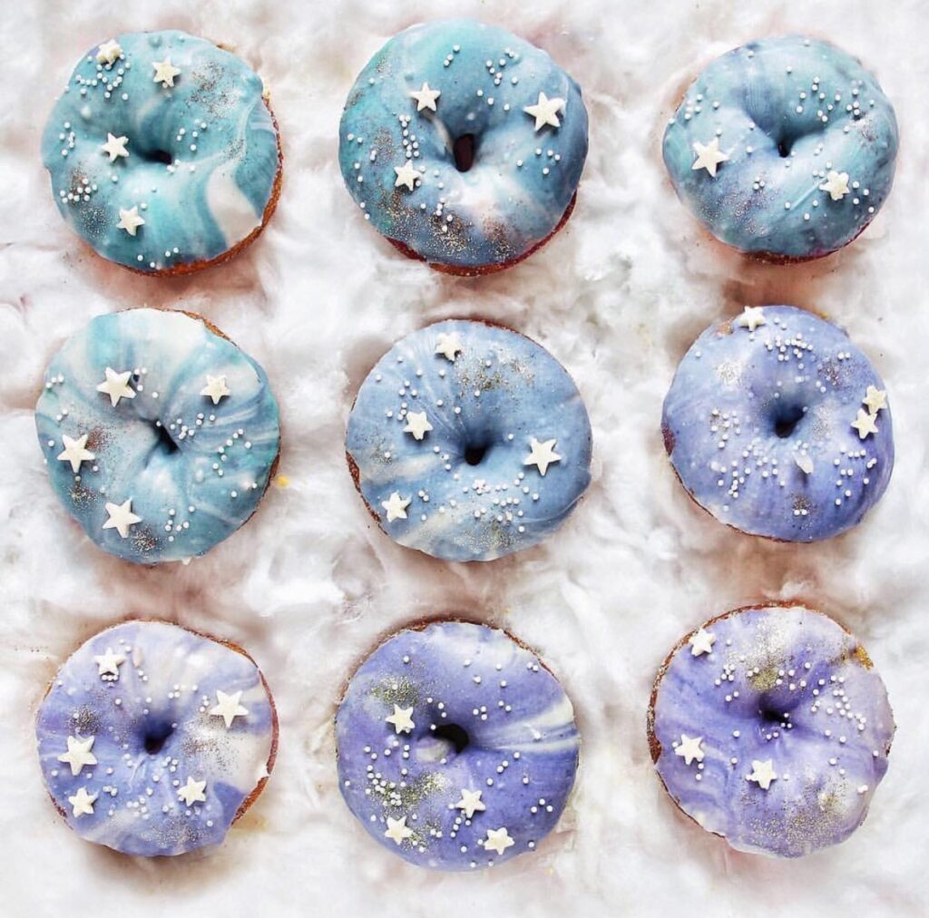
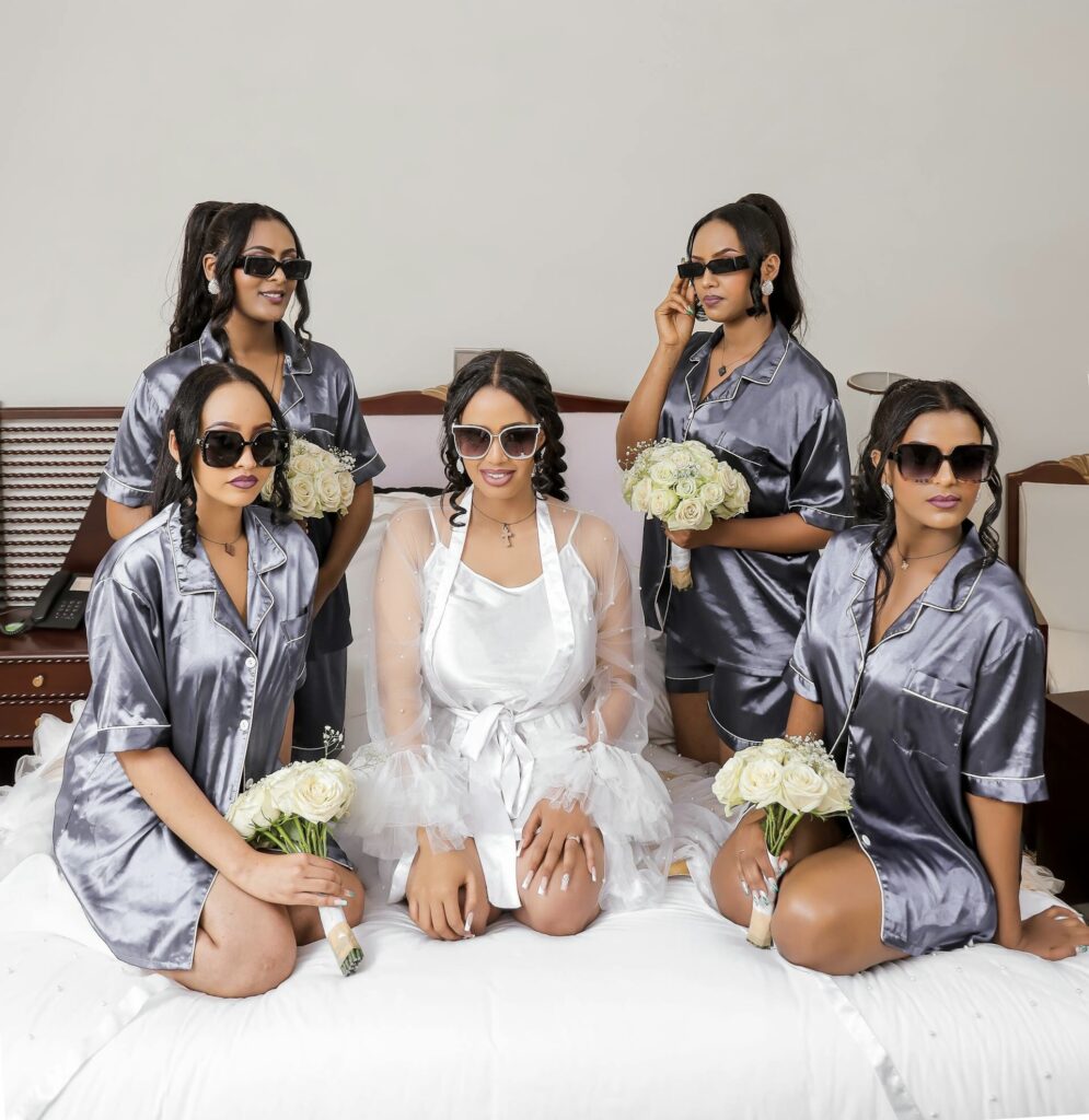
18. Very Peri
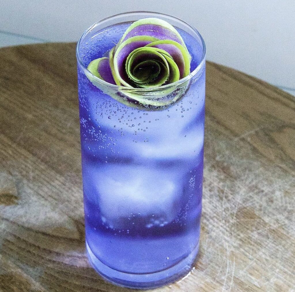
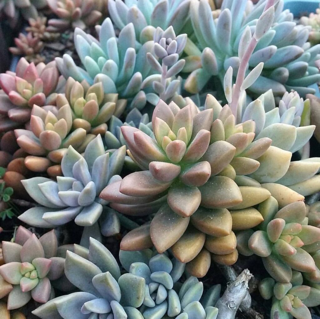
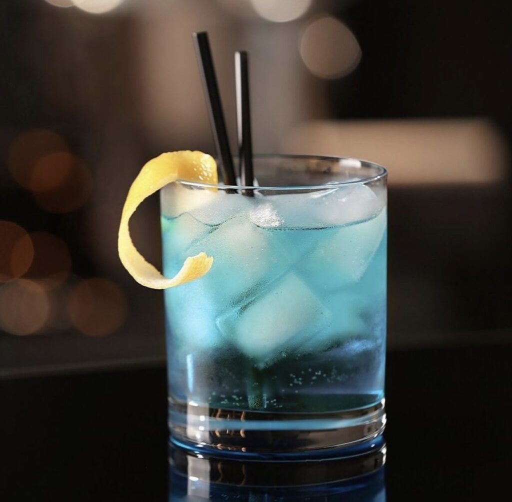
Very Peri is a vibrant shade. Named Pantone’s Color of the Year 2022, Very Peri is a dynamic blue hue with a vivifying violet-red undertone. This happiest and warmest of all the blue hues. It lies on a spectrum. Describing things for which there aren’t neat little categories. It’s where they blend together like the dynamic duo of you and your partner!
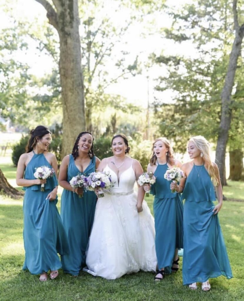
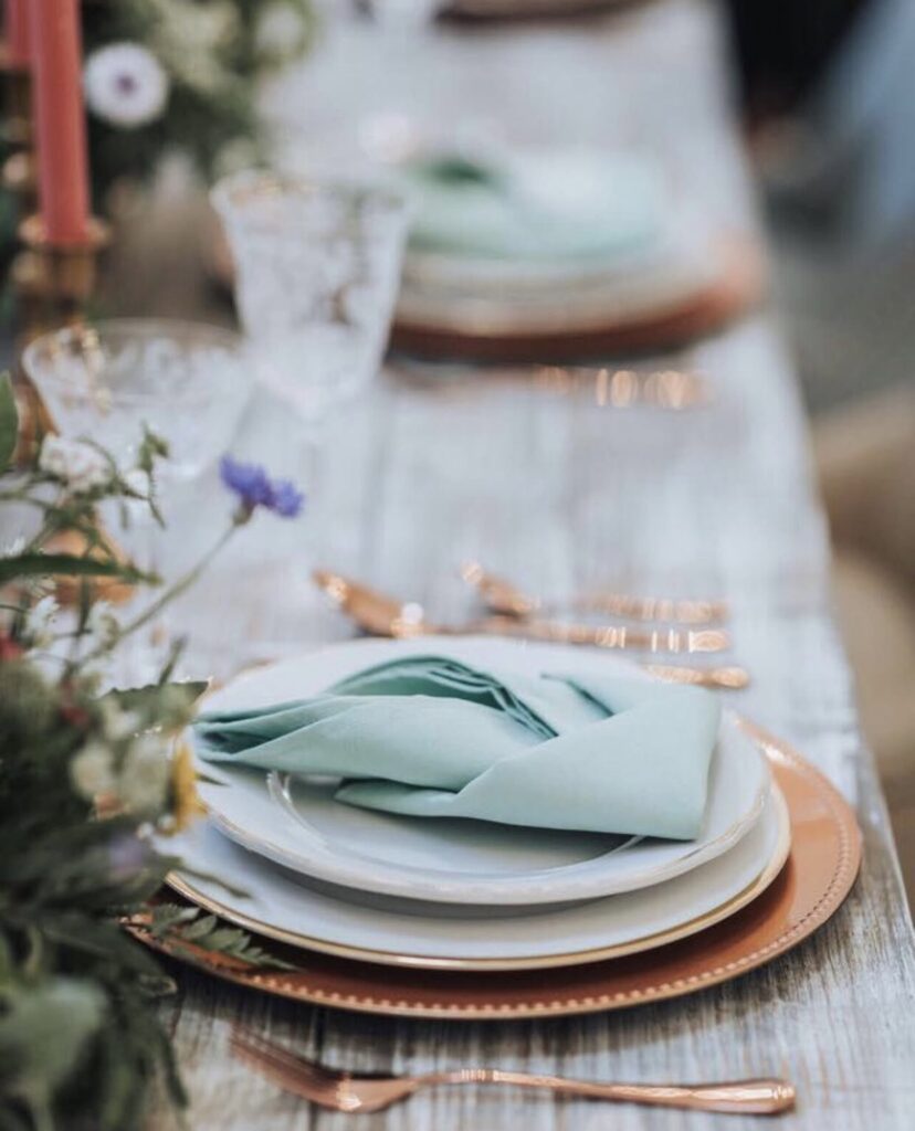
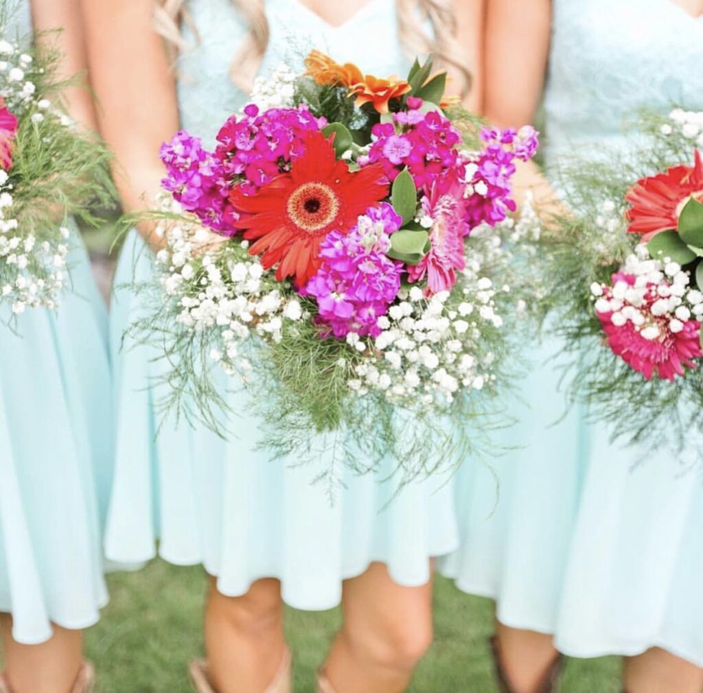
19. Teal
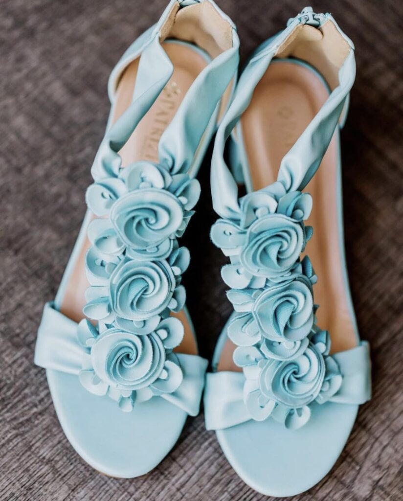
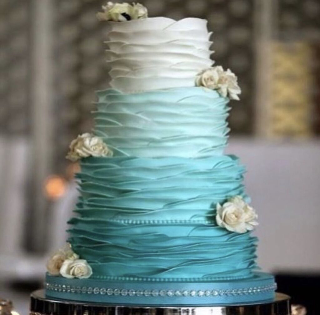
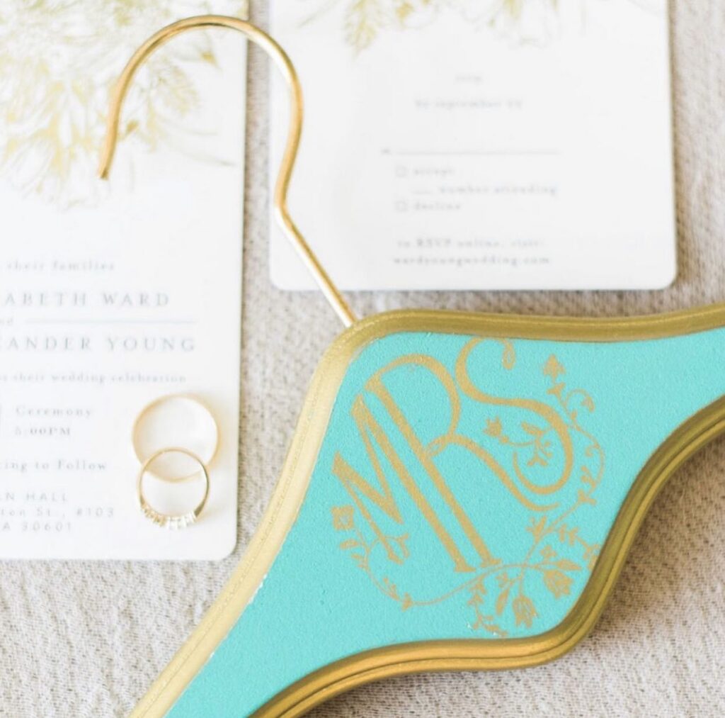
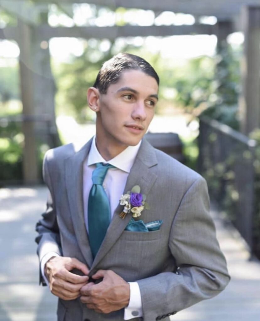
Teal is bold, rich, and dynamic, making it an excellent fit for adventurous couples who want to make a statement with their color palette. Its unique blend of blue and green creates a vibrant yet sophisticated tone that stands out in any setting. Whether used as a primary color or as an accent, teal adds depth and personality, perfect for those looking to infuse their event with a sense of creativity and elegance.
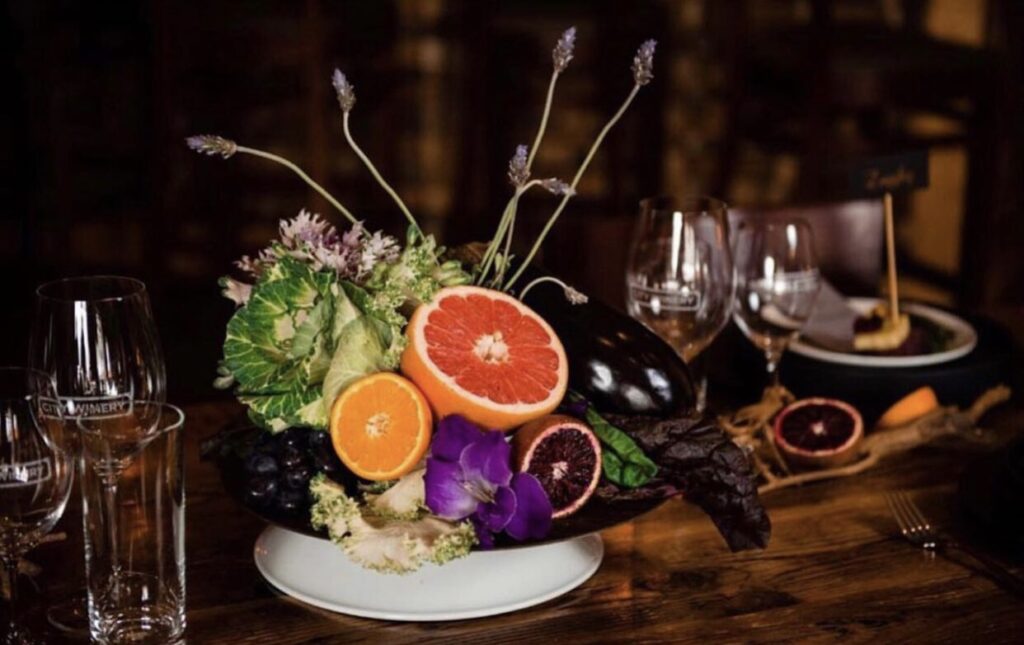
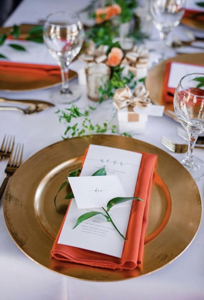
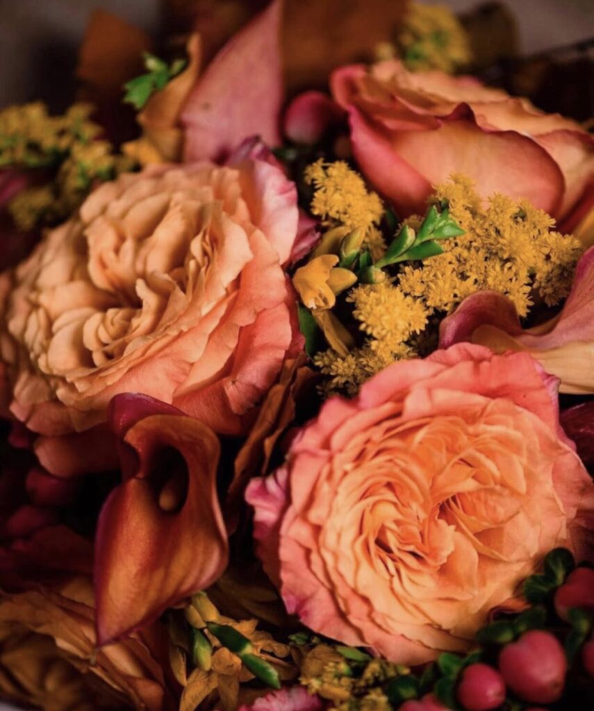
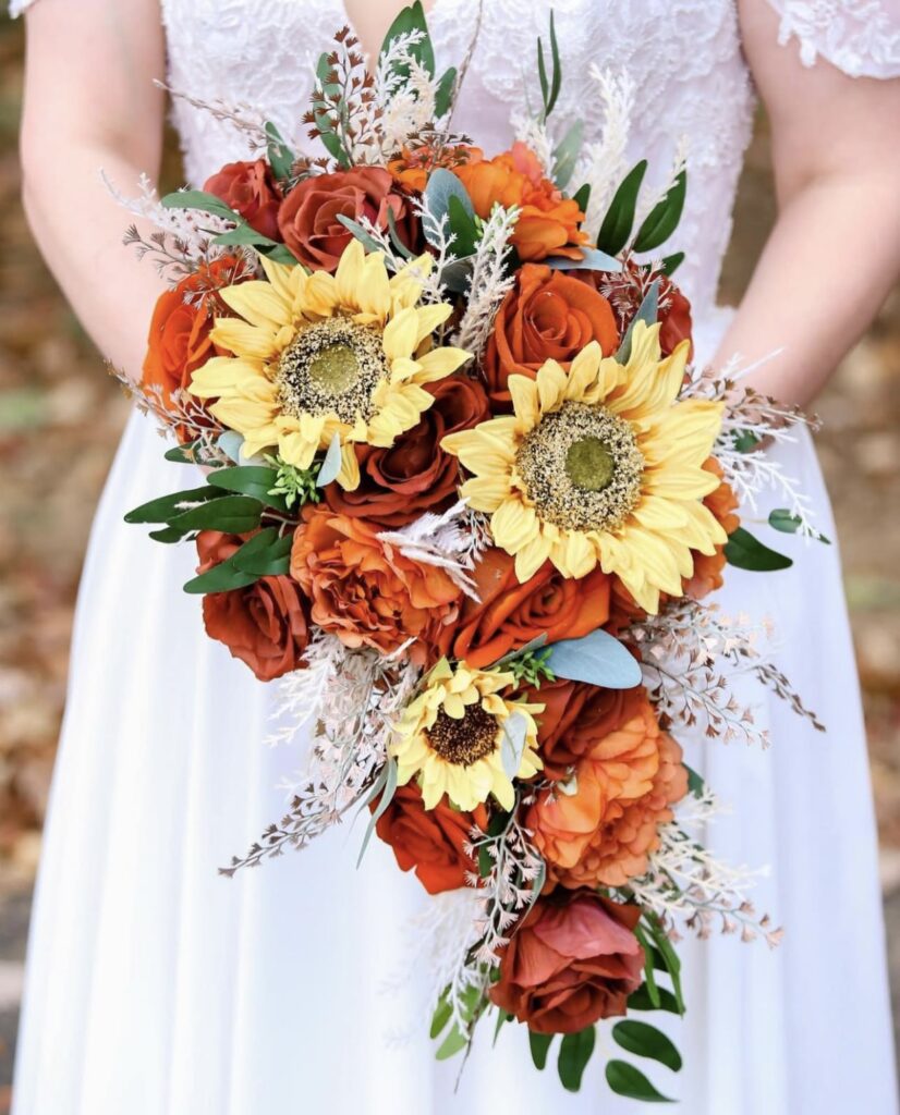
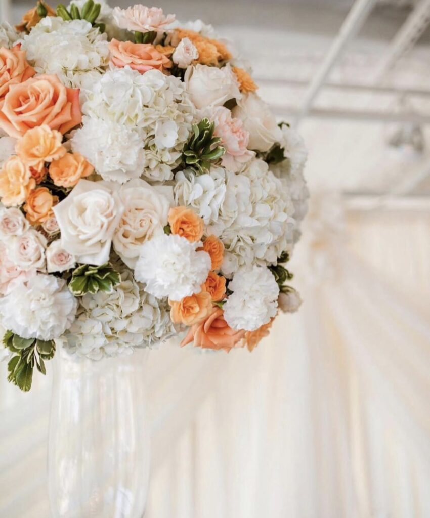
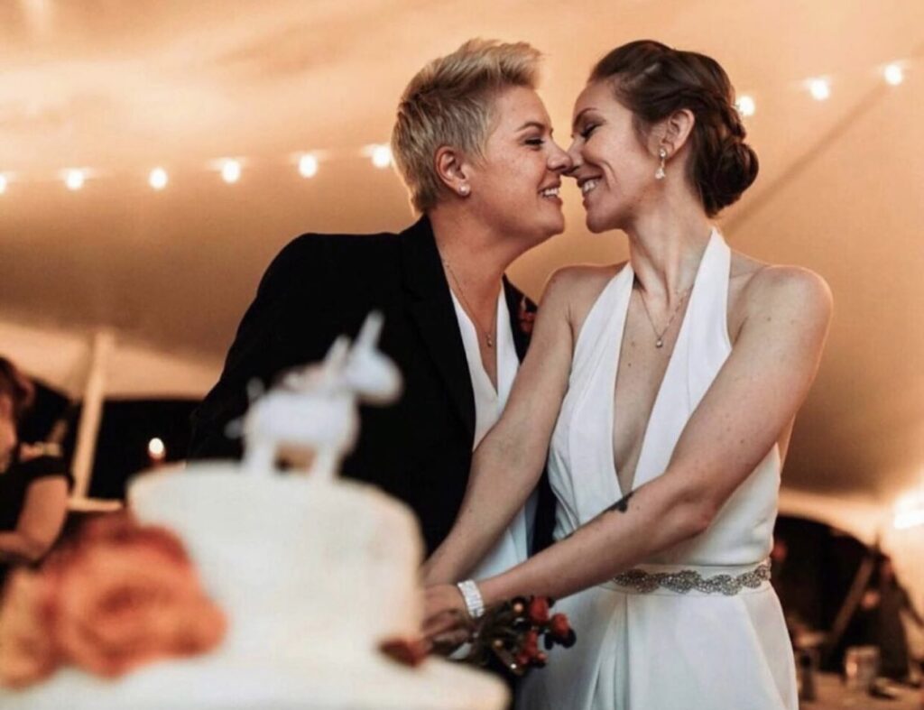
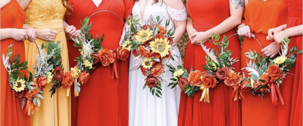
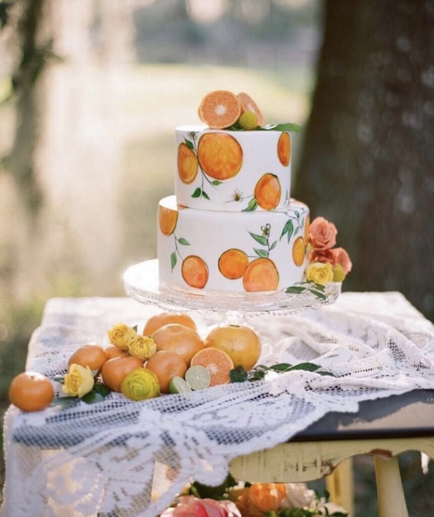
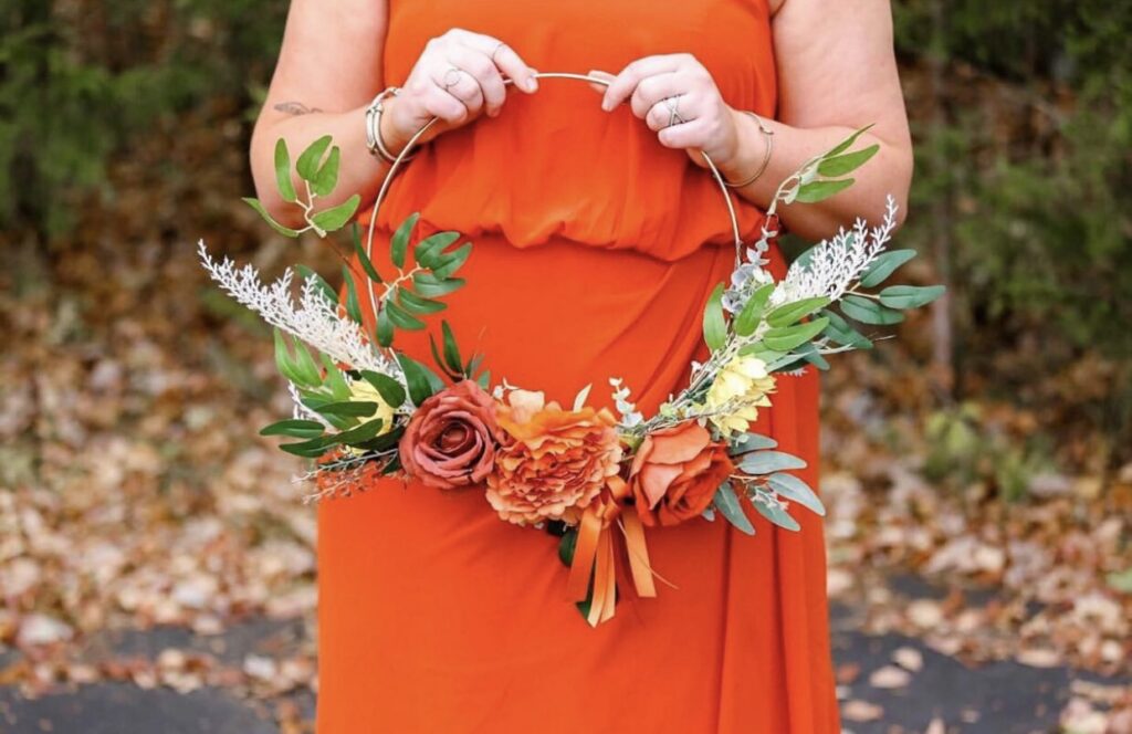
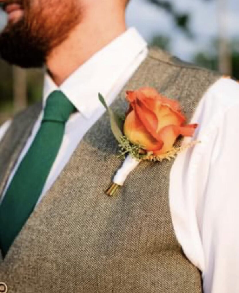
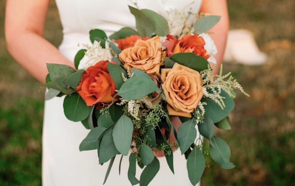
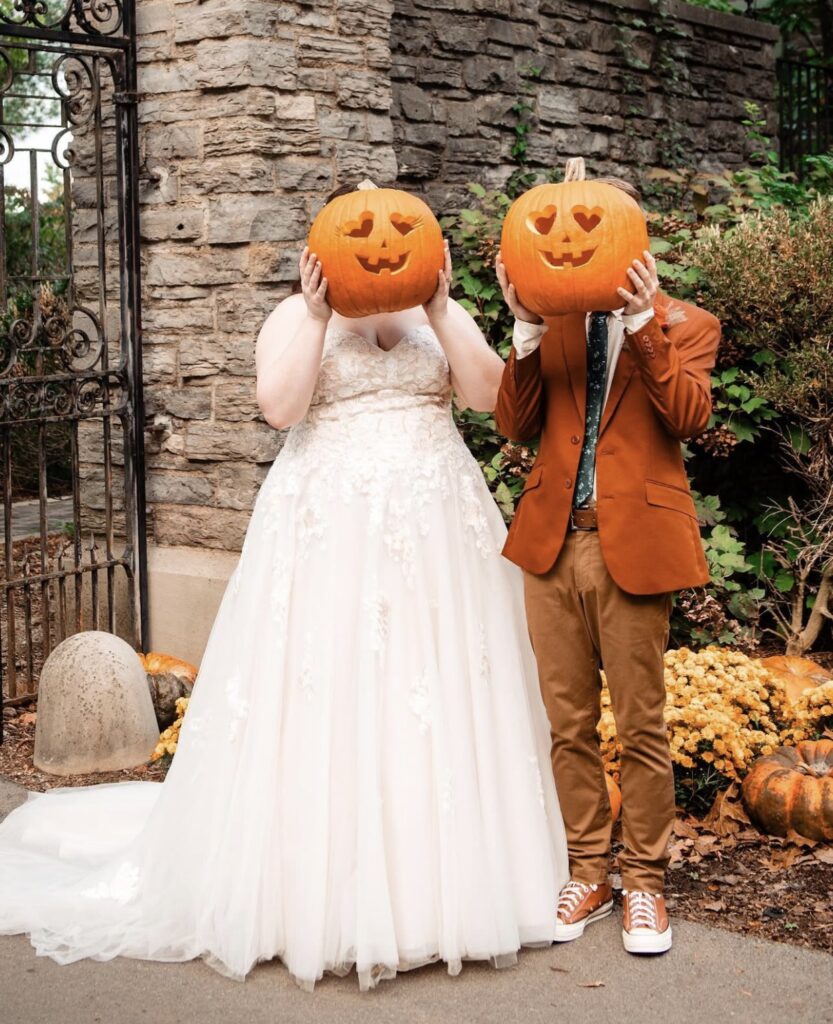
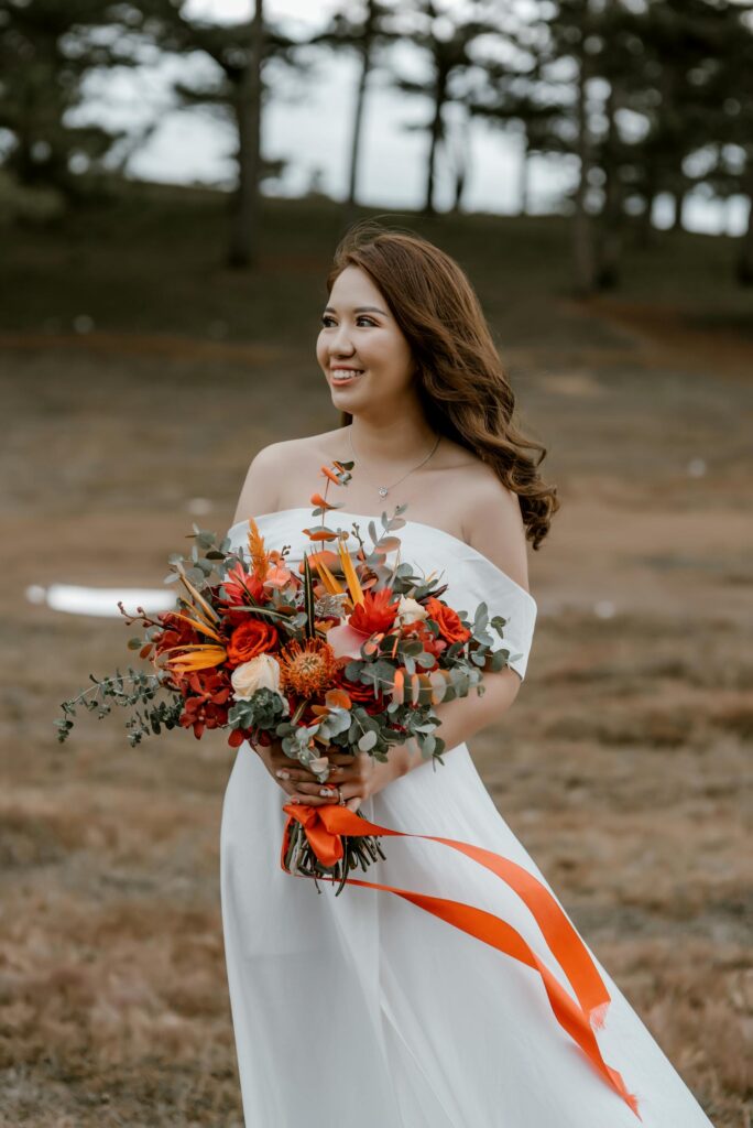
20. Orange
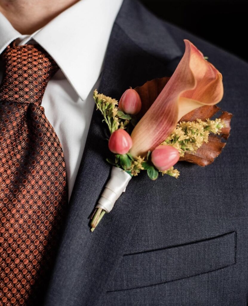
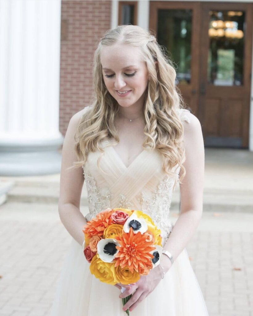
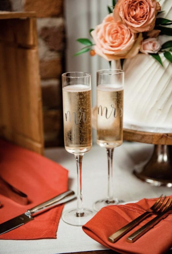
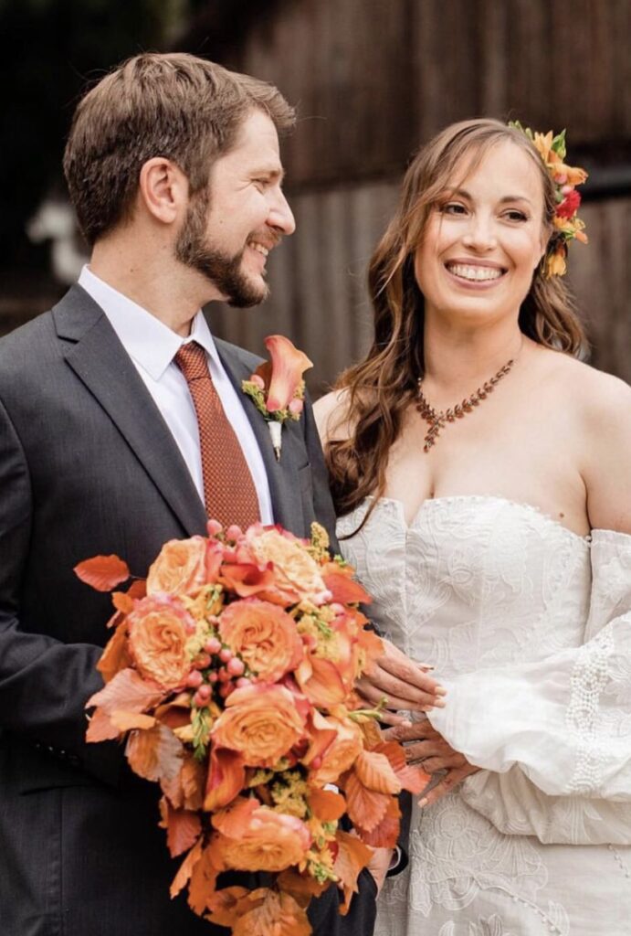
Richer and more decadent than peach, orange adds a sense of warmth and vibrancy to any space. Its bold yet inviting tone pairs beautifully with deep greens, creating a striking contrast, while also enhancing metallic accents like gold or bronze for a touch of elegance and sophistication.
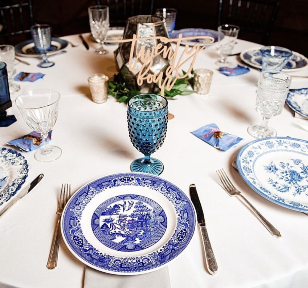
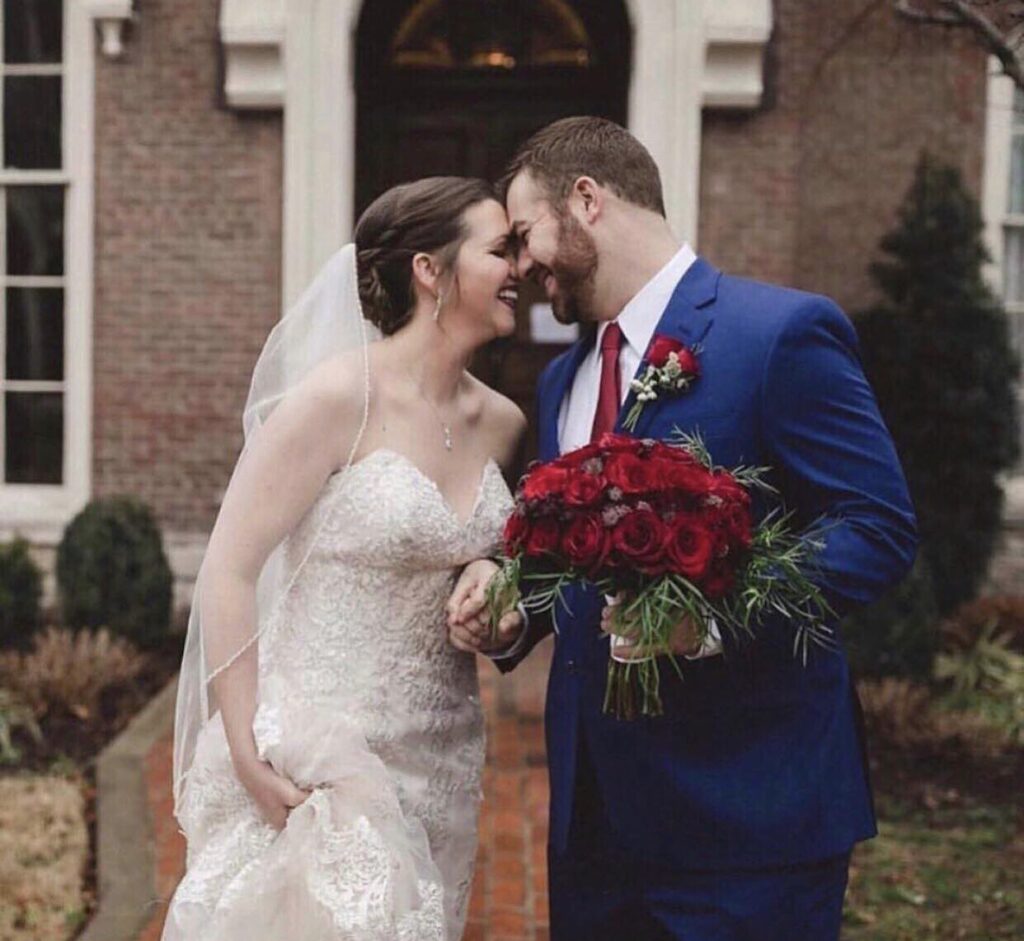
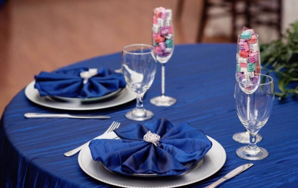

21. Classic Blue
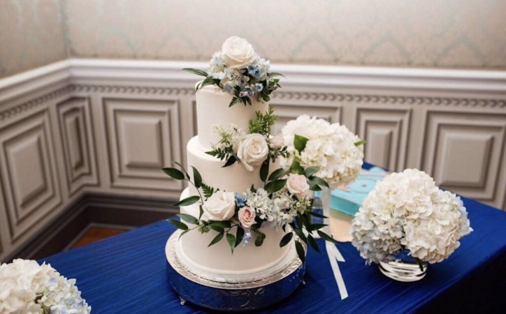
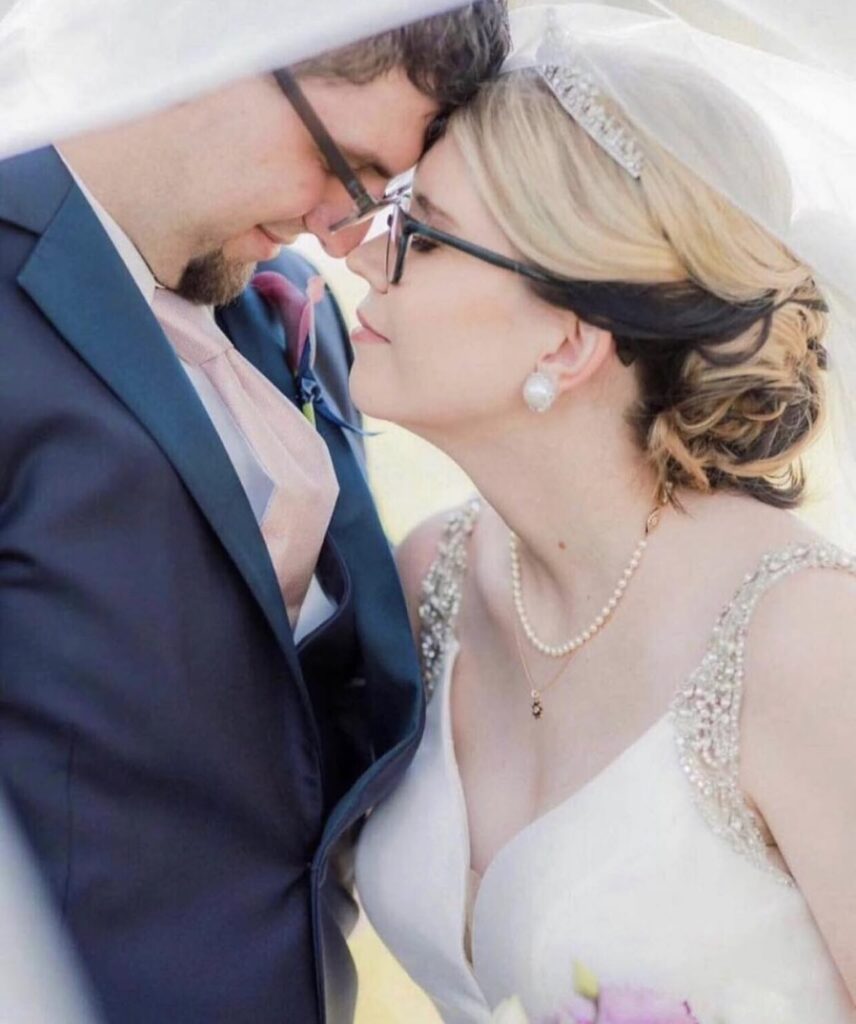
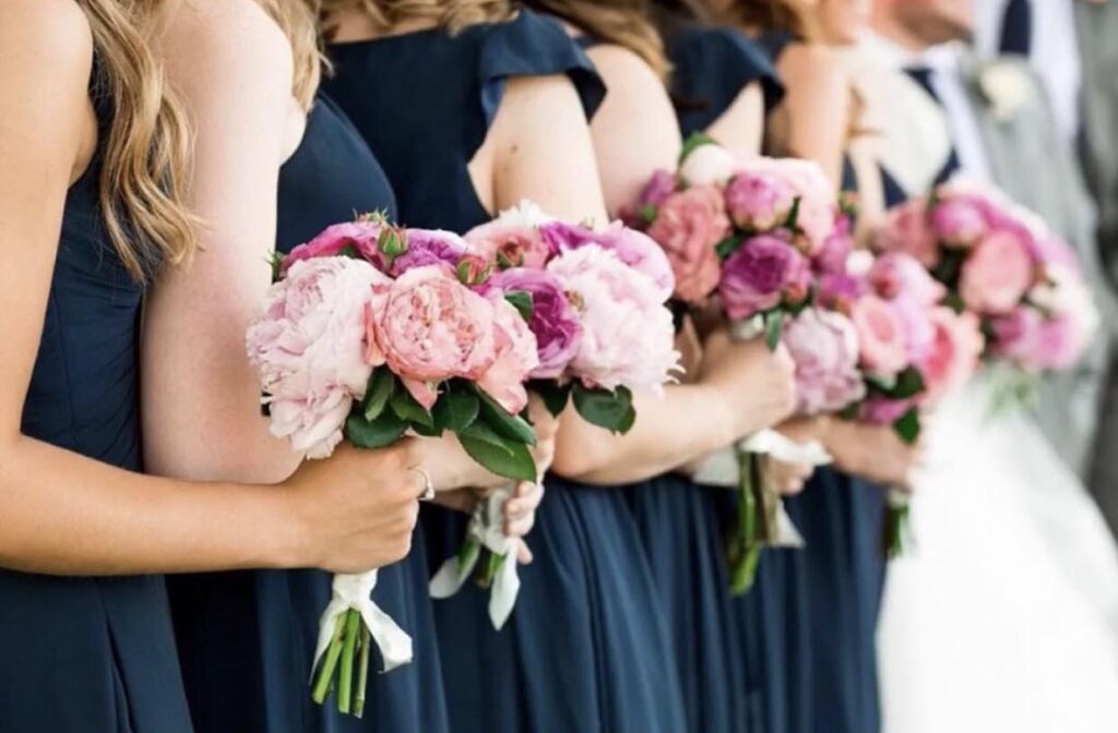
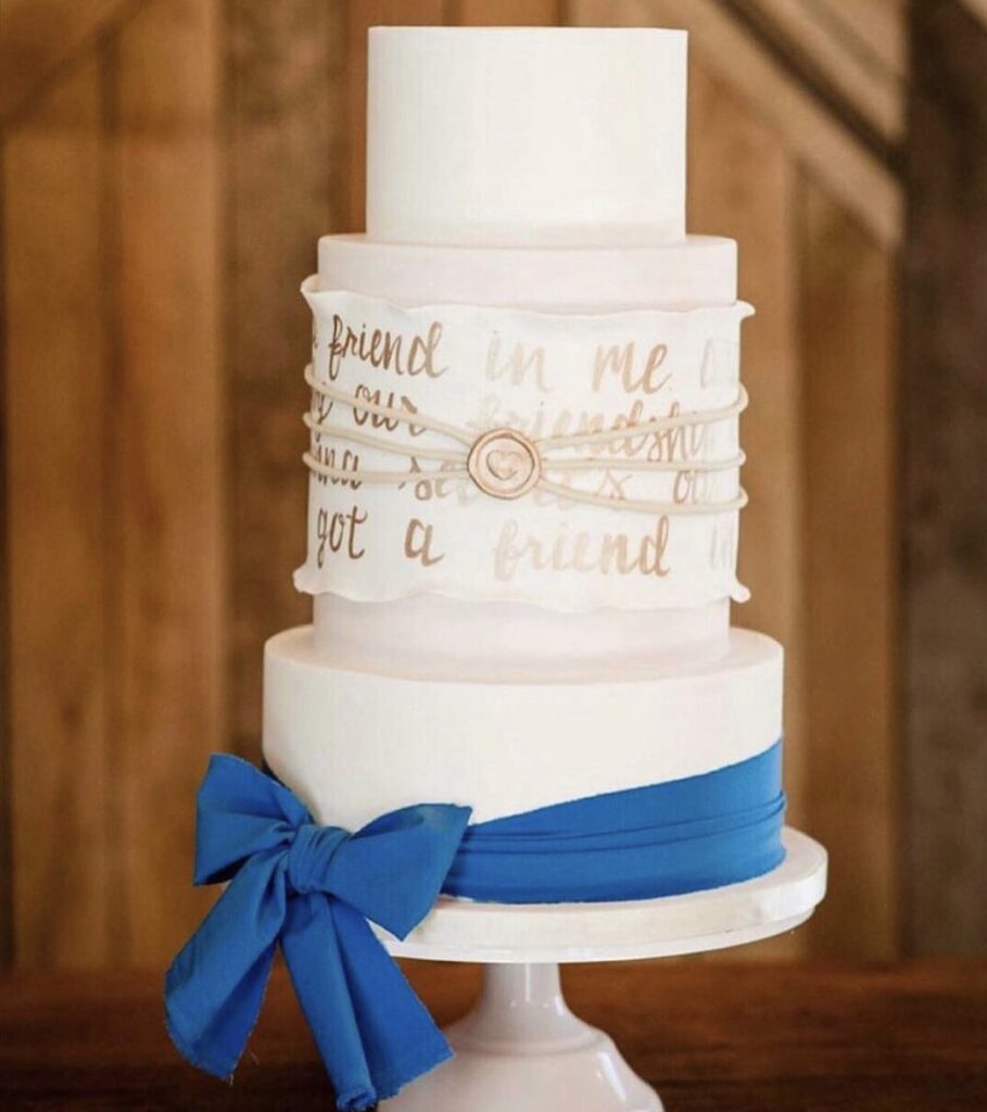
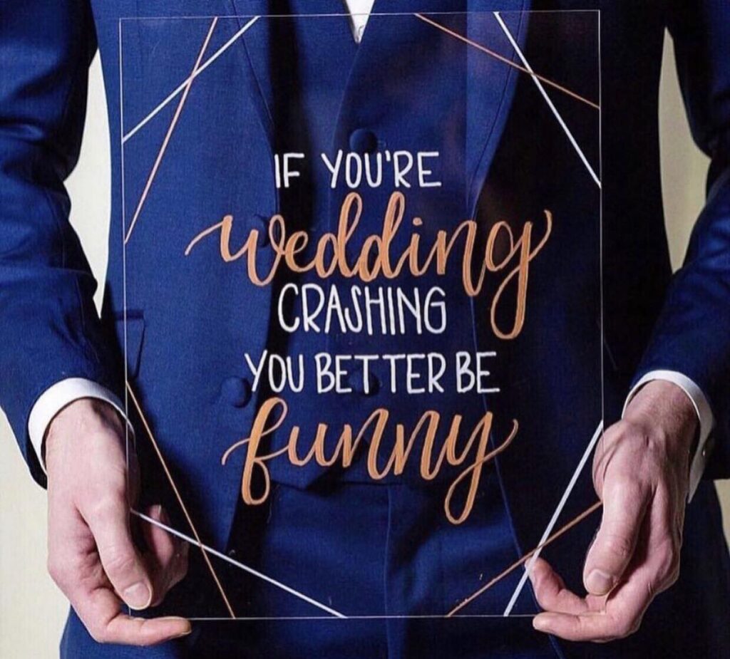
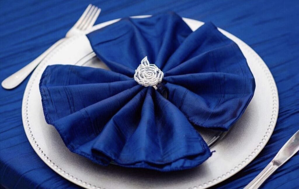
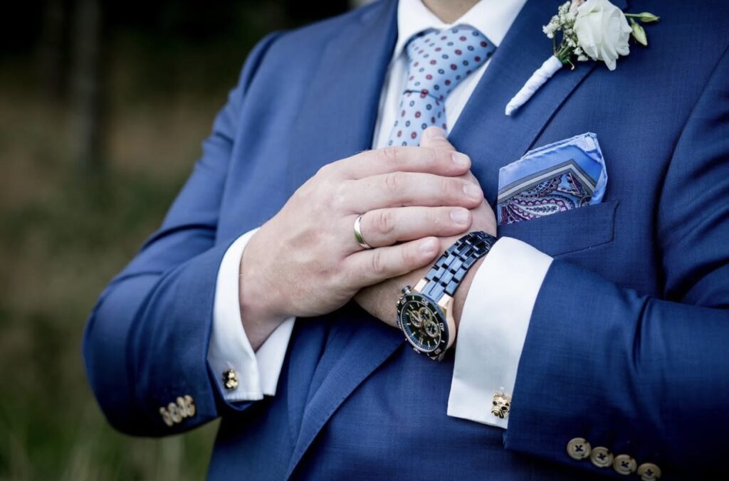
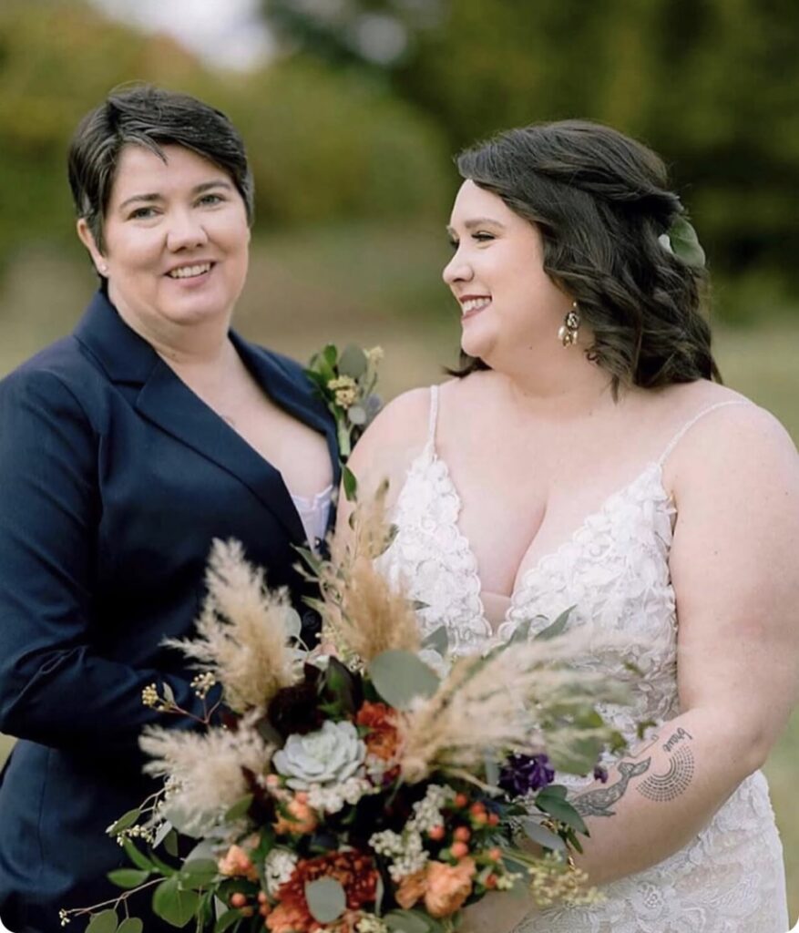
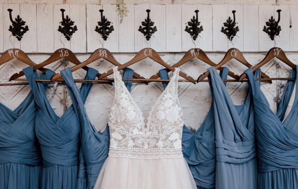
Nothing says vibrant and lively like Pantone’s Color of the Year 2020, Classic Blue. This timeless and elegant shade brings a sense of calm and confidence to any setting. It’s a perfect choice for weddings. Classic Blue adds a bold yet cheerful touch to your celebration.
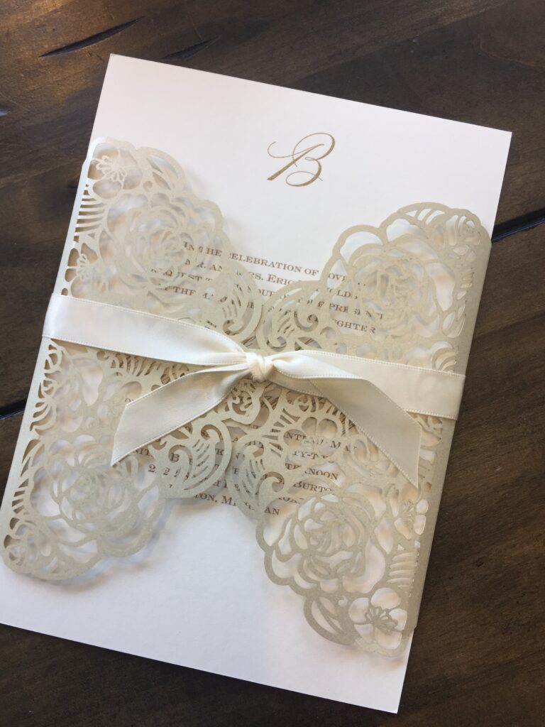
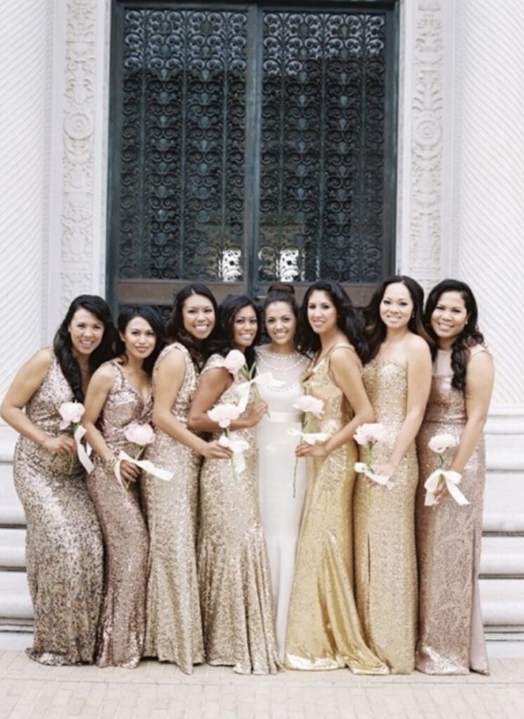
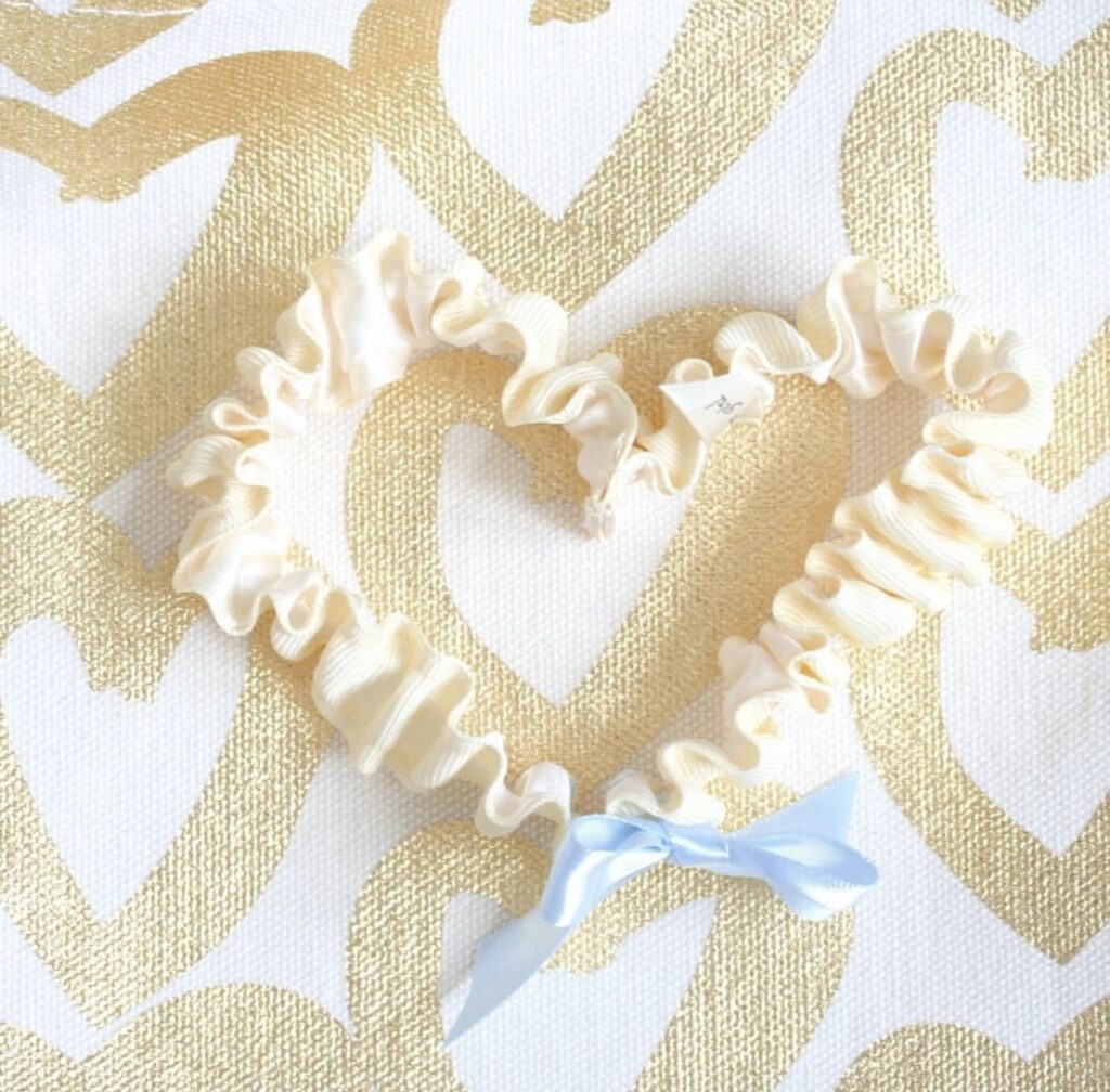
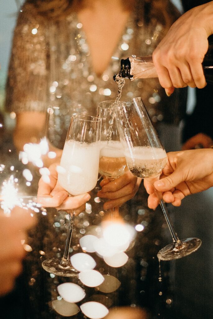
22. Champagne
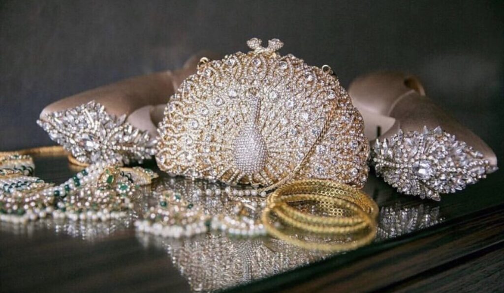
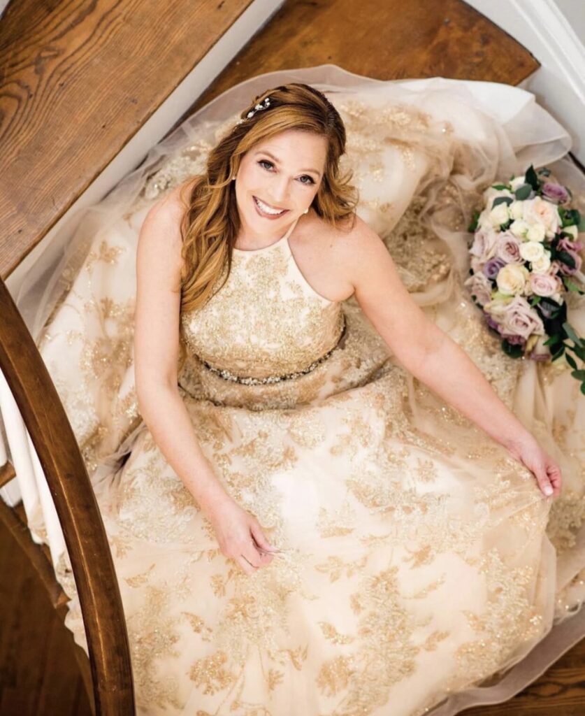
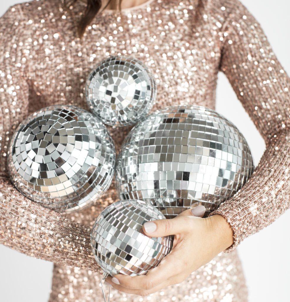
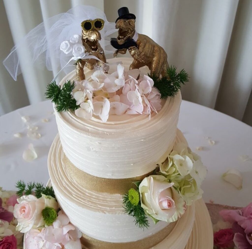
While technically a neutral, champagne exudes more elegance and sophistication than traditional shades like beige or brown. This soft, warm tone brings a touch of understated luxury to any setting. Use it to elevate your tableware with shimmering plates or linens. Add a refined touch to accents or make it the centerpiece of your bridal couture for a timeless, graceful look. Its versatility makes it a favorite for creating spaces and styles that feel both classic and modern.
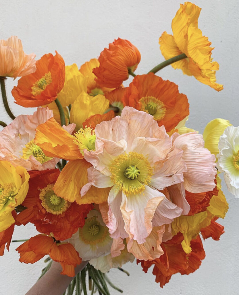
23. Peach
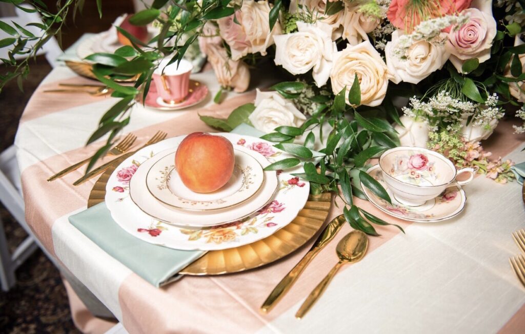
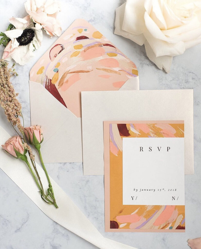
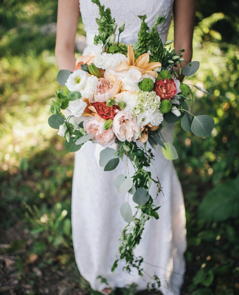
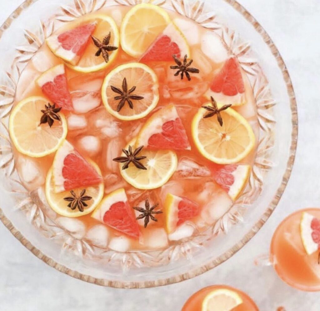
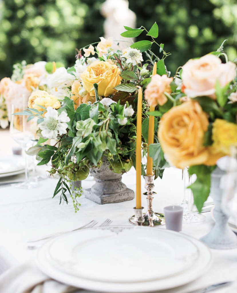
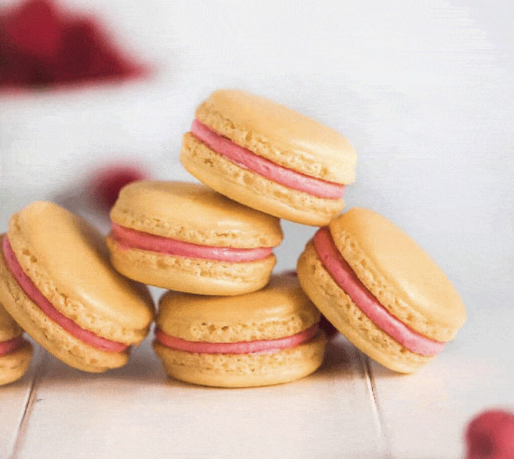
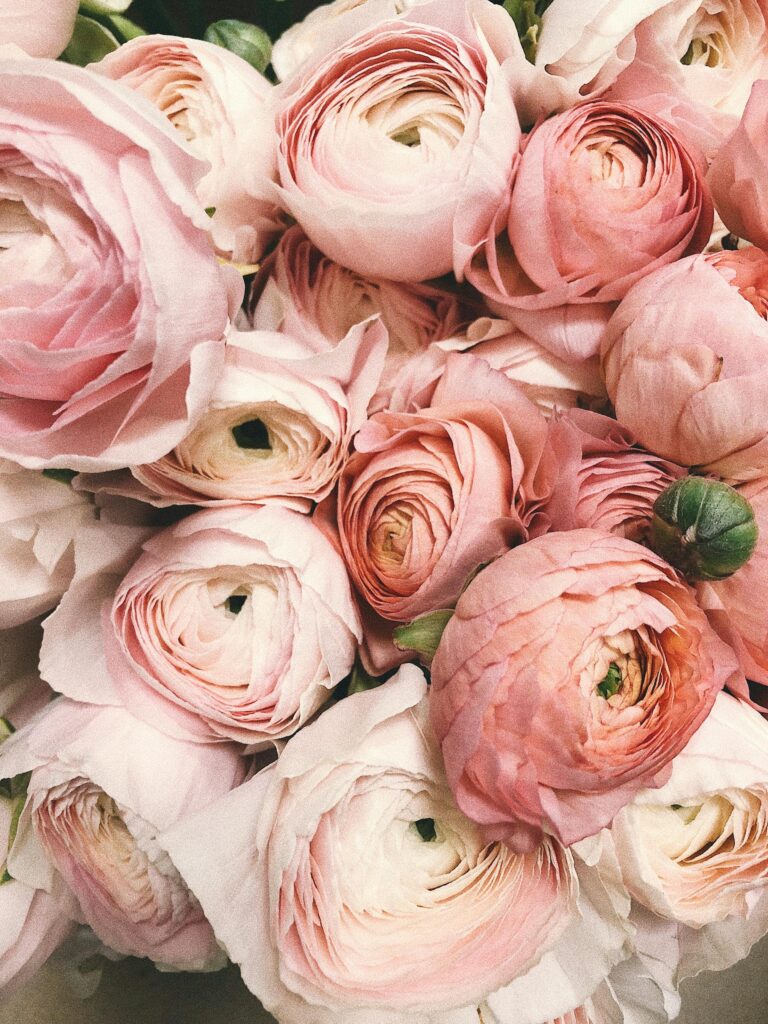
Peach, a color that is both pastel and vivid. It effortlessly exudes a dreamy and ethereal vibe. Soft yet striking, it is perfect for creating a romantic, vintage-inspired look, adding warmth and charm to any setting. Whether used in fashion, decor, or design, peach evokes a sense of elegance and nostalgia, making it a timeless and versatile choice.
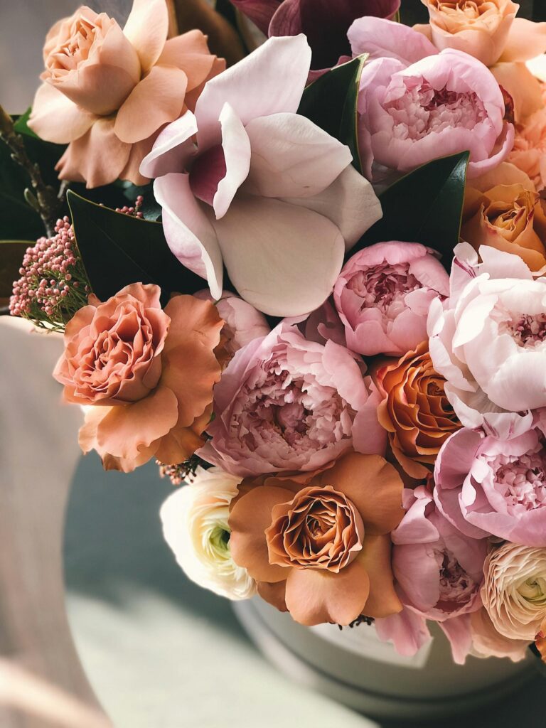
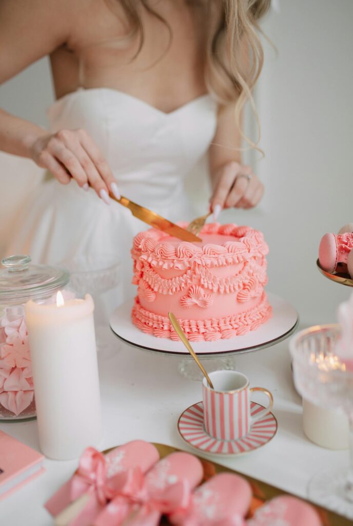
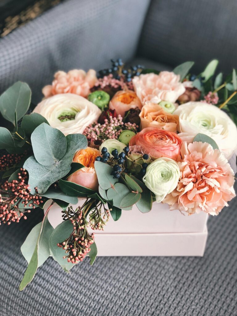
24. Rose Gold
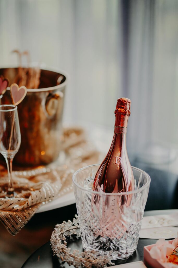
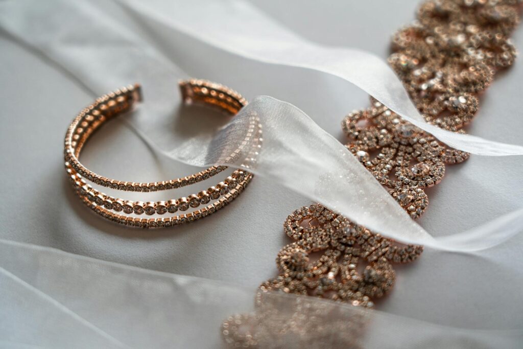
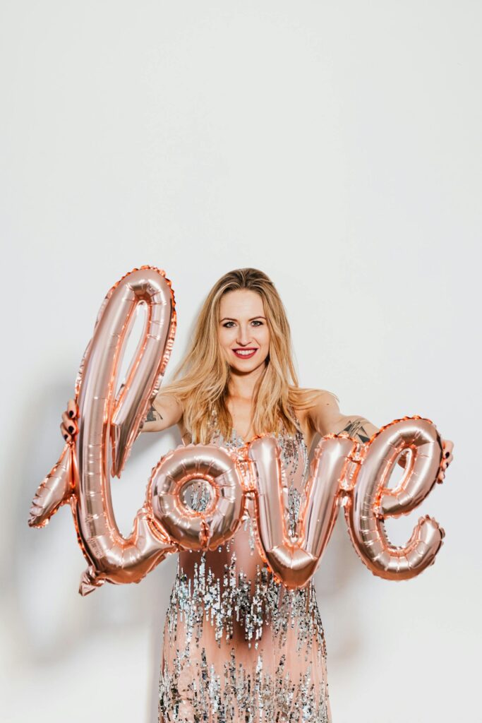
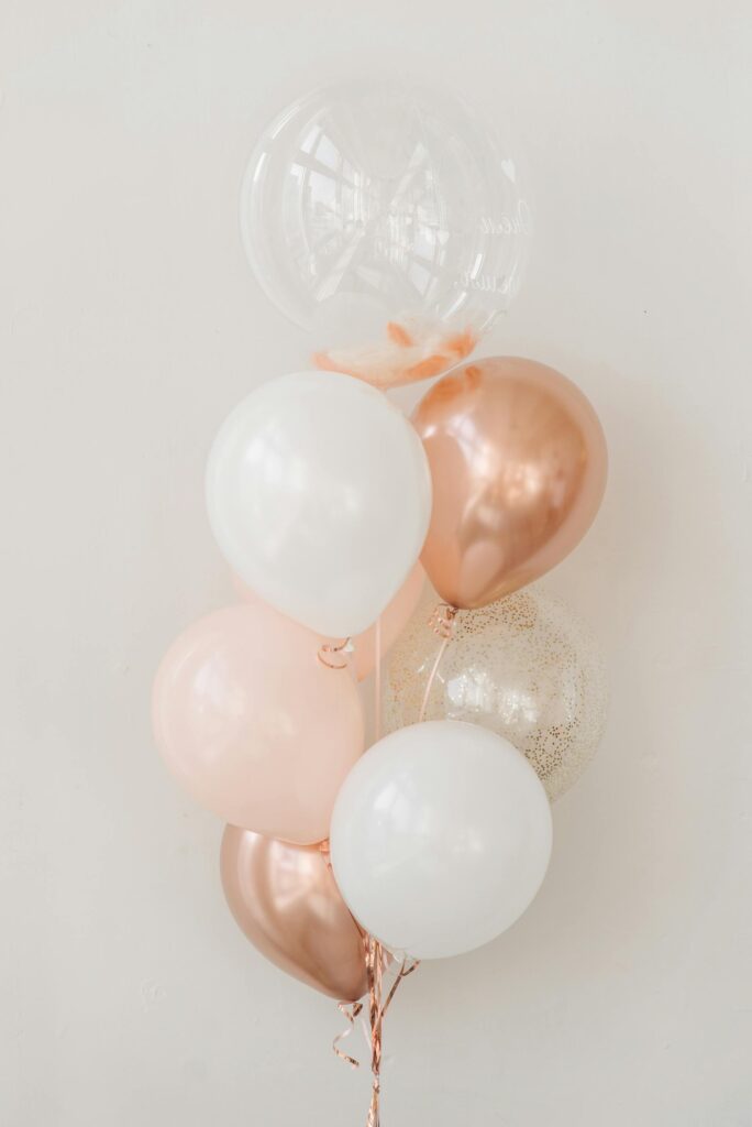
A serene shade of rose gold is perfect for weddings with a vintage vibe, adding a touch of elegance and romance to the décor. Its soft, warm tones complement antique-inspired designs, creating a timeless atmosphere that feels both sophisticated and inviting.

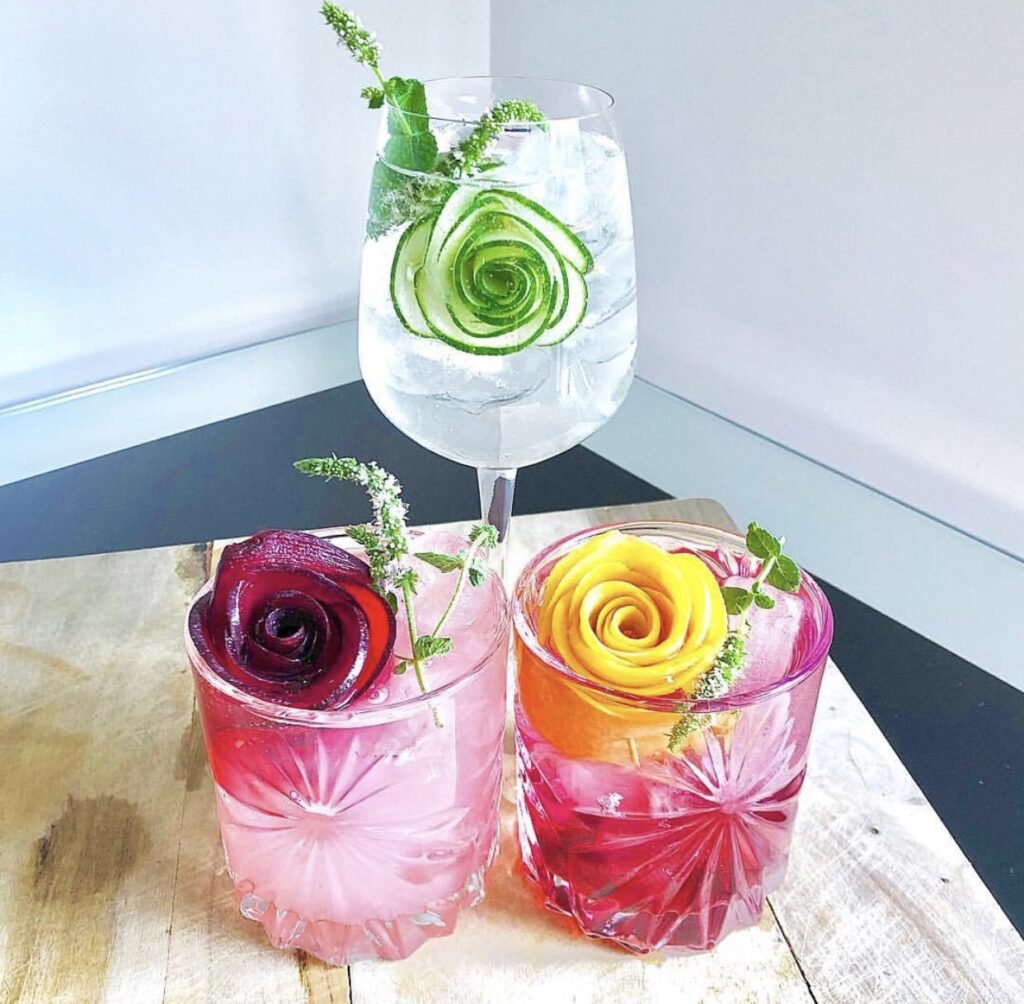
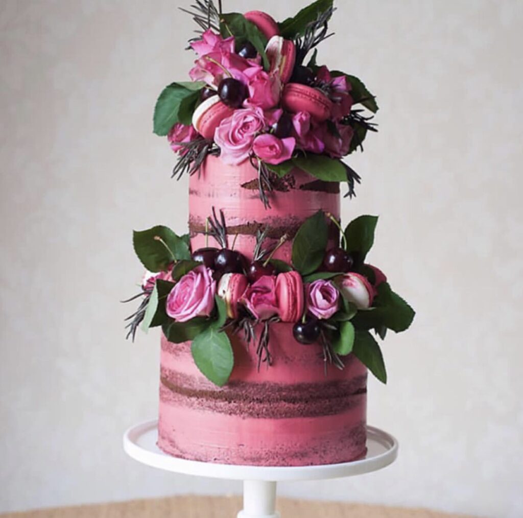
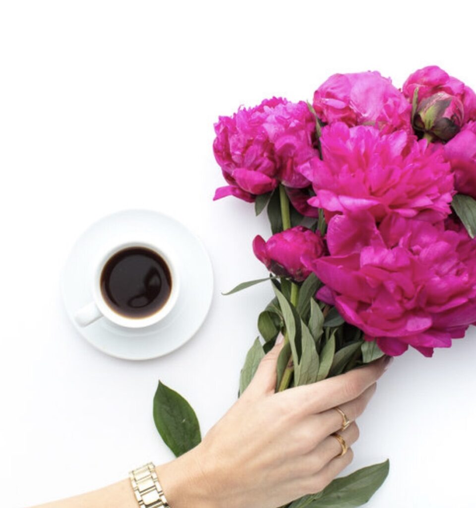
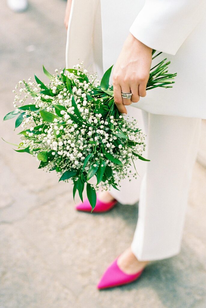
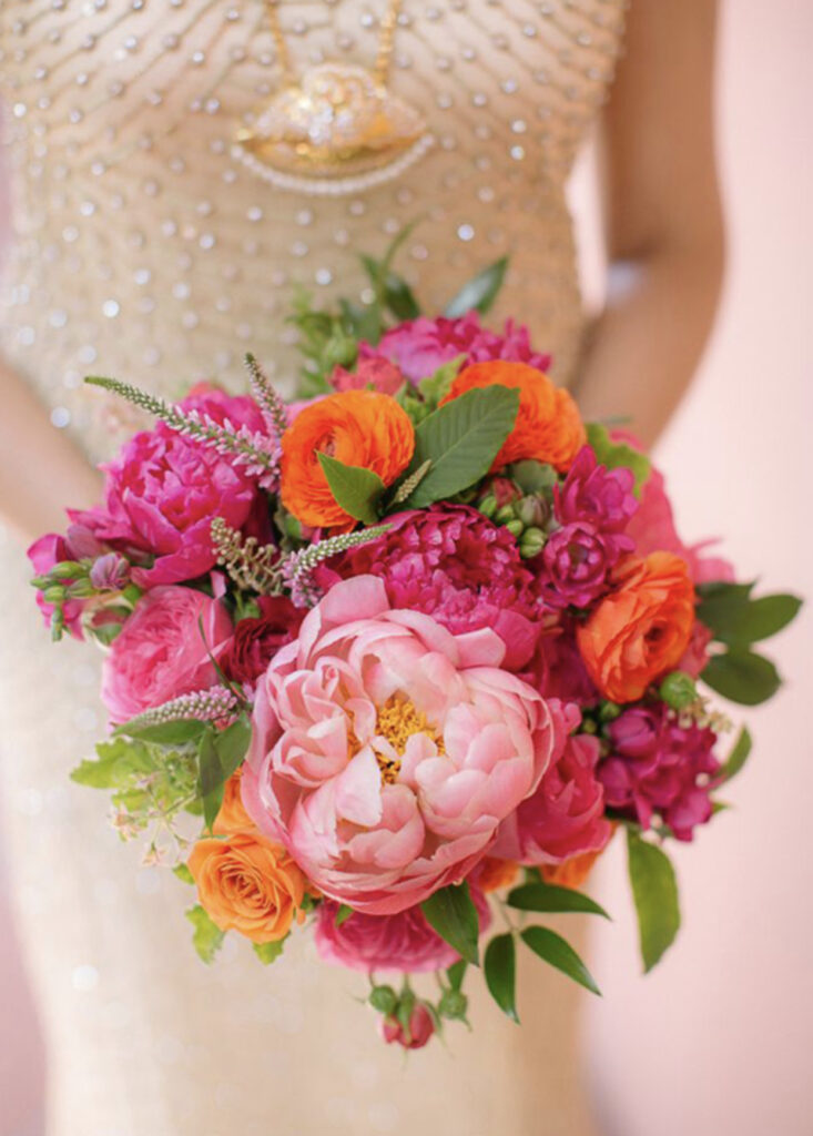
25. Fuchsia
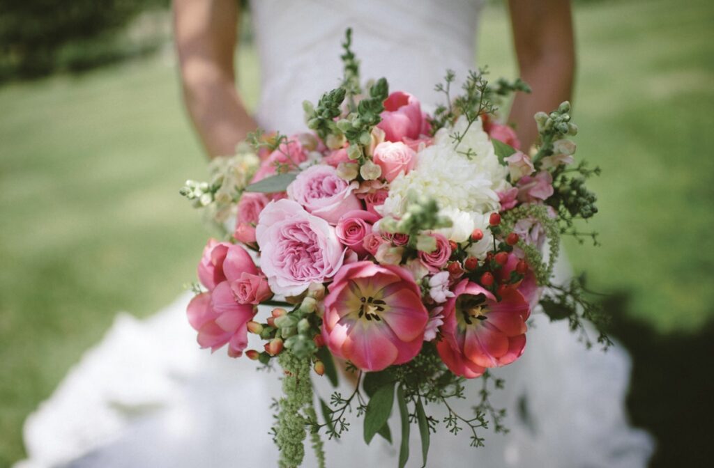
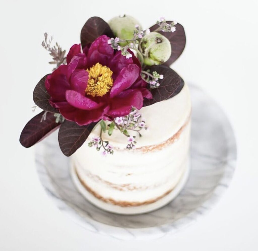
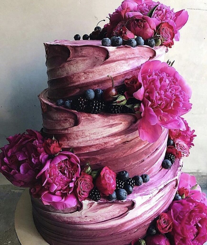
For couples seeking a bold and vibrant color to make a statement, fuchsia is the perfect choice. Its bright, energetic tones bring a sense of excitement and passion, creating a lively atmosphere that brown simply can’t match. Whether used in floral arrangements, decor accents, or attire, fuchsia adds a modern, dynamic feel to any celebration, making it a standout option for those who want their event to feel fresh and unforgettable.
Why These Colors Shine Brighter Than Brown Brown
While practical as an accent color, Mocha Mousse simply lacks the sparkle and romance that weddings demand. It doesn’t create the same uplifting atmosphere that colors like blush, canary yellow, or dusty blue evoke. By leaning into pastels or vibrant hues, you create a wedding palette that’s fun, modern, and unforgettable—not one that fades into the background. Need help refining your wedding color story? Work with Weddings & Events by Raina’s design experts to craft a palette as vibrant as your love story! From florals to linens, we’ll ensure every detail brings your vision to life. And remember, just because Pantone says its trendy doesn’t mean we actually have to believe them. Pretty sure we can all agree. Chocolate mousse is delicious, and we can also unanimously consent that this is a crappy choice.